Stemming back into the days of Windows 2000/XP we have seen icons become more prevalent in our digital nature. Not only have we seen an explosion in software but also with Internet applications. Graphic designers are now able to access hundreds of tutorials on graphics and vector design within the blink of an eye.
In this article I’ll be going over a few tips to get those interested in icon design off on the right foot. It’s a tricky subject which isn’t captured much in today’s media.
Practice in Adobe Photoshop
No matter how you go about icon design you will be required to spend some time working in Adobe Photoshop, with some top-notch tutorials. This is the de-facto premiere software suite for creating web mockups, page graphics, banners, and especially pixel-based icons.
By practicing in Photoshop you are building skills with a common toolset and getting familiar to the artistic environment. Even if you aren’t spending time creating icons (at first) you’ll still be putting in practice and patience. Practically speaking Photoshop will turn out to be much easier on newbies than an alternative such as Fireworks or Illustrator.
Grids are an important concept when designing icons, or any graphics really. When drafting a mockup layout for a website it can be very helpful working with guides and rulers to limit page width, boxes, text areas, what have you. Icons work very similarly in that you’ll generally be fitting them to a specific size. Below are some examples of the most common dimensions:
- 16px x 16px
- 24px x 24px
- 32px x 32px
- 48px x 48px
- 72px x 72px
- 128px x 128px
As you work your way up into areas such as iPhone/iPad design you’ll find yourself working within a set scope of limits. For example, the icon for each iPhone/iPad app in cover view is sized into 512px x 512px – the largest sample size given for most any software branding.
Practice your Sketches
As a designer I can’t stress enough how important hand-drawn artwork can be. I have envisioned so many layouts and page graphics just by starting with the framework in my mind. Armed with just a simple pencil and pad of paper you’ve got a blank canvas to jot down all your ideas and visions.
![]()
Icon design is especially receptive to this behavior considering the nature of the craft. To jump right into Photoshop and start creating will be much more difficult and restrictive than if you had started off with a general idea. Planning ahead is the key to liberation and success. Sketches are also powerful in that they always give you something to fall back to if you’re running dry on ideas.
There isn’t a requirement to get too much into detail. You should really gauge your own comfort level and see how far things need to go. Perhaps you only need a rough idea of how your final product will look and can do away with shadows, gloss, and other effects.
Make use of Perspective
Crafting icons requires you to step out of the box for a moment and consider just how you want your product to appear. By the end of your work the ideal situation is the rendering of a unique, formatted icon. This could be 1-dimensional or even contain detailed highlights & shadows.
Consider how your users will be looking at the edges of your graphic. As not only a designer but also from a UX perspective it’s vastly imperative to consider what feeling your icon should emanate. Try avoiding any overly complex shapes or geomorphic patterns which may skew the end result or amass into confusion.
![]()
Being put simply, if all you need is an envelope for a mail icon just create an envelope. Ensure it’s distinct and will stand out when placed next to text or inside a web browser. But there isn’t a huge demand to go all-out crazy with effects. Icons have been the hallmark of all great user interfaces, it’s important to continue this legacy with a strong foothold in simplicity.
Avoid Overlay Text
In general offering the placement of text or letters on an icon design is a big no-no. This often causes problems on multiple levels, but the largest is with re-sizing. If you create a 512×512 icon with legible text it will reach a point where re-sizing won’t make any sense.
This limits your branding to a great extent and would require a re-design for the smaller dimensional icons. It is even worthwhile to avoid using small phrases or sub-titles as they won’t carry over well during most conversions.
The only possible acceptance to this rule comes with acronyms or abbreviations. If you run the company Global Internet Bank your icon may be recognized for sporting the GIB letters. This is certainly the case with many current institutions – although the practice is very last century. We’re seeing countless innovations in vector art which stand out much more than big, bold, distracting letters.
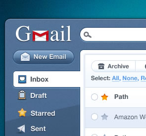
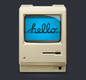
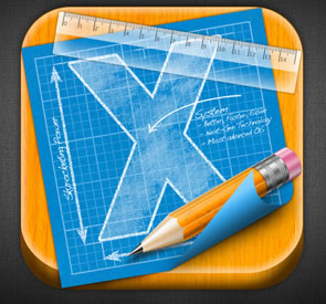
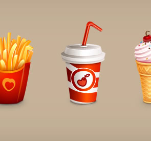
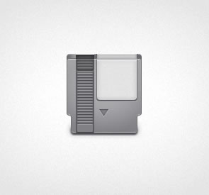
Icons Gallery
Below are a few examples of great icon designs found from around Dribbble’s gallery. All have been linked to their original source and offer a great deal of insight into some of the more common trends. Getting started into the art of icon design isn’t easy. But with a small boost and the right inspiration anything can be achieved!
Football Icon
![]()


Game On

Japanese Lamp

Related Topics
Top