Poster design has gained immense popularity in the last century and is now recognized as an art form. As an art form, posters offer endless opportunities for creativity and expression.
Photoshop is a popular tool for poster design because of its versatility and range of features. It allows you to create complex compositions, manipulate images, and apply special effects and typography.
With its extensive set of tools and filters, you can create unique and striking posters for various purposes, such as advertising, marketing, events, and much more.
The Photoshop tutorials we have for you here provide step-by-step instructions on how to create posters from scratch using various design elements, such as images, typography, and colors, and cover a wide range of techniques and styles, from vintage and retro to modern and minimalist.
You might also like this collection of poster design tutorials for Illustrator, or these free poster mockup PSD templates.
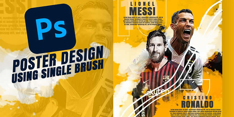
How to Create Professional Sport Poster Design in Photoshop
In this Photoshop tutorial, you’ll learn how to design a professional sports poster using a single brush and transparent PNGs. This video guide will help you refine your skills and create professional-quality posters that capture the spirit of sports.
How to Create a Dance Festival Poster in Photoshop
Learn how to create a creative street dance festival poster design in Adobe Photoshop with this tutorial. You’ll also receive a free PSD template to help you get started.
Summer Poster PSD Bundle for Photoshop
This template bundle is a collection of 30 unique and colorful posters perfect for promoting events, parties, or summer-themed activities. With customizable elements and a high-quality design, these templates are an excellent addition to any marketing or branding strategy.
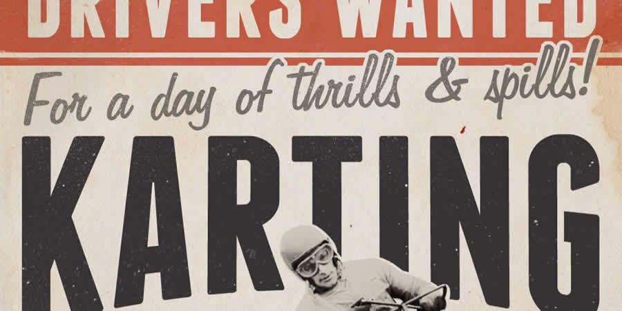
How to Create a Retro Style Racing Poster in Photoshop
Discover how to create a retro-style race poster in Photoshop with this tutorial. You’ll learn how to create a vintage look and feel using various textures and brushes. Additionally, you’ll switch back and forth to Illustrator to create the typographic elements.
How to Create a Music Poster Design in Photoshop
This tutorial teaches how to create a city sound music poster design in Adobe Photoshop. Using watercolor brushes and stock photos, you’ll discover how to create a visually striking poster that captures the essence of music in the city.

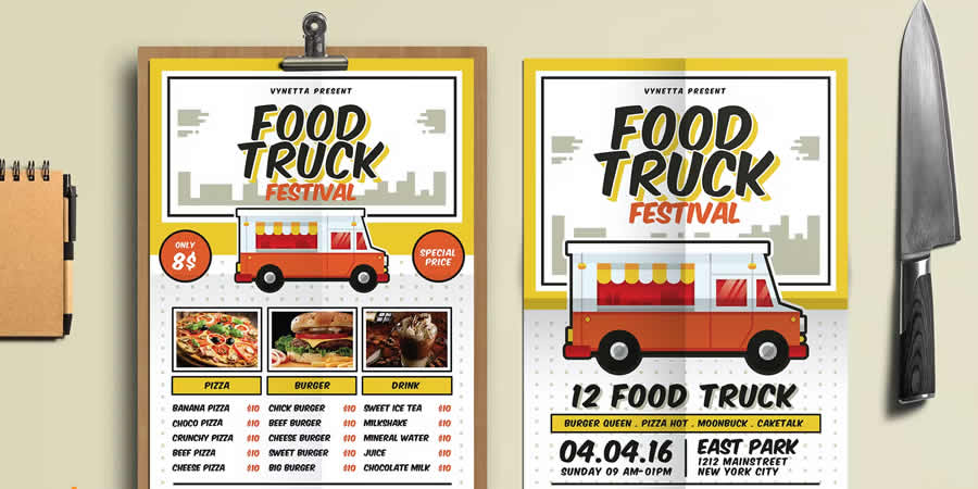
Food Truck Festival Poster PSD Template
This PSD template is the complete package for promoting food festivals and events. The set includes a poster, flyer, and menu design, making it an excellent choice for any food-related marketing or branding campaign.
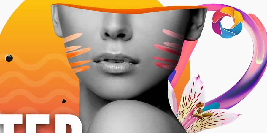
How to Create an Abstract Poster in Photoshop
With this step-by-step tutorial, discover how to create an abstract poster design in Adobe Photoshop. Learn valuable techniques for creating visually striking posters and flyers that make an impact.
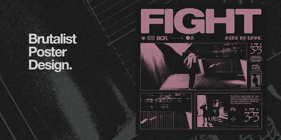
How to Create a Brutalism-Inspired Poster in Photoshop
This video tutorial will show you how to create a brutalism-inspired poster or cover design in Illustrator and Photoshop. Using textures and editable vector packs, you’ll create a visually striking design that captures the essence of brutalism.
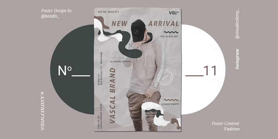
Fashion Poster Photoshop Templates
These stylish and modern posters templates are suitable for promoting fashion-related events or businesses. These Photoshop templates are perfect for creating eye-catching visuals and can be easily customized to fit any brand or campaign.
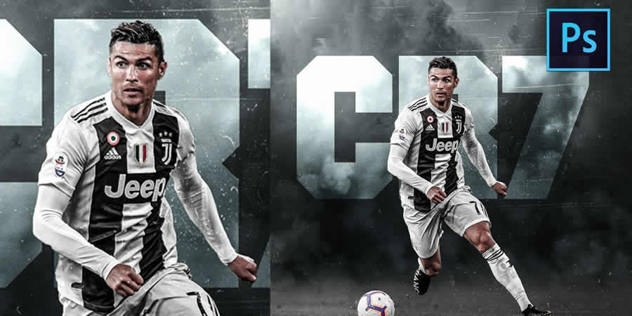
How to Create a Professional Football Poster Design in Photoshop
In this Photoshop manipulation tutorial, you’ll learn how to create a professional football poster design using brushes, textures, and stock photos, and discover techniques for creating a visually striking poster that captures the excitement and energy of football.
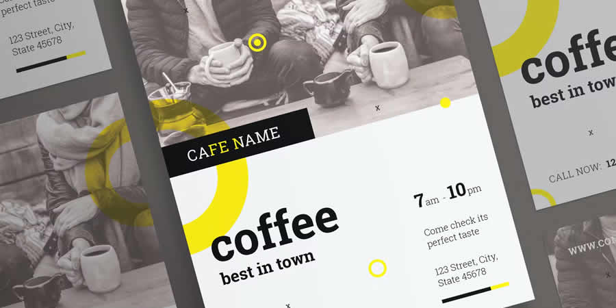
Coffee Shop Flyer & Poster PSD Template
With a minimalist and elegant design, this template includes customizable elements, making creating promotional materials that stand out much easier. It’s a great addition to any coffee shop’s marketing strategy.
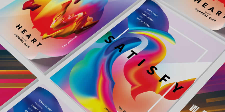
How to Create a Colorful Retro Futuristic Poster
Learn how to design your own bright and colorful retro-futuristic poster using dynamic lines, vibrant gradients, and rough textures in Photoshop tutorial. With this tutorial, you’ll learn new skills that you can apply to your future designs.

Recreate the Avengers Poster
This Photoshop tutorial teaches you how to recreate the iconic shine effect from the Avengers posters. Using Layer Styles and the Brush tool, you’ll learn how to create a dynamic and attention-grabbing poster that captures the essence of the blockbuster film.

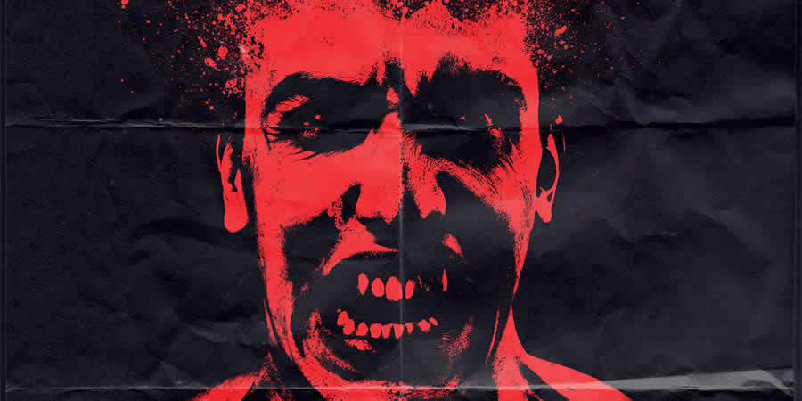
Design a Raw Horror Movie Poster
Learn how to create a spine-chilling horror movie poster with this Adobe Photoshop tutorial. You’ll learn how to design an old-school-style poster that captures the essence of classic horror films.
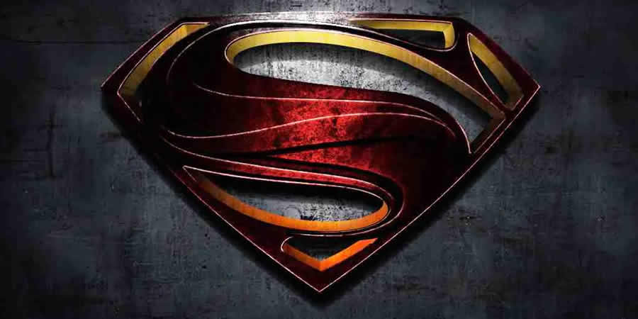
Recreate the Man Of Steel Movie Poster
Learn how to create a stunning and powerful Man of Steel movie poster with this Adobe Photoshop tutorial. Using the Pen tool and textures, you’ll discover how to recreate the iconic poster of Superman in his Man of Steel persona.
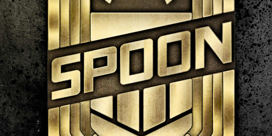
Recreate the Judge Dredd Badge Design
Unleash your inner law enforcer with this Adobe Illustrator and Photoshop tutorial on creating a Judge Dredd badge design poster. You’ll learn how to construct the pieces in Illustrator and then use Photoshop to give the badge a realistic metal-like appearance.
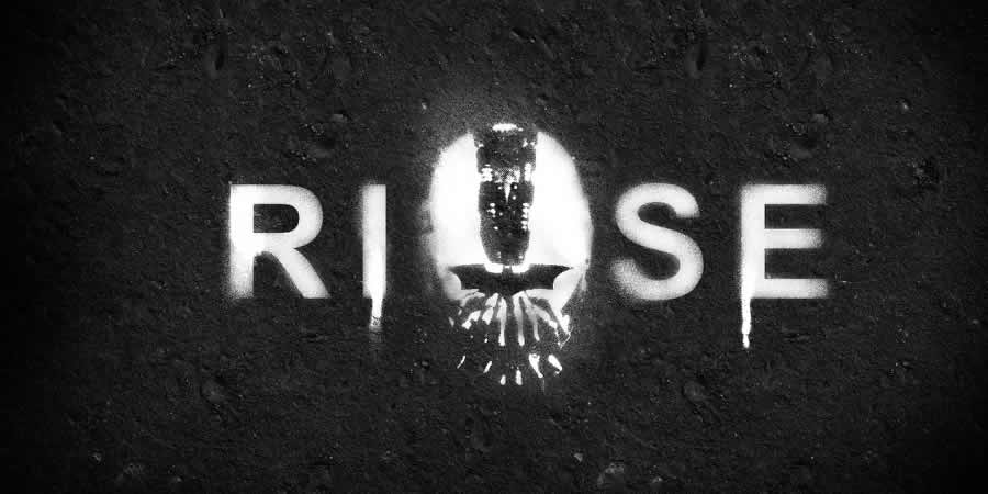
Recreate the Dark Knight Rises Stencil Effect
Using filters and brushes, you’ll learn how to create a dynamic and visually striking stencil and spray effect from the Dark Knight Rises movie poster in this Photoshop tutorial.
How to Create a Retro Poster in 10 Steps
Discover how to create an eye-catching retro poster in just ten easy steps with this Adobe Photoshop tutorial. Follow along with clear and easy-to-follow instructions to create a design that captures the nostalgia and aesthetic of classic posters.
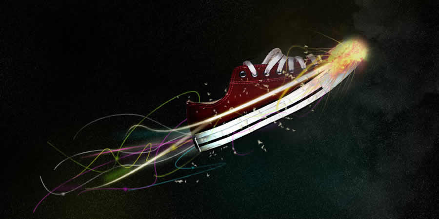
Design a Stunning Sneaker Advert
Whether you’re a sneaker enthusiast or a designer looking to refine your skills, in this Adobe Photoshop tutorial, you’ll learn how to design a stunning sneaker advertisement poster using a variety of lighting effects inspired by the incredible works of Peter Jaworowski.
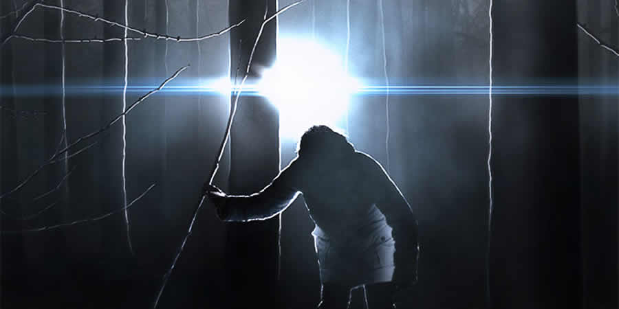
How to Create an Intense Movie Poster
Learn how to create a suspenseful thriller poster for a fictional film called “Fugitive” in this Photoshop tutorial. You will be taken through the process of creating a poster that captures the essence of the movie’s plot.
How to Create a Trendy Galactic Poster
Learn how to create a trendy galactic-themed poster using Photoshop. The tutorial covers textured backgrounds, blending modes, layer masks, and adjustment layers for color balance, and saturation.

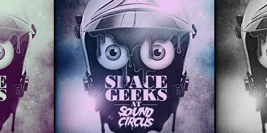
How to Create a Space-Helmeted Future Retro Illustration
In this Photoshop tutorial, you’ll learn how to create a space-helmeted future retro illustration. You’ll discover how to use brushes and layer masks to create texture and depth, as well as how to use filters and adjustment layers to fine-tune your poster’s overall look and feel.
How to Create an Event Poster
In this tutorial, you’ll learn how to create an event poster using Cinema 4D and Photoshop. Create a 3D text render in C4D, add props and modify the scene, and finish the poster design in Photoshop using various tools and techniques.

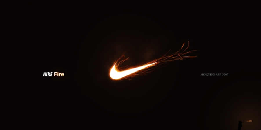
How to Create an Amazing Nike Ad
Learn how to create a fantastic Nike advertisement in Adobe Photoshop with this tutorial. You’ll learn how to create a stunning and dynamic poster using images and techniques such as blend modes and color adjustments.
More Photoshop Tutorial Collections
Related Topics
Top