The current state of technology allows us to create different user interfaces. From plain, oversimplified designs where all the information is placed in one screen to massive, overwhelming experiences with enthralling storytelling and exciting interaction. We are spoiled with choice and, most importantly, tools to bring ideas to life.
There are general rules that you need to obey in order to sit at the “cool” table. Use WebGL or other advanced libraries in your projects for enriching design and making interaction attention-grabbing. You will undoubtedly end up with something grandiose and sensational.
However, this movement is a bit artificial, don’t you think? In the digital world, we have enough of it. What is actually missing is a warm, human touch. It is amazing how we human beings easily fall for new tricks. But we always feel an urge to go back to roots that lie in the real world.
And the vivid proof are designs that were built with the help of old-school illustrations or patterns that are an echo of the real world. They naturally stand out in the sea of interfaces that are populated with digital animations and effects. Why? Because art never gets old.
Epicurrence
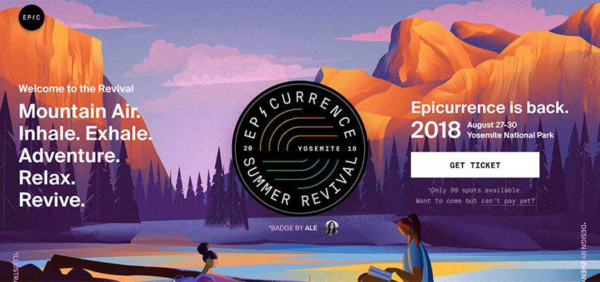
Take a look at the refreshed and renovated front page of Epicurrence. It is just awesome. Colors and undertones are astonishing. The slight touch of noise texture ideally blends in. Not only does the background illustration for the welcome section fascinate with performance and idea. Most importantly, it creates the proper mood for the festival. The event will take place in a national park, and the website breathes with fresh air and charms with sun-kissed scenery. It perfectly supports the main tagline, promising the audience a relaxing and reviving atmosphere.
Drip Pop
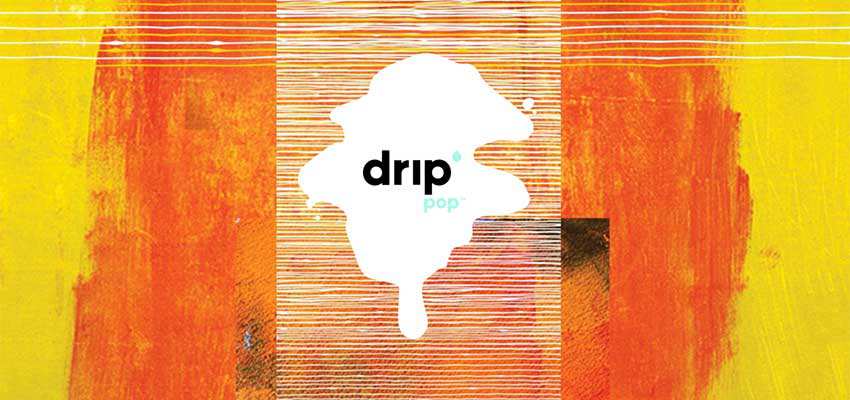
There are no limitations and rules when it comes to art. Drip Pop is a perfect example. The website welcomes the audience with a spectacular image of creative chaos – captivating with a powerful, artistic feel. They use classic stylization to make an illustration look like it was created using oil and watercolor paints. It’s one of the time-proven and win-win solutions. You can’t take your eyes off it while trying to form shapes and imagine the concepts within.
Bruce Clay
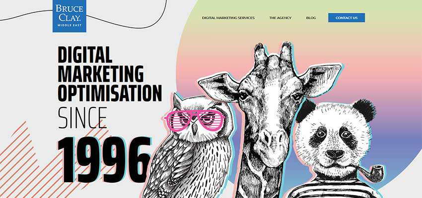
Art is art: Whether it is a precise sketch or a messy spot of paints; whether you use digital means to create it, fake it using the special software or use a Photoshop of your handiwork. It always bears a warm, human touch that is increasingly welcoming and sought-after in the digital world. Bruce Clay’s website feels personalized. It has a nice, retro vibe that hints at the venerable age of the agency. The entire aesthetic is built around the marvelous hand-drawn illustrations, complemented with old-timey coloring, gradients and lovely visual effects.
ICO Syndicate
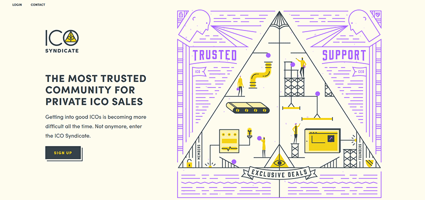
The team behind ICO Syndicate opts in favor of a sleek and trendy type of art. The line-style illustration takes the center stage of the overall aesthetic. It is pretty popular these days and can be seen not only on a large scale, but also in the small one such as with icons. A unique pastel palette, intentional shifts in coloring, lots of geometry and fresh air: It feels fantastic and a bit cryptic. Precisely what is needed to support another ICO syndicate out there, a mysterious and enigmatic thing.
Lamplighter Brewing Co.
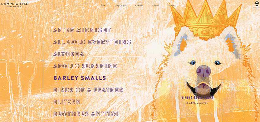
Unlike the previous examples, the design team behind the Lamplighter Brewing Co. went even further. The website has a whole collection of illustrations. They are used to accompany drink names that are featured at the left. Each illustration is unique, graphically describes the title and conveys the mood. Just cycle through the assortment and see it for yourself.
PRA Healthcare
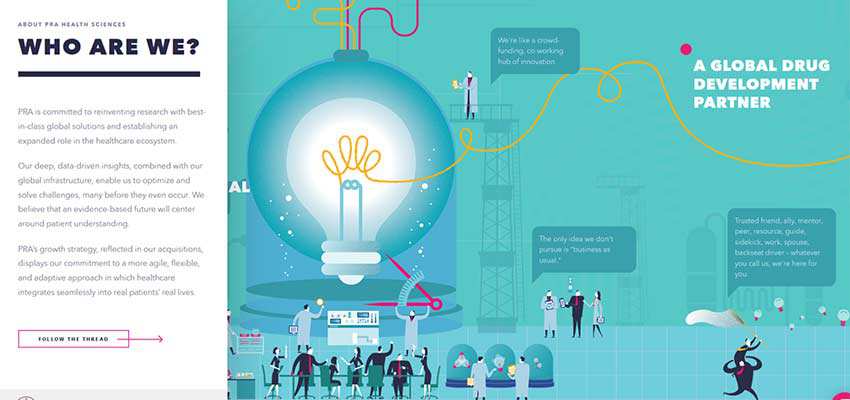
PRA Healthcare is an example of a modern take on an illustrated approach. It is used to tell a story about the project uniquely and creatively. It is simple, exciting and engaging. Each scene is enriched with info blocks that are hidden behind the interactive dots. You can enjoy an adventure and still get all of the necessary information.
Mony’s
Mony’s front page is an excellent example of how to make the most out of one of the oldest techniques out there: The use of patterns. Sound familiar to you? We were used to doing this in the early days of web design. We took a small pattern and cloned it until the background started to look cool. However, Mony’s design is not exactly the same. There is a certain pattern, but there are no identical blocks. It’s just a beautiful illustration. What’s more, the approach can be found throughout the entire website – enriching the overall aesthetic.

Universal Love
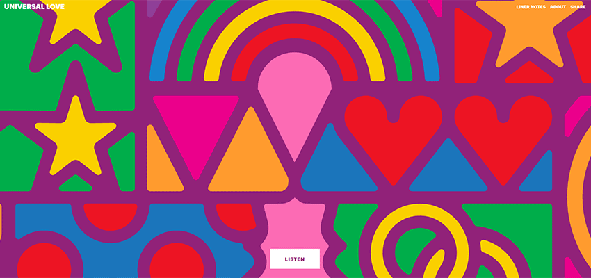
Universal Love is all about wedding songs, so it is entirely predictable that the website has some schmaltzy atmosphere and looks a bit Plateresque. The design is based around the bold geometric print that is intentionally colored in all the basic colors. This drastic palette and geometric vibe accompany each page and section, tying everything together.
Touring Bird
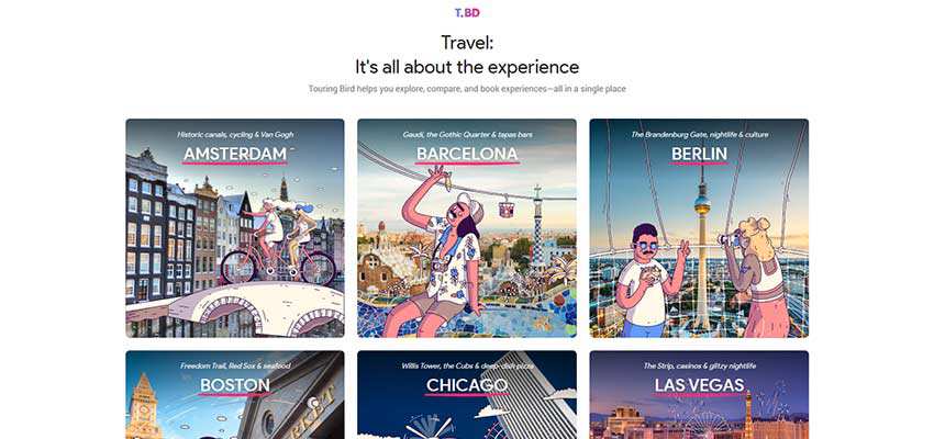
How about a combination of photography and hand-drawn sketches that results in quite a symbiosis? Touring Bird shows how to do it right. Being related to one of the most banal themes out there (travel), it still looks not only good but also original. The design naturally captures the attention of an online audience, serving an old boring dish with new sauce. It feels fun and playful.
DUG
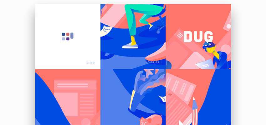
DUG uses an illustrated approach to take their navigation to the next level, thereby successfully avoiding banalities. As a result, the home screen reveals a creative side that is the calling card of the agency. Although the illustrations can’t be seen anywhere else on the website, each section and page are marked by an artistic touch that hugely contributes to the overall impression.
A Timeless Look
At first blush, the idea of populating your website with illustrations seems boring and totally uncool – especially when you have so many effects at your fingertips. It feels like a step back.
However, certain things never get old, and the illustrated approach is one of them.
Related Topics
Top