Blogs on the Internet are becoming are easiest way to consume news & information. Many web designs are responsive which allows reading on mobile devices, and you aren’t even paying for the privilege. The popularity of simple open source CMS’ like WordPress makes it even easier to launch your own project online.
In this guide I want to look at some WordPress themes as examples for current blogging design trends. By studying these current trends designers may also speculate potential changes for the future. The Internet has grown so quickly in a very short time period – who can really know for certain what the next phase will be?
You might also like to view this gallery of beautifully designed personal blog websites.
Obscure Homepages
Something that has always caught my attention is the uncertain design pattern on blog homepages. Often you will find some large heading panel with featured articles, possibly rotating or shifting between stories. There is also usually a set of different cascading post displays focused on categories, recent topics, popular articles, or even specific authors.
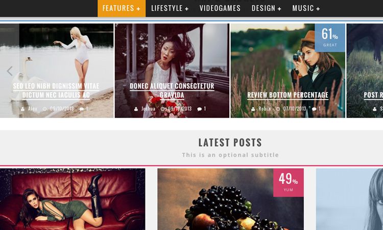
The new Valenti theme is a good example of this complex homepage layout. The first 5 posts are displayed in a block-level thumbnail widget. But you’ll also find a small image rotator beneath this, followed by some latest posts and then columns of post categories. In some cases you will find yourself way too confused at the mass of content strewn across the page.
When considering your homepage design make sure that it’s easy to follow along. As a reader myself I can imagine being too overwhelmed by the complexity and just leaving a website before reading anything. But if you plan well then you may be surprised how many people actually like the semi-disheveled style of skimmable homepages.
Trending Posts
Popular breaking news and trending topics are sometimes displayed as news tickers. These will show one post headline at a time for just a few seconds before moving onto the next one. Definitely check out the header on Manshet to get a better conceptual idea.
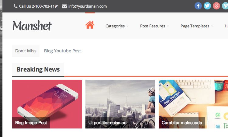
This design is really cool because it features the news ticker along with a slideshow of breaking news. This has post thumbnails to draw more attention than just plain text. But all of these elements appear towards the top of the page. It’s an area above-the-fold which visitors will notice right away.
I feel like this idea only works on a blog or magazine with a lot of content. Meaning typically more than 1-2 posts each day. If your blog is constantly publishing news articles then you need a method to differentiate the more popular stories from milder ones. These top headline sliders and news tickers are definitely one trendy solution.
Prominent Author Features
Weblogs have always been partially about the author behind the website. Readers who fall in love with a blog eventually try to learn more about the writer. blogs do try to make this a lot easier with more featured details promoting the authors themselves.
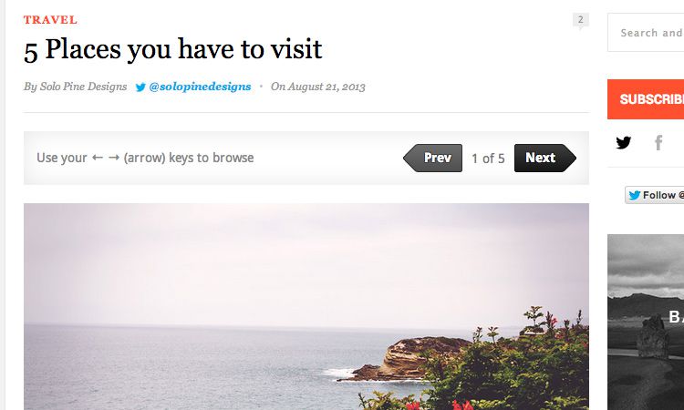
You will notice articles that include a full author bio, links to their website, and even other external links onto Twitter or Facebook. An example article from the Hickory theme includes a direct link to the author’s Twitter account underneath the post headline. It also directs to the author page itself listing all of their articles on the site.
Giving readers a more intimate connection with the staff helps to build a small community around your website. Readers may come back just to check out a certain author because they really enjoy their articles. Over time you can build a reputation for your website within dynamic niches for really powerful content. Try including other social links onto Tumblr, Pinterest, Instagram, or whatever your writers may benefit from promoting.
Every website needs a footer even if it’s just one line. Sometimes this will basically focus on copyrights or simple internal page links. But an online blog is such a different beast altogether that you have to marvel in some of these footer designs.
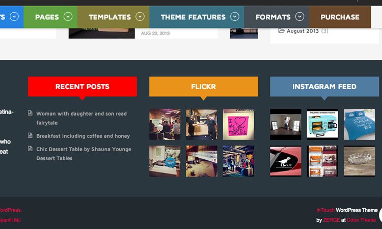
The screenshot above is from an example theme called InTouch built for WordPress. Notice that these are most likely footer widgets, but they format perfectly into columns based on the responsive design. You can definitely include simple elements like tag clouds, site information, and links to contact/company pages.
But also notice the connection into 3rd party services like Instagram or Flickr. You can pull data from your own account using APIs and display these into widgets on the page. A website’s footer may be the best placement because it won’t get in the way of your main content or advertising space. The goal is to make your footer relatable to the viewer. Make them feel like your blog is just a typical website, big or small, and present content which will keep them engaged for a little while longer.
Reviews & Ratings
I think that any product in regards to movies, music, gaming, food, books, has the ability to be reviewed. People thinking of buying or consuming something may want to know what your blog thinks of it first. And so internally-powered review features have become very prominent within online blogs.
These reviews typically come from the author who may leave some positive and negative feedback. It could be presented in a 5-star rating, or in a numerical system which talks about different properties(acting, directing, screenwriting, music, etc).
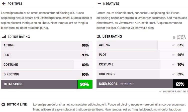
It’s interesting because this theme also allows users to vote on each of the stories as well. This means any review post has the author’s rating along with the collective readership’s rating value. If your blog has a tremendous audience it may be worthwhile to get into reviewing products more frequently. It can sometimes lead to deals with companies or Internet publishers who need market exposure on their new product/service.
Another fantastic design example by Industrial Themes is called Steam. These reviews, much like the other theme, include ratings for various aspects of the product itself. And it also features little trophies or detail icons which explain the type of content in the product.
![]()
For one example looking at this video game review you’ll find icons for details like underwater gameplay and multiplayer support. This is a really cool feature but it’s not always going to be necessary, depending on how many things you review. Sometimes it is easier for a blog to keep it simple and provide one single rating value – then leave all the detailed explanations for the article content itself.
Regardless, it should be understood that blogs are adopting this review & rating system, along with simpler interfaces like total view counts or total likes on a single article(internal likes not Facebook likes). If you feel these added features could benefit your blog or magazine then definitely find some time and build it out! You may be surprised how many people are willing to interact with your articles, leave feedback, and even return again sometime in the future to read more.
Closing
I know these are some basic ideas since they’ve been coded into websites for a long time. But we have never seen online blogs growing so quickly – blogs which also never had their own print version in retail stores.
I do hope these suggestions may help webmasters or WordPress developers who are looking to build a useful product. Similarly, if you have any questions or comments on the topic feel free to share with us in the post discussion area below.
Related Topics
Top