 Get 10 Free
Depending on the type of website or app you’re building, there will always be some key areas to which you have to give more attention than others. One area that is critical to all types of websites, and requires more thought than others, is navigation.
Menu items generally lead to a site’s most important pages or areas and help visitors navigate easier. And, as you have to consider multiple screen sizes when designing a menu, making the navigation responsive can often make things much more complicated, especially on larger sites.
As there is no universal solution, the type or style of menu you use will depend on the kind of site you are creating. If it is a small site like a personal portfolio, a <select> drop-down menu or a simple hamburger toggle menu will probably suffice. But suppose it is a larger site like an eCommerce store that relies upon a mega-menu for navigation. In that case, a drawer-style navigation or an animated side panel menu will most likely help you.
JavaScript & jQuery Responsive Menu Plugins
Sidr – Responsive Side Menus
Sidr is an easy-to-use plugin that will create a responsive Facebook-like side menu. It allows you to create multiple ‘sidr’ menus on either side of your layout.
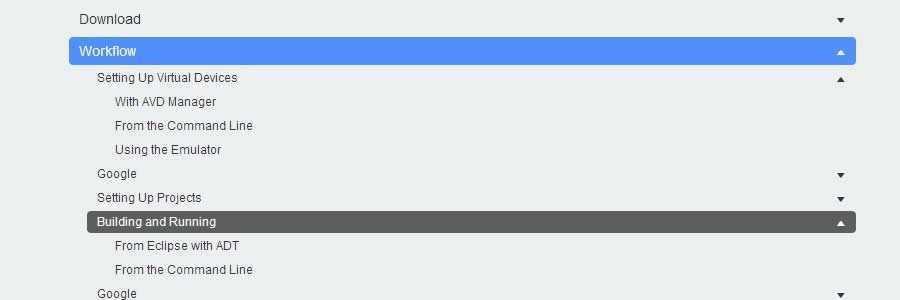
Navgoco is a simple jQuery plugin that can turn a nested unordered list of navigation items into a beautiful vertical multi-level slide navigation.

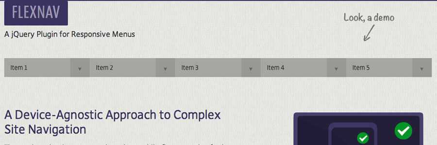
FlexNav is a mobile-first example of using media queries and jQuery to make a robust dropdown menu. From the developer: It is a ‘device-agnostic approach to complex site navigation with support for touch and keyboard accessibility.’
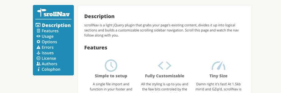
scrollNav is a lightweight jQuery plugin that grabs your page’s existing content, divides it into logical sections, and builds a customizable scrolling sidebar navigation.
Flaunt.js allows you to create a stylish responsive navigation with nested clicks to reveal.

jVanilla Menu
jVanilla Menu is a simple jQuery menu plugin that takes an existing CSS drop-down menu and adds enhancements such as animations, submenu levels, and timeout delays.

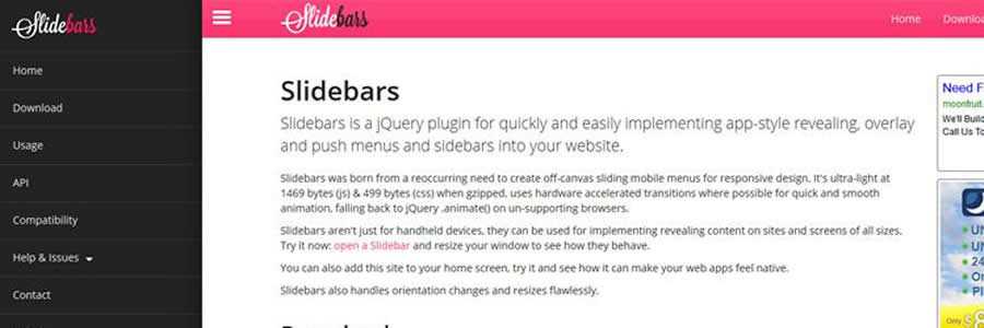
Slidebars – App-Style Push Menu Plugin
Slidebars is a lightweight jQuery plugin that will allow you to add an app-style push menu to your website or application easily.
scotchPanels.js – Off-Canvas Menus
scotchPanels.js is a jQuery plugin for creating an off-canvas menu and other panel types such as images, videos, and iframes.

SmartMenus
SmartMenus is a feature-rich plugin for creating both horizontal or vertical menus. Responsive and accessible. There are also Bootstrap add-ons available.

jQuery Menu Aim
Menu Aim is a dropdown (both horizontal or vertical) plugin that can differentiate between a user hovering over a dropdown item versus trying to navigate into a submenu content.

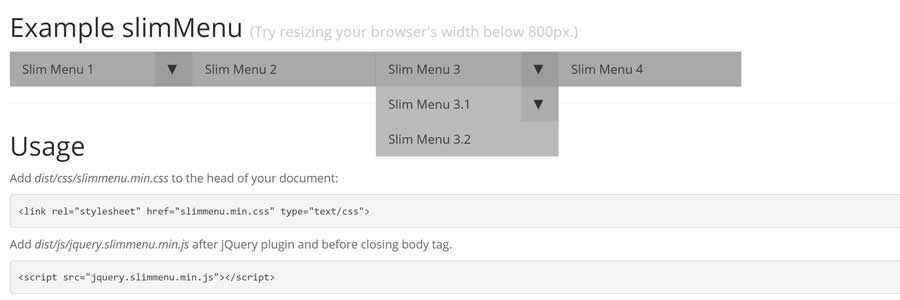
jQuery slimMenu
slimMenu is a lightweight jQuery plugin that makes it easy to create responsive and multi-level navigation menus on the fly.
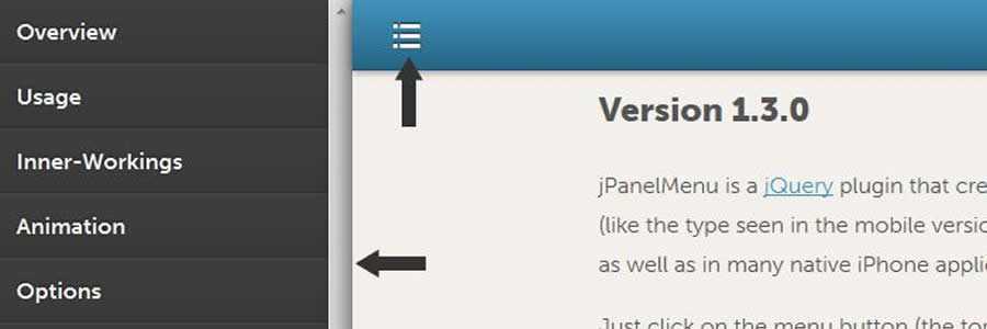
jPanelMenu – Animated Paneled-Style Menu
jPanelMenu is a jQuery plugin for creating a smooth animated paneled-style menu. The animation is handled by CSS transitions.
Naver is a simple plugin that automatically turns a basic navigation system into a mobile-friendly one.
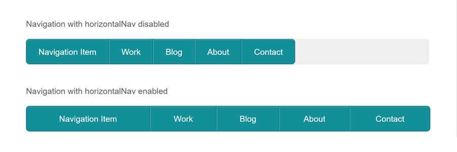
The HorizontalNav plugin will span a horizontal navigation to fit the full width of its container and comes with an option to make it responsive.
jQuery.mmenu is a plugin for creating slick, app-like sliding menus for your mobile website with only one line of JavaScript: $("#nav").mmenu();.

TinyNav.js is a lightweight plugin (452 bytes) that converts <ul> and <ol> menus into a select dropdown. It also automatically selects the current page and adds selected="selected" to that item.
Responsive-Menu
Responsive-Menu is a tiny jQuery plugin that will turn your site’s navigation into a dropdown (<select>) when your browser is at the preset mobile width.
MeanMenu
MeanMenu is a media query-independent plugin for converting a standard menu into a mobile responsive menu. It is not a menu system replacement but simply some lightweight jQuery to convert a standard menu into a mobile version.
Side Toggle Menu
The Side Toggle Menu plugin allows you to add a sidebar menu to your website that slides in from either the left or right edge of the browser window.
Planning and creating a menu that works as intended on mobile devices is the trickiest area of building any responsive layout. To help you out, we have a selection of responsive navigation tutorials that will take you through each step.
- CSS Alternatives to JavaScript Navigation (CSS)
Learn how to create a JavaScript-free hamburger menu, horizontal scroller, or have the menu on a separate page. - Responsive Off-Screen Menus (CSS)
Learn how to create a slide and push menu using CSS transitions. - Full Width Responsive Tiled Menu (CSS)
Create a fully responsive tiled navigation, with a little JavaScript to show/hide the navigation on smaller screen widths. - Basic Responsive “Three Line” Menu (CSS & jQuery)
Learn how to progressively enhance a responsive site and build a “three line” (hamburger menu) responsive menu without adding additional markup to the page. - Responsive Multi-Level Navigation (CSS & jQuery)
Create a horizontal drop-down menu, with up to two levels of sub-menus that appear when the parent element is hovered over. On smaller screens, a menu button will display the menu vertically. - Responsive CSS Navigation Menu (CSS-only)
Learn how to create a responsive menu, without any JavaScript, using clean and semantic HTML5 markup. The menu can be aligned left, center, or right. - Top Drawer – Smooth Responsive Dropdown Menu (CSS & jQuery)
This tutorial will show you how to create a smoother reveal mobile menu using CSS rather than animating it with JavaScript. - Simple Responsive Navigation (CSS & jQuery)
Learn how to build a responsive menu from the ground up using CSS media queries and a little jQuery to display the menu on a smaller mobile screen. - Simple & Responsive Mobile First Navigation (CSS-only)
Learn how to build a simple mobile layout and navigation, then using media queries, progressively enhance the design for larger screens. - Responsive Navigation Menu Tutorial
With this tutorial, you will learn how to code a simple responsive navigation menu that you will be able to easily modify and reuse in your own projects.
A selection of resources that discuss the pros and cons of the many different responsive menu options. Learn how you should handle responsive navigations and discover which solution best suits your current project.
- Responsive Navigation Patterns by Brad Frost
- Scalable Navigation Patterns in Responsive Web Design by Michael Mesker
- A Brief Overview on Responsive Navigation Patterns by Chris Poteet
- 7 Responsive Navigation Patterns by Steven Bradley
Related Topics
Top