Bright visual identities, as well as those featuring clever geometric compositions, are popping up everywhere. While these two trends can stand independently and offer designers a vast scope of opportunities, they can make an even more significant impact when used together.
This combination is not simply a colorful scheme used in tandem with geometry, but a true symbiosis where splashes of color are enclosed within various geometric frames.
These designs can interact with each other or work separately, but together they create unique abstract scenery that adorns the backgrounds of various elements of brand identity, from business cards to packaging.
Let’s look at some exciting projects that exemplify this combined trend.
Floating Award, Campaign & Identity
Prepare to be amazed by this design’s exuberant personality! Despite the coordinated chaos of explosive, vibrant hues, it feels like an artistic outburst that captures the essence of young creativity.
It’s no surprise that the project boasts such a bold and slightly unconventional appearance, as it aims to represent young creatives. Note how the colors overlap the letters, blurring the boundary between foreground and background, resulting in a brilliant and innovative idea.

Identity & Packaging Design
For Folks Patisserie
In contrast to the previous two examples that exude youthful exuberance, this brand identity project exudes a mature and sophisticated vibe.
The golden shapes add a touch of luxury to the design. Pay close attention to how effortlessly and seamlessly the designers have managed to merge such bold colors as lime and turquoise, resulting in a truly fantastic outcome.

Museum Identity
Designed by Kristina Hristova
This project is undoubtedly one of a kind, with a distinctively peculiar artistic quality that perfectly suits the museum theme. It wouldn’t be out of place among the installations of a modern art gallery.
Each element catches the eye with its intricate design, featuring thoughtful layering and color combinations that, at times, evoke a scrapbook style, albeit with modern twists and a restrained use of layers. This project’s distinctive and unconventional approach sets it apart from the crowd.

Taipei Songshan Airport Visual Identity
Designed by Seikyo Jo & I-Mor Liao
This project is simply outstanding, drawing inspiration from the airport terminal design and traditional Chinese window lattice to create a visually striking visual identity.
The design features sharp angles and rectangles that convey a techy and business-like vibe. The color scheme, derived from the airport terminal design, enhances the overall aesthetics.

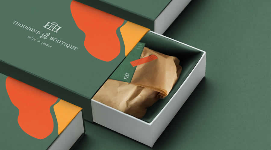
Thousand The Boutique
Designed by Cansu Merdamert
Cansu Merdamert has tackled one of the most challenging yet stunning color combinations out there, guided by the client’s goal of cultivating an atmosphere of luxury living and the spirit of London.
The design’s use of green, yellow, and red exudes luxury without coming across as too flashy. The smooth shapes in the design also add a friendly and inviting touch, striking a balance between aesthetics and the business-oriented aspect of the project.
CiDOWN Brand Identity
Designed by John Dias
John Dias’ project is truly amazing! The use of bright colors, with purple taking center stage, combined with geometric shapes, creates a playful and positive vibe that skillfully captures the brand’s essence.
The shapes may seem childlike, but they add a touch of charm to the design. The duotone photography, featuring beautiful shades of yellow and green, blends perfectly with the overall design and immediately captures the viewer’s attention. The design not only sets the tone for the company but also conveys a message that’s bold and attention-grabbing.

Academy Brand Identity Design
Designed by Baianat
Unlike the previous examples with sleek aesthetics, this designer’s brand identity concept looks sharp – literally and figuratively.
The design features colorful polygons that come together to create striking visuals, and the typography with acute letterforms completes the ensemble. The project is aimed at youth and easily resonates with Generation Z, thanks to its daring appearance.

LFD Indentity
Designed by Atelier Irradié
Similar to the previous example, LFD’s brand identity also features sharp angles and irregular polygons that overlap each other, resulting in an intricate and layered design.
However, this time, the color scheme is less daring than Academy’s. On the contrary, the colors complement each other perfectly, creating a harmonious and balanced design. The beautiful patchwork design, reminiscent of leather, effortlessly portrays the fashion industry that inspired this project.

Sharing Horizons Debrecen 2023
Circles take center stage in this visual identity, with geometric shapes serving as a dynamic and symbolic element in the design.
The bright colors create a striking visual impact. Using horizontally split layouts identifies the horizon and enhances the overall idea. And the beautiful photography add a personal touch that makes the concept relatable to people.

Geometry & Colorful Shapes
Each trend has advantages and disadvantages, but both can effectively draw and maintain the user’s focus on the brand identity, resulting in magnificent designs that border on artwork.
Using bright color schemes in tandem with a geometric shapes doesn’t necessarily produce an overly ornate outcome, instead, the shapes, especially circles, soften the impact generated by the vibrancy of the colors.
While each trend has distinct qualities, they become a powerful force when used together.
Related Topics
Top