CSS Grid has become one of the more talked about developments in web design in recent times. The reason for all of the excitement is simple: CSS Grid looks like it just may change the way we create grid layouts. That’s a pretty big deal.
If you’re looking to learn more about what CSS Grid is and what it does, you’ve come to the right place. We’ll provide a rundown of what you need to know, along with some helpful resources to get you started.
First Thing’s First
One thing we need to note is that, as of this writing, CSS Grid is still a work in progress according to the W3C. That means that the final version of this specification hasn’t been fully released just yet. Overall, browser support is a bit spotty. But that will certainly change as the final spec rolls out.
That being said, it’s never a bad idea to get ahead of the curve when it comes to learning new techniques. Just keep in mind that some things may change between now and the official release. With that fair warning out of the way, let’s dig in and learn more about this important development in web design.

Layout in 2-D
CSS Grid is a system that allows for building 2-D grid layouts. While the term “2-D” doesn’t sound so groundbreaking, it absolutely is in this particular case. You see, CSS Grid will allow you to manage layout according to both columns and rows.
Flexbox, by comparison, is really just meant for columns (1-D, if you will). Using CSS Grid, designers will be able to achieve layouts that were downright difficult before. In fact, some of these things were on our wish lists since the days of table-based layouts.
With tables, it was easy enough to have a column take up multiple rows using the rowspan attribute. CSS didn’t really have a direct equivalent. That led to using multiple nested containers, floats, clearfixes, etc., to achieve the desired effect. This is exactly what CSS Grid aims to fix.
The good thing is that if you are at all familiar with Flexbox, then you’ll be off to a great start with CSS Grid. With both Flexbox and CSS Grid, things are set up via a parent container and subsequent items (children). And, like Flexbox, content order can be set via CSS. This is particularly nice when adjusting the content for mobile devices. What shows up first on a desktop grid may be pushed down lower in the display order on smaller screens.
A Simple CSS Grid Example
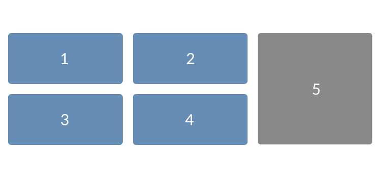
Let’s look at a very basic CSS Grid layout. There are three columns and two rows. The third column is unique in that it spans both rows and will display on the right side of the layout.
It actually takes very little code to make this happen. Take a look:
The CSS:
.container {
display: grid;
grid-template-columns: [col1] 33% [col2] 33% [col3] 33%;
grid-gap: 10px;
grid-template-rows: [row1] 47% [row2] 47%;
text-align: center;
color: #FFF;
}

.grid-cell-1 {
background-color: #658db5;
padding: 25px;
border-radius: 6px;
}

.grid-cell-2 {
background-color: #658db5;
padding: 25px;
border-radius: 6px;
}

.grid-cell-3 {
background-color: #658db5;
padding: 25px;
border-radius: 6px;
}

.grid-cell-4 {
background-color: #658db5;
padding: 25px;
border-radius: 6px;
}

.grid-cell-5 {
background-color: #898989;
grid-column: 3 ;
grid-row: 1 / 3;
padding: 25px;
border-radius: 6px;
}
A few notes on the CSS:
- In
.container, notice that we have the ability to define the width of columns and height of rows. We can also individually name columns and rows with the use of brackets:[name] .grid-cell-5has a couple of interesting attributes.grid-column: 3;tells the browser to start this item as the third column. Meanwhile,grid-row: 1/3;says that the cell will span from the first row until the start of the (non-existent) third row.
The HTML:
Doing this type of layout without CSS Grid would be significantly more challenging. There are, of course, several more complicated layouts that can be achieved. But hopefully, this will illustrate the ease with which something basic can be set up.
The Demo:
See the Pen Simple CSS Grid by Eric Karkovack
CSS Grid Resources
There are a number of outstanding guides and tutorials out there to help you make the most out of CSS Grid. Here are just a few to get you started:
- 10 Creative Examples of CSS Grid in Action
- A Complete Guide to Grid By Chris House
- CSS Grid Layout By Mozilla Developer Network
- Grid by Example By Rachel Andrew
- A Complete Guide to CSS Grid By Codrops CSS Reference
- An Introduction to the CSS Grid Layout Module By Ahmad Ajmi
Related Topics
Top