One thing we do at the start of every year is look back at some of the popular trends from last year and try to predict what will be the exciting new thing of the next.
Following along from those lines, I recently took a look at some cool interesting web design elements and thought it would be a good idea to expand on that and to take look at a few more. So without further ado here are some epic new web design ideas that you guys might appreciate and maybe find some inspiration from.
1. Your words become your actions
Smartphones have made most of us comfortable with the idea of talking to our phone, but what if we could take things further and use our voices to navigate through a website on our desktop? It’s quite possible.
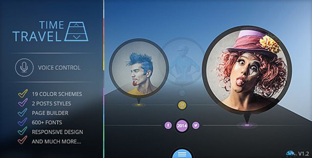
If you check out this WordPress theme called Time Travel, it allows users to use voice commands like homepage – go to homepage, next – go to the next post, previous – go to the previous post, tweet, share, search for, show comments, and much more. You can even build your own custom commands for your visitors.
Although its voice command support is currently limited to just Chrome.
2. Go on, read the next one too
The “Read This List” sidebar on The Daily Beast is fantastic. Scroll down a couple pages and have a look at what it does. The list gives you a visual cue as to how far you have ventured in to an article and encourages you to follow up on the next one.
I think it will be qute useful when articles/posts are related or when you have a multi-part story.
3. Want to know more about me?
If you check out startupsthisishowdesignworks.com you will see that you can effectively move secondary content, which is not integral to the story you are reading, to be hidden from sight. This way you have the option to read more in to it if you choose. Click on the highlighted words to see it in action.
4. Go on, take a swipe at me
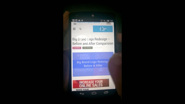
With more and more users actively engaging with your site on a mobile device, it’s nice to look at some interesting ways in which you can offer content to these visitors. Many smartphone apps offer the users the ability to swipe to the right to bring up the navigation menu.
There are many jQuery plugins like Bamboo and mmenu that can help you add this to your website. And if you want a WordPress plugin for it, then how about trying something like mobile.nav.
5. I just want to talk about this
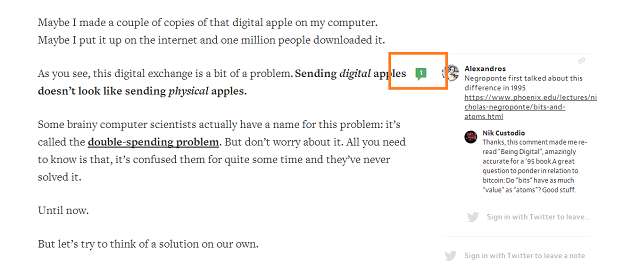
One of the things I like about Medium.com is their contextual notes/inline comments as a way for visitors to engage with the author. When you bring up any article on the site you can highlight any portion of the article and leave a note/comment.
If you have a passionate community that leaves meaningful comments then this is a great way to engage with them. Visitors can selectively pick out portions of comments they want to read and engage with. Sadly I don’t think there is an existing solution that I am aware of that could get this feature on your site. Do you know of any?
6. Two hands are better than one, or is it?
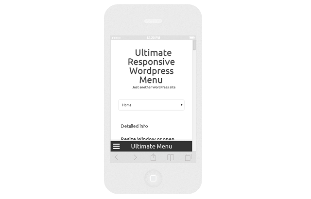
Navigation has traditionally always been something that has resided at the top of a web site. But we are staring to see a shift in that design, especially with the rise of mobile. It is a bit of an inconvenience to scroll back up to reach the top of the site to use the navigation menu.
Especially since a high percentage of smartphones users tend to use one hand to interact with their device – this study shows that 49% of users tend to do just that. So wouldn’t it be wonderful to show a mobile menu in the footer for easier navigation? If you have a WordPress site then you can use a handy WordPress called Ultimate Flyout Responsive Menu to get a footer navigation menu. (FYI the plugin supports a lot of different navigation options, even the slide to open the menu we saw earlier).
7. I want to know more about you
I really love the fitbit.com website. Its another case of putting secondary information to the background until the visitor wants to take a look at it. If you scroll down to the part where they talk about syncing the device, you will see the option to do it either via bluetooth or Wi-Fi.
8. Unparalleled storytelling skills
We have all seen far too many sites with parallax scrolling, but when used effectively this technique can be used to convey a powerful brand story, a recent one being the be moved campaign from Sony and the new Mac Pro.
9. Let there be light or not
Last year an acquaintance of mine Damir Kotorić said that we will be using luminosity levels in RWD. And guess what? We are already beginning to see some cool things people are trying to do with luminosity media queries.
Check out what Tomomi Imura is trying to do with luminosity media queries and how it could help with screen readability.
10. This was created just for you
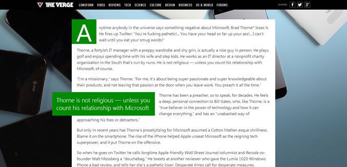
What is so new about that, I might hear you ask? Responsive design is based on this premise. If you are an iOS fanboy then you would have loved it when the you seen this article on The Verge, but if you were on Android it would have looked like this, and similarly for Microsoft devices, the page has a ‘metroy’ feel. The exact same story, but looks a lot different depending on the device. We could be seeing a lot more of this in the future.
Concluding
So there you have it folks, 10 things that I think are pretty cool in web design at the moment. Of course as with any new design change it’s important to educate your visitors on the new features, or to provide visual cues that they can easily pick up on.
Of course there are many more exciting things out there, some of which I might have missed so don’t be shy and sound off in the comments as to what are some of the exciting web design elements you have come across recently.
Related Topics
Top