Sometimes all you need is a name. It is a powerful thing. It always has a meaning and, even more, it has a subtext and undertone. A name can speak for itself. It can elicit trust in potential clients and quickly establish the proper atmosphere.
As a rule, this name is the one associated with a company, and it lies at the heart of the brand and serves as a source of inspiration when it comes to creating a visual identity.
So it is not surprising that instead of using modern features, detailed illustrations, or creative typography, designers prefer to build their branding around their name, using it as a primary detail of the composition. Yes, it can be tricky since you need to turn this minimal approach to your advantage. It requires imagination and skill. But when done right, it can lead to a fantastic outcome.
To demonstrate this, we have compiled a collection of business cards centered around a name. There are a number of excellent examples that give you hints as to how to create a name-based card that looks stylish and memorable.
Nymbl
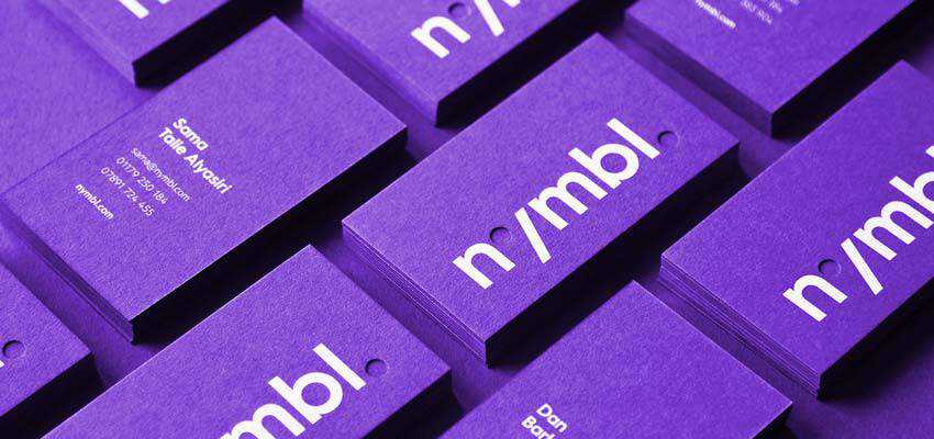
Nymbl opens our collection with its modest, yet marvelous design. Here, every detail counts. The creative team wants to convey a forward-thinking, experimental nature, along with a playful mood, tech appeal, and of course, personality.
It may seem impossible at first, but they have certainly nailed it. Every detail contributes to this mission – including the gorgeous purple color, luxurious paper material, and bold, intricate letterforms.
BY Studio
BY Studio is a classic example of a minimal business card that has just one word on the front side. It wins over potential clients with its stately and authoritative look. The latter is obtained by three main factors: classy black-and-white coloring, a fantastic letterpress effect and high-quality paper.

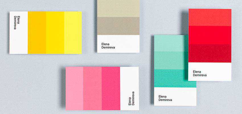
Elena Demireva
Elena is an interior designer who knows how to use color combinations to create the perfect mood. The front side of the piece features a small color card and the name, which is all it takes to convey Elena’s creative personality, showcase her expertise, and pique the interest of onlookers.
Soul Scapes
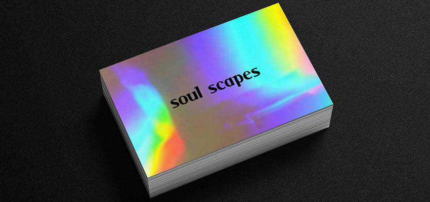
The color black and a holographic surface always form a potent combination. The business card of Soul Scapes looks incredibly sophisticated. While the flashy front side catches the eye with its mesmerizing appearance and stylish “makeup,” the clean black back side radiates a businesslike appeal.
Voyager
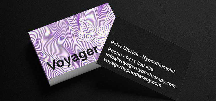
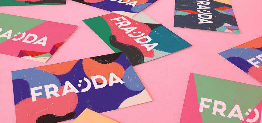
If the holographic canvas is not an option, then you can always try some offbeat abstract designs used as a background. A – Bradley, who stands behind Voyager, along with Magdalena Marchocka, the designer of Frajda, show us how to achieve this.
Each one features only a nameplate on the front side. However, this is enough since the canvases are the main visual driving force. They make the business cards look not just artistic, but also creative and individual. While the first example feels more techy and cold, the second one feels warm and authentic.
Hey
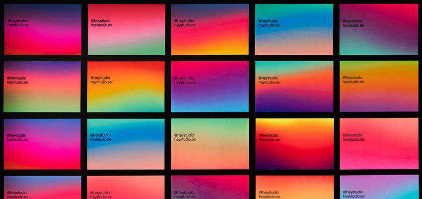
Another way to make the most out of a canvas is to adopt an old-school gradient. Consider Hey’s business card. It is marked by a truly garish gradient that won’t leave anyone indifferent. It just draws the attention right away. The author even offers several options that nicely cooperate and complement each other – fitting the theme perfectly. Although the black typography requires a bit more contrast, nevertheless it is still readable and pretty perceptible.
Craft.chic Travel Agency
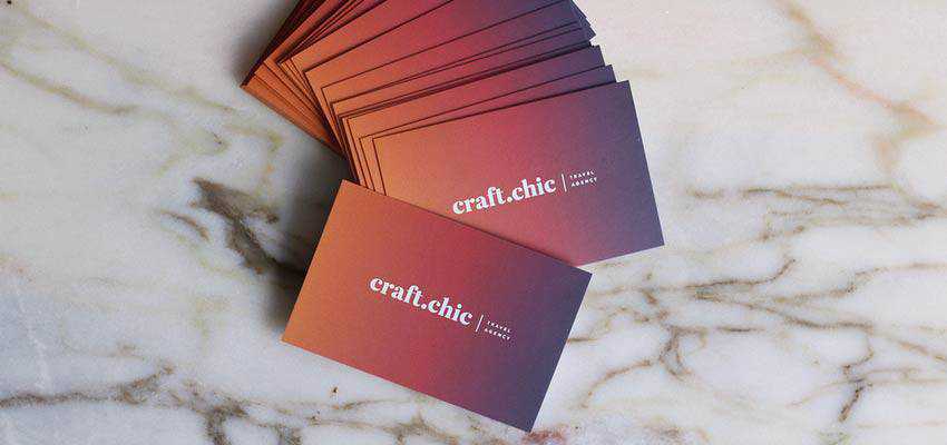
Craft.chic Travel Agency also relies on a gradient to make an impression. However, this time the gradient is less varied and more organized. It is deep, hot and sophisticated. This card looks exceptional. The name of the company is all you need here; everything else is done by the beautiful background.
Now, let’s shift our attention from the background to typography, since the latter is a popular tool for enriching minimal designs. It saves the day when it comes to business cards. Consider these prime examples.
Tidepool
Tidepool has customized typography where each symbol is hand-crafted. The idea of connecting the dots lies at the core of the concept. Each character has small solid circles. They form a hidden message. Also, note beautiful blue coloring and subtle canvas that perfectly complete the design.

Stefan Mader
This artist uses just a standard sans serif typeface. However, here it looks great. The front side of the business card reads only “hallo.” and is set in a relatively big size so that it strikes an eye right away. The black-and-white coloring, paired with a generous amount of white space, not only favorably highlights the greeting but also makes the design feel fresh, crisp, businesslike and of course appealing.

Carlos Bauer
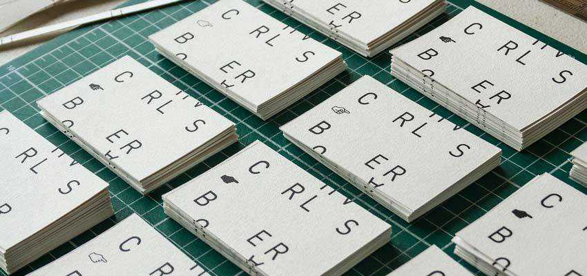
Much like in the previous example, Carlos Bauer leverages a regular typeface – nothing fancy at all. However, there is a small twist that gives the business card a touch of personality. The artist has broken the word into symbols, made the letter-spacing as big as possible and excluded vowels – leaving them to your imagination. As a result, the name forms the aesthetic here, adding its unique zest.
Getting Down to Business
Name-centric business cards can be lifesavers for those who prefer to get straight to business with their brand identity. Covering only the essentials, they are able to reach the audience and convey the required message without much hassle.
And thanks to some smart features and creative ideas that are used to save them from looking primitive and ordinary, they awaken curiosity and leave a long-lasting impression.
Top