What makes for a good business flyer? It is a symbiosis of the informational and inspirational. It strikes a balance between the pragmatic and motivational. It should unobtrusively lure in instead of scaring away with its too-serious looks and manners. It should be like a well-written creatively dished up “blurb” that summarizes the plot of the story behind your company. At the same time, it should provide readers with intriguing details that ignite interest.
Whatever you want your flyer to be, it is vital to stick to the basics. It is a traditional handout advertisement that, as a rule, holds all of the company’s vital information on a small sheet of paper. Anywhere from A4 to postcard size gives you enough space to show off and, at the same time, avoid overwhelming onlookers. This limitation forces designers to pay particular attention to their choice of information to include as well as design features to use.
Be Informative
As the times change, our priorities change as well. There was a time when your office address was of top priority, then a link to a website was enough. Let’s face it – the digital contacts are the front-runners nowadays. Even a phone number is not as important for potential clients as the ID of your Skype, Viber or Telegram accounts.
Links to a website, social media profiles and other platforms are must-haves. Also, do not forget about the QR code. It is much easier to use a scanner app and quickly open the necessary page or a chat with instant feedback instead of retyping a link manually.
What else should you include on your business flyer? Without a doubt, there should be some oldie-but-goodie information, such as:
- Logotype;
- Company name;
- Slogan or tagline;
- “About us” block;
- Services;
- Bonuses, and other promotional offers.

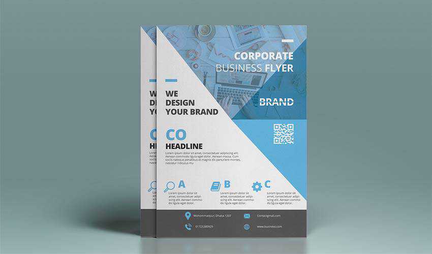
Corporate Business Flyer by mahmud reza
Must-Have Design Elements
Wondering how to turn your flyer into an effective marketing force? Here are the design-related features you’ll want to include:
Blue Tones
When it comes to a businesslike atmosphere, we always opt in favor of neutral coloring. Light shades like white, grey and beige are primary colors that are used for backgrounds.
As for the secondary color, in the majority of cases it is blue. The reason is simple: Designers rely on the psychological aspect: Blue inspires safety, serenity and creativity. It also instills a sense of trust and responsibility.
All of these feelings and moods are ideal for promoting your business. Add to this the fact that blue is considered to be one of the most favored colors, and you will get a reasonable, practical and time-proven option. Although, using blue will make it quite difficult to stand out from the crowd since everyone else is using it, too. However, the design will meet the expectations of those viewing it, and that means a lot.
Blue is good, blue is time-proven and with blue your flyer will certainly look businesslike. However, if you are a true fashionista, then you should follow examples of industry giants such as Apple and Samsung, whose teams use lots of bright colors in their promos. Stick to their doctrine and go for drastic color combinations and gradients to dazzle the audience with unique coloring.
Geometry
The current obsession with geometric details and stylistic choices that overpopulate the web design sphere has taken its toll on graphic design as well. With its sharpness, authenticity, openness, plainness, elegance and, in some way, brutality, the trend works great for business designs.
The trend manifests itself through various elements, such as:
- Asymmetry in layouts;
- Circles;
- Triangles;
- Narrow diagonal panels;
- Polygons of various shapes, etc.

A Website-Like Layout
A Company flyer is kind of like a paper analog of a landing page. It bears the same key information such as provided services, contacts, advantages of choosing the company and more. As a rule, it is broken into three main sections.
The first one is a header with a prominent hero area, the second is content and the third is a footer. Sound familiar? Yes, the arrangement is the same as on a website. So why not to use some tricks from the latter?
Furthermore, the website layout is a time-tested method of displaying blocks. Modern flyer design has many similarities. For example:
A relatively big image located at the top. It could be a photo of a metropolis that feels urban and strong or a photo of an office routine that oozes confidence and professionalism. It can be corporate or motivational photography.
A bold statement. It can be a catchy slogan, a tagline or a short promo phrase.
A multi-column layout. The layout holds only the essential information such as a list of services, an “about us” block, etc.
Sometimes flyer designs adopt the same tricks, like an overlapping trend that is quite popular among web designers these days. Just take a look at Corporate Business Flyer by Humaiara Akter Shorna. It looks refreshing.

Icons
Like the previous trend, icons are an integral part of every website and have become an essential of business flyers as well. It’s something that you cannot just ignore or toss out from the design. It may seem that they are just accompanying details that bring nothing special to the project.
However, people need these visual cues. In the beginning, everyone scans rather than reads. Icons serve as focal points that lead a visitor’s eyes to the important information. When well chosen, they can even enhance the message by making it clearer and stronger.
Big, small, oversimplified or sophisticated – you can stumble upon various stylistic choices. An icon should support the statement. And if you need it to be bright, detailed and graphical, then that is the way it should be.

Spread Your Message with Just a Single Page
The pamphlet of present-days is not just a primitive, single-page leaflet that contains boring facts. It is a well-written synopsis that is presented in a beautiful package.
Designers use various tricks, including psychological ones, to make data presentation pleasing to the eye. They follow the trends and result in flyers that get straight to the point.
Now that you know the elements of a great business flyer, what will you create?
Related Topics
Top