Web designers and developers have been practicing the art of landing page layouts for over a decade. The refined techniques we use in modern websites have been crafted from years of failure and strife. But there is still a lot we can learn from by studying common user experience when visiting a product landing page.
In this article I hope to introduce a series of ideas for constructing great landing page layouts. It may take a bit of practice utilizing a series of alternate design patterns. I think the best landing pages capture the visitor’s attention and quickly express their goals. And of course the circumstances will be different for each product. Consider a few of these ideas along with your own design senses to put together landing pages that convert & sell.
You might also like: Free Landing Page Web Templates for Photoshop.
Big Catchy Headlines
Titles and headlines are usually the biggest text pieces on your webpage. Visitors will quickly notice this text since it applies as a general overview to your products. Make sure your web copy is captivating and worth investigating further. You want to make visitors curious as to what you are offering them and how it could benefit their needs.
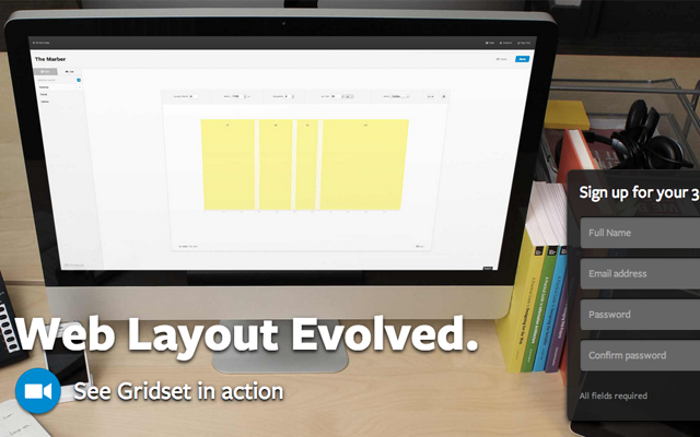
The landing page for Gridset uses big typography coupled with a full-scale background image. The product is used for creating fixed prototypes and wireframes for website projects. You can find a slew of features and examples by scrolling a bit down the page. However the captivation which leads you towards more information is their initial design which appears above the fold.
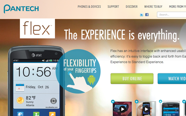
Another great example can be found on the page advertising Flex by Pantech. This is a mobile phone which should be considered a physical product, but the rules are still the same in any case. Notice how the top headlines are focused more on the product than anything else. The large buttons offer further presentation tools for understanding the Flex phone and its features.
Expanding on Details
All too often I will run into landing pages which barely explain anything about the product. This is especially the case with mobile apps where the visitor is expected to watch a video and learn about how it works. I would think developers shouldn’t expect visitors to sit around and watch/listen just to understand what the product does. So by adding more details right into the webpage you can offer better insight while driving away fewer visitors.
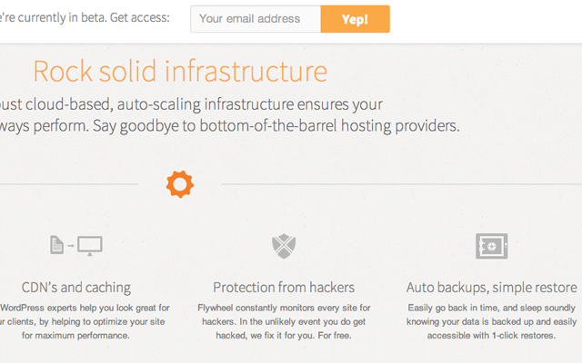
Although I do not personally use Flywheel I have heard nothing but good things about their services. After taking a peek at their homepage layout I would think these anonymous reviews are certainly on to something. Flywheel is a company which handles WordPress hosting for webmasters or design clients who don’t want to deal with all the backend stuff. Their services can definitely be confusing since you don’t know what they are expected to handle vs what you need to handle.
After scrolling a bit down the page you’ll find a nice list of features which they provide. Flywheel goes into much greater detail by outlining how the network is setup. Since the company is still in beta testing at this stage, there are not any other internal pages with greater content. This is a letdown for some readers because it would provide much better context for how to use Flywheel’s services. But even just focusing on the layout structure you can understand how the minor details greatly affect their overall product design.
Screenshots and Display Cases
When you are selling an application or digital product it is good practice to offer screenshots and previews. Visitors may enjoy checking out how your product would run in a natural environment – either an iPhone, desktop computer, or Mac/Windows/Linux OS. Or even when launching a small web application, it helps to explain some common misconceptions with your interface.
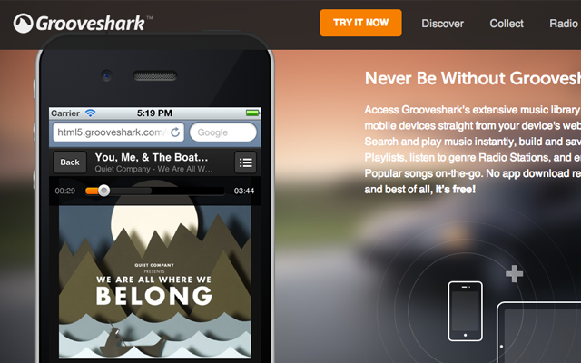
The Grooveshark music webapp has been online for years and many people already know what they can offer. But for their new Grooveshark landing page you can find a number of features which have yet to be implemented. Users of the old Grooveshark system will not access the updates until they manually select from their account. I feel the landing page offers a tremendous effort to bridge old users into a newer system.
They have provided screenshots from the various album views and music playlists. You can setup options for a radio feature which automatically pulls recommended songs based on related genres and artists. Similarly Grooveshark even updated with mobile screenshots for iPhone users. Just by glossing over this landing page you can tell that quite a bit of effort has been put into the design aesthetics.
Converting Page Sections
It is fair to say that almost every landing page is looking for some type of conversion. Whether that is new registrations, e-mail signups, or customers purchasing their product, the goals are similar. But you should really analyze the sections of each landing page which are looking for conversions. How are they designed? And what would a conversion look like?
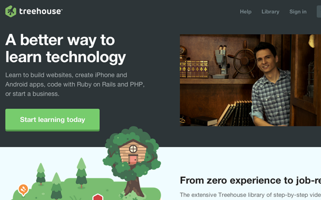
The website for Treehouse is phenomenal and it includes a wonderful branding as well. The big green buttons with “Start learning today” behave as eye-catching objects among other elements. Users will click because they are interested in the library of contents Treehouse has to offer.
These page sections are also wrapped with very few distractions. Maybe an illustration or screenshot, or towards the top a small video stream. The purpose is to keep your visitors funneled towards a specific goal and provide the best possible design to push them forward.
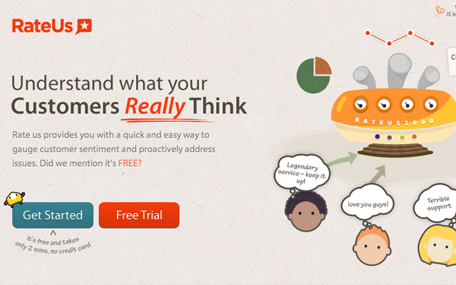
Another example privy of page conversions is Rate Us. This digital webapp allows users and customers to rate, review, and comment on their experience with your product(s). This would be targeted towards small businesses or even larger companies which are looking for a service to handle customer feedback. The larger buttons at the top and bottom are geared towards acquiring interested users who have never heard of their services before. The design is fitted using illustrations to mesh with the branding and offer a consolidated presentation in the layout.
Selective Content
Each landing page will probably have a chunk of content you want to push as a larger target for most visitors. This means using highlights or bigger fonts to encapsulate a piece of the webpage for drawing in more attention. This selective content should be more important and relative towards the success of your product or services.
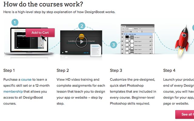
For the website layout of DesignBoost this has to do with understanding how their services work. At the very top you’ll find a small signup form which is used for converting new interested users. Similarly as you scroll down the page you will find a step-by-step diagram outlining how you can start learning iOS and launch your own application in the store. Bright buttons and graphics stand out because they are not used everywhere on the page – mostly places where visitors should pause and read into some of the content.
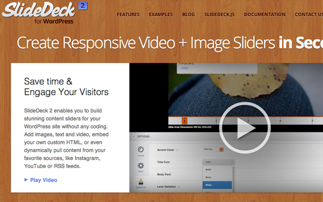
The content slider/gallery plugin SlideDeck is a premium product with its own landing page. Lots of important content for how the plugin behaves, along with how it looks in your WordPress theme. The designers have organized important content by adding icons and related screenshots. This makes the perfect foundation for curious WP users who may be interested in using a single plugin for managing content sliders.
Final Thoughts
Landing pages are a tricky concept and there are marketing experts still analyzing the best practices. I find that there is no method which beats out all the rest. Instead you have to consider design techniques which follow well in your own market, such as selling themes or PSD graphics or even mobile applications. All of these ideas will force a bit of change towards your landing page designs. But keep practicing and always be willing to analyze the greater details of your own work.
Related Topics
Top
