If you want to stand out from the competition and make yourself heard, you need to go the extra mile. That’s the first rule of the online jungle of these days. However, it does not mean that you need to reinvent the wheel or have a bunch of money to afford a grandiose solution in order to impress.
The thing is, despite all the hustle and bustle around big ideas, small details still matter. They always make a difference. You can have a regular website with the basic structure and conventional design and still stand out from the crowd. All you need to do is to enrich the user experience with some little, well-thought-out features. And it seems that many creatives have an eye on this workaround since modern websites are teeming with microscopic solutions. Therefore we can witness many tiny trends.
One of such small, but smart and impressive trend is a liquid-like effect. Its superpower lies in the fact that it just quietly works – enhancing the overall user experience and reinforcing the general impression. It is smooth, elegant and sophisticated.
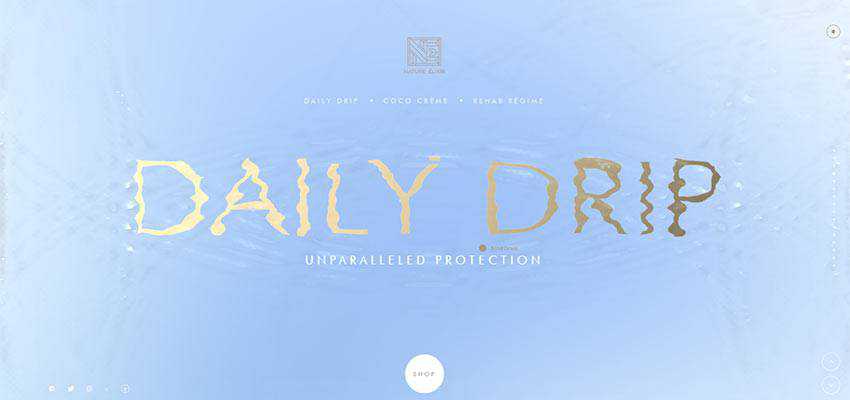
Davide Perozzi / Nature Elixir / Nesatex
Consider the personal portfolio of Davide Perozzi, Nature Elixir and Nesatex. These three examples show the tendency from different angles.
Davide Perozzi uses a watery behavior to put the tagline of his website into the spotlight without making it loud. The solution is barely perceptible here. Nevertheless, it is enough to grab attention. It gives a clean and neat interface a lovely zest. Also, it helps to reflect the creative soul of the artist, as well as show everyone that Davide is one who follows the trends and knows how to apply them without overpowering the audience.

The team behind Nature Elixir leverages water surface within one of the sections of the homepage slider. You are welcome to play with it using your mouse cursor. You can leave ripples and traces – disturbing the serenity of the surface. Here the solution is used to support the product’s essence as well as lighten the mood.
In the case of Nesatex, the liquid-like behavior is a mere extravaganza that gives the hero area a nice touch of individuality and peculiarity. It is also featured in the slider, but this time it spices up slides with some extra dynamics as well as enriches the transitions between them.

eumRay Academy
The liquid-like effect can be seen everywhere. It is quite popular among website artists nowadays. Its sphere of usage is not limited to just backgrounds in hero areas, even though it is here where it flourishes. You may have already seen that it is an ideal candidate for taking sliders to the next level. Consider eumRay Academy, where the solution benefits the overall user experience with fanciful transition effects.
It has a conventional design in terms of layout and coloring. However, the liquid-like effect keeps it from looking banal. It makes the interface feel intriguing and fancy. And, at the same time, this technique manages to save its business-like nature. The solution is used in the slider and as a main revealing effect for showing sections on the scroll.

Fleava / Kombu Drinks
The teams behind Fleava and Kombu Drinks easily enrich the classy aesthetics with a note of bizarreness. In both cases, the latter serves as a lovely transition effect between the slides that make this basic carousel look original and inviting.


Ruya Digital
When it comes to transition effect, the trend can be beneficial for all the slide-out navigation menus that are hidden behind hamburger buttons. Let’s take a look at Ruya Digital as a vivid example. Every opening and closing of the main menu is accompanied by a special layer that flows down from the top.
It has a beautiful retro gradient background, with very smooth and subtle behavior. It vividly separates the front side from the back – yet still skilfully ties everything together.
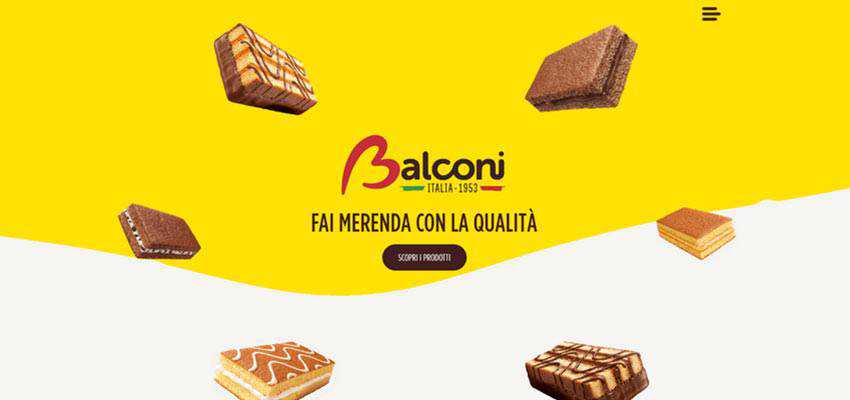
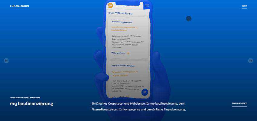
Balconi / Lukas Jardin
The liquid-like effect can be brought into play as an alluring twist. Consider Balconi and the personal portfolio of Lukas Jardin.
The creative team of the Balconi official website uses the solution to add some spice to the fairly trivial design of the homepage. As you can see, the background has been split into two horizontal sections. The top part is set in motion. And its movements are so gentle and subtle that they add to the aesthetic – rather than make everything about themselves. The solution provides users with some unobtrusive focus anchors as well as keeps the theme alive (literally).
Lukas Jardin matches the tone of his creative personal portfolio with liquid-like behavior. Here it is applied to images placed in the hero area slider. The idea leaves a good first impression. It does not overwhelm nor annoy – it just makes things exciting.
The effect nicely cooperates with the rest of the website, adding a little more personality to the project. It is an excellent example of how to make a regular image-based carousel feel special and unique.
Azure The Oceanic / Cobra Ultra Swipe
Of course, one of the areas where the liquid-like effect feels at home are designs with a water-inspired theme. Let’s explore Azure The Oceanic and Cobra Ultra Swipe.
The name of the first website speaks for itself. From the get-go, it becomes evident that the water theme runs the show here. And, without a skilfully reproduced liquid-like behavior, it will undoubtedly lose something. Much like in the case of Nature Elixir, here you are invited to participate in a small playground with a dynamic surface where you can leave ripples. Fun and engaging.

As for Cobra Ultra Swipe, even though the nameplate does not make the story behind the project clear at first, the hero area says it all. The website is dedicated to underwater goggles, so it comes as no surprise that the team has chosen water motifs. The liquid-like effect that can be seen in the hero area as well as throughout the entire website fits like a glove.

A Tidal Force
The magnetic power of this tiny trend lies in its origin. In essence, it is a skillfully imitated water behavior. And we all know, there are three things people can watch forever – and water is one of them.
The liquid-like effect is just destined to win over visitors’ hearts. And it certainly does that. Used in small doses it effortlessly contributes to the projects – making the user experience unforgettable.
Related Topics
Top