An x-ray is a form of electromagnetic radiation that has wavelengths shorter than visible light. It easily passes through solid objects and lets you see inside. It has found many applications in physics. However, the most notable and, without a doubt, the most useful one is that used in medicine.
For more than a century, x-rays have been used to detect and diagnose infections, bone fractures, etc. Noel Delgado’s mind-blowing SVG experiment conducted on CodePen called “X-ray me” illustrates the principle. A huge circle allows you to see the character’s skeleton, much like any scan in a medical center does.
The idea is brilliant, and the realization is flawless. And if you think that this experiment is just a lone concept to play around with, we are going to prove you wrong. Recently, the x-ray effect has appeared in the web design sphere. And it was not just a one-time thing that made a dramatic entrance. The solution is gaining momentum and already considered as a small, emerging trend.
The X-Ray Effect in Real-life Websites
Much like the code snippet of Noel Delgado, this solution is also based on the concept of “see through.” In a nutshell, there is a circle that serves the role of an X-ray scanner. It lets you peek under the essential elements of the interface such as logotypes, typography, and even backgrounds. This circle, as you may have already guessed, is a mouse cursor that has changed its habitual arrow shape into a ring and borrowed some superpowers, to be more precise an x-ray vision, from Superman.
Alex Thery
The effect manifests itself in several ways. The first method implies revealing a skeleton-like base, like in the case of Alex Thery and his fantastic personal portfolio.
Here, you can stumble upon a big round mouse cursor that has a transparent body and vivid white borders. It affects only the typography. Once you hover over the name of the project, one that sits at the heart of the screen, the circle shows the inner part of it – transforming the solid typeface into a hollow one. The roller titles, on the contrary, change their ghost-like style into solid one. Just brilliant.

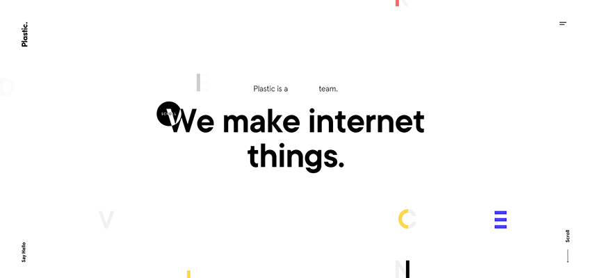
Plastic
Another way to implement this trend is to reverse the color of various elements. In the majority of cases, we can see shifting from black to white and vice versa. Consider Plastic.
Unlike the previous example, where the scan effects only the slider, here the x-ray effect is applied to various elements of the interface. Note, the mouse cursor is smaller than one on Alex Thery’s website, yet it works perfectly well and does not overwhelm visitors by its massive size.
When it hovers over the title, logotype, navigation links and even these small colourful rectangles that are scattered throughout the screen, it changes their color – skilfully imitating an x-ray scan behavior. It is a perfect example of how to make your minimal, incredibly airy website look amazing.
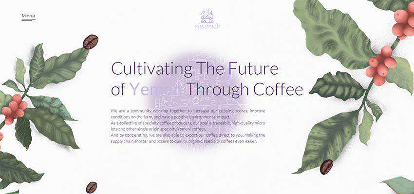
Sabcomeed
While the two previous realizations are widely spread among developers, there is another way to imitate an x-ray effect. As a rule, it requires a skillful play with masking. It lets the audience see through the fore layers, revealing the background. Consider Sabcomeed.
Here, the effect does not touch the title, text or navigation. Instead, it allows you to pass through the background and peek inside to see what is happening behind the curtains. As it turns out, there is another layer with beautiful scenery made in a delicate line style.
It goes perfectly well with the natural motifs presented on the foreground of the website. It also interacts with some words in the titles. Note the words that are set in a pale purple – they become dark purple when the mouse cursor hovers over them. Another great touch is that this effect extends throughout the entire home page, thereby creating a consistent user experience.
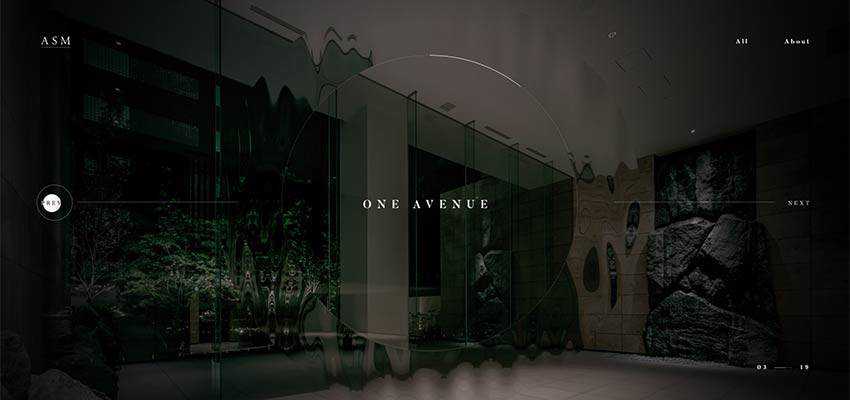
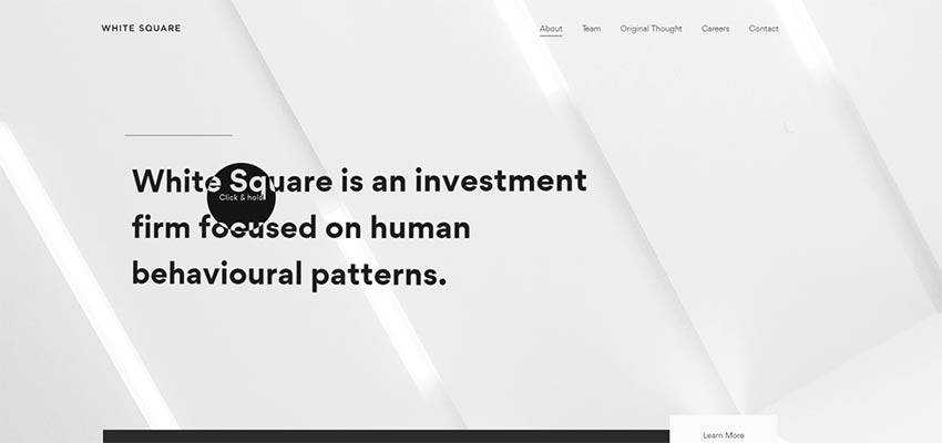
Archi Site Mobius / White Square
There are many examples where the x-ray effect is barely perceptible, yet it is still there and makes a difference. Consider Archi Site Mobius and White Square.
Both websites have relatively minimal hero areas. While in the case of Archi Site Mobius, you will stumble upon a full-screen slider and logotype, with White Square you will find only the abstract image backdrop and slogan. That’s all.
However, they are not as simple as you may think. And the x-ray effect proves that. It not only enriches the user experience, but also gives both projects a little zest that distinguishes them from the crowd.
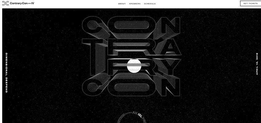
Contrary Con
The team behind the website of Contrary Con relies on a golden mean when it comes to choosing the size of the mouse cursor. Their x-ray scanner is neither big nor small. It is just what the doctor ordered. It does not distract attention from vital elements and, at the same time, allows users to enjoy this marvellous solution in action.
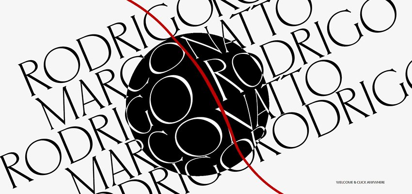
Rodrigo Marconatto
All of the previously mentioned examples pale in comparison with Rodrigo Marconatto’s website – at least in terms of size. The welcome section greets you with a gargantuan x-ray scanner. If you take a careful look, you will notice that it has a magnifying glass quality as well. And that’s not all. Just try to move the mouse cursor all over the place, and you will be pleased with its smooth behavior. It feels like you are sailing through the project.
This unique mixture of effects and behavior, spiced up with a colossal size, makes the solution a star of the party and an absolute winner.
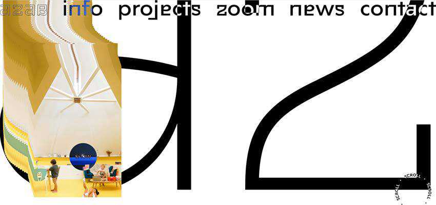
Azab
Here you will find not only the x-ray effect, but also an infrared effect that is applied to the images. Together, they transform a regular user experience into a small adventure. And even though the website does not feature anything ultra-modern in terms of dynamic solutions, it still looks swanky.
Conclusion
This might sound funny, and a bit bold, but x-rays have finally found their application in the online expanses. Of course, it is not an exact replica (we do not see the actual skeleton of the typography, logotype or background). Nevertheless, it looks and acts like we expect it to.
Whether you go for a small scanner like White Square or a big one like Rodrigo Marconatto. Whether you apply it only to one element of the interface or make it affect everything in its way. Regardless, the effect will add its particular charm to the project, leaving a strong impression.
Related Topics
Top