A memorable photograph on a website can single-handedly shape a brand’s entire identity,
As sight-based creatures, we process visual data much better than any other input method (a lot better, as David McCandless explains in this TED talk). This should explain the emphasis on photos in web design, and not on blocks of text.
Today I’ll discuss seven of the best strategies for taking advantage of photos in web interfaces.
Hero Images
Full or large-screen images immediately capture the user’s attention. One of the latest homepage image techniques is the hero header – full-screen images overlaid by text and navigation options.
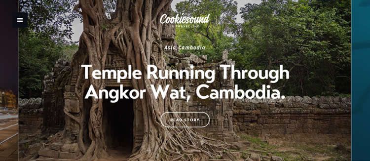
A stellar photograph is a great way to start the experience and set the right tone. Cookiesound, above, uses oversized images and simple sans-serif typography for a more custom look and feel. Since the site is a travel blog, the HD photos paired with catchy headlines immediately draws you into the narrative.
When using hero images, follow these general guidelines:
- Typography – Your picture will be the central focus, so your text should be brief but punchy. It has to compete against a much more stimulating visual, so a strong typeface and treatment always helps. Experiment with tasteful typefaces and different treatments (bold is always a safe default).
- Position of Text – Keep the photograph’s natural flow in mind when positioning the text over it. The center may seem like the logical choice, but this could ruin the impact of some photographs.
- Ghost Buttons – See-through buttons impede the image far less than other options, so they’re best for letting the image shine.
- Responsive Design – Make sure your photo looks the same or similar regardless of screen-size. That’s a big concern with hero images.
As in Web Design Trends 2016, a hero photo can make the strongest first impression on the user. Carefully select the HD photo, then decide your typographic treatment based on the aesthetic and composition.
2. Objects in Reality
Especially popular with retail sites, showing items in their actual environments have been proven to boost conversion rates. These allow to users to more easily imagine how the product or service could fit into their own life. (One thing you might want to avoid – the overused “desk and computer” image made popular by online marketplaces.)
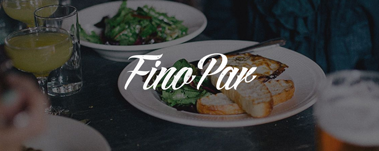
As you can see from the example of Fino Par above, the “reality” photos are a common strategy for the food industry (because the photos make people hungry). The setting of the restaurant shows the table, atmosphere, drinks, and people – though not faces, as they would be distracting. This makes the meal look far more appetizing than simply a picture of the food because the users can place themselves in the scene.
Photos which depict realistic objects also add texture without running the risk of skeumorphic tackiness. As described in Flat Design Trends Present & Future, this technique is perfect for adding more warmth to a flat-inspired interface. As an alternative to adding texture to a background, try using an HD photo that provides a textured look and feel.
3. Black and White
Not every image must be in full color to create a memorable impact. As talked about in Web Design for the Human Eye, black and white images offer an inherent sense of sophistication and professionalism.
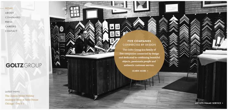
Goltz Group mixes black and white photography featuring their products – photo frames – with colored text overlays. The contrast helps draw the user even more into the photo slider on the homepage, while drawing out the select text (including the call-to-action).
For more stunning examples, check out this gallery of black and white photographs.
4. Color Overlays
Just like black and white images, color overlays are effective because they differentiate the picture from the user interface elements (such as text, navigation or call to action buttons).
This technique usually makes the header text the most visible while retaining the richness of a color background. Because it adapts to any brand and color scheme, color overlays are more generally applicable than black and white images (which usually require adjusting the entire site’s color palette to match).
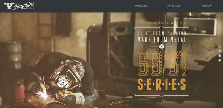
Knuckles Industries creates a sophisticated aesthetic similar to the effects of black and white using an additional color cast to support a unique visual hierarchy. The rich tinted background photo entices the eye to wander to the bold headlines, which are even more impactful thanks to their mix of colors and alternation between decorative and straightforward typefaces.
Their application of the color overlay accents the raw yet refined feel for the metal fabrication shop. The vintage visual treatment makes a lot of sense since it immerses the user in the era of an old-world craftsmanship and industrial muscle.
Because implementing color overlays can get tricky, try reading these tutorials for CSS and for Photoshop.
Smaller Custom Images
Almost as popular as full-screen images are collages of smaller images. This layout showcases more products and their use cases, plus can add visual intrigue when animated with the motion of a slider (sliders aren’t appropriate for all scenarios, however).
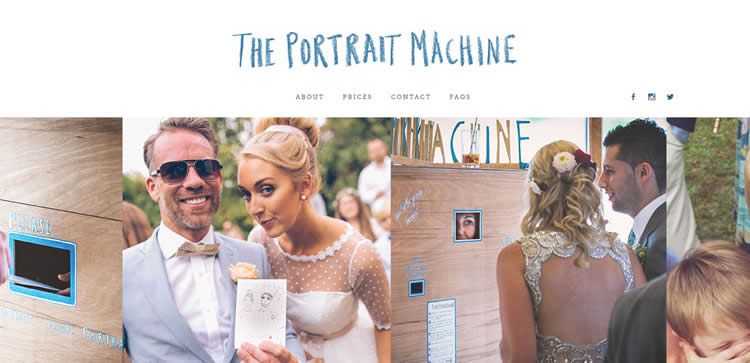
The Portrait Machine (above) uses a slider to showcase a variety of images featuring their product. Each image has a slightly different mood and features people of various age groups in a snapshot-style. This serves the practical purpose of explaining the diversity of their business, across different ages and events. A single photograph could not establish this range.
This photography technique goes hand-in-hand with the cards UI pattern. The cards pattern is growing in popularity thanks to its effectiveness in responsive design and mobile screens, and this layout is completely dependent on a screen of multiple small images. For guidelines and advice on implementing the card pattern, check out the free ebook Cards & Minimalism.
Custom Typography and Words
Nothing says unique more than pairing a custom photo with custom typography. The tradeoff, of course, is time and effort. With the web being so crowded, the investment can certainly pay off in terms of creating a long-term identity that’s hard to replicate.
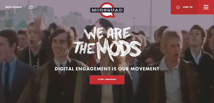
For example, Metaverse Mod Squad (above) takes custom to the next level. First, notice that the vehicle and rider on the right side have been stylized with the bullseye logo. Then look at the text. The decorative typeface for the “WE ARE MODS” headline also adds to the youthful mood of the scene.
Photo Manipulation
Just as the Metaverse Mod Squad modified their photo to insert their logo, any photo can be modified in a program like Photoshop to better fit your brand. Common photo editing entails:
- Resizing individual elements.
- Color overlays.
- Inserting/deleting objects.
- Photo Effects (blur, negative, etc.).
Moreover, in the right hands, photo-editing software becomes a new medium in itself. You can use it to create some unforgettable images that untouched photos can’t match.
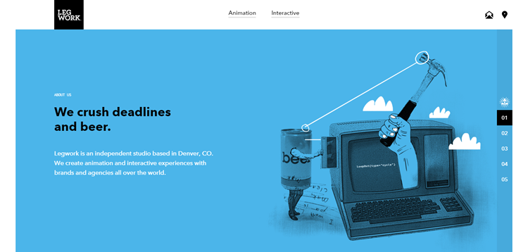
Playing up their creativity, the animation and interaction studio Legwork shows off their skills by using photo manipulations. While this extremism wouldn’t work so well for more professional companies like law firms, it can be just the thing for displaying your unique personality.
Custom photography, regardless of use, is a design technique that always makes a site perfectly yours. Images should be sharp, focused and of high quality. They should represent your brand, voice and style. If you don’t have a library of photos to work with, get out and start shooting a few pictures on your own as you envision what you might want, and then recruit a photographer to help you create the perfect custom photo set.
Related Topics
Top