In recent years, the world of web design has undergone significant changes. While responsive design and web fonts have revolutionized the field, modern design trends have moved away from skeuomorphism and towards a cleaner, flatter aesthetic. Web typography has become larger and more prominent, and content has taken center stage, with page-load speed being a critical factor in determining a site’s success.
These changes have resulted in a clutter-free and visually uncomplicated experience for users. We are in the era of clean web design. To highlight this aesthetic, we’ve selected twenty-five websites that encapsulate the abovementioned factors. Each site, in its own unique way, showcases the beauty of clean design.
From minimalist layouts and bold typography to striking color schemes and simple navigation, these websites demonstrate the power of clean design to create a memorable and fantastic user experience. Whether you’re a web designer looking for inspiration or simply appreciate good web design, these sites are sure to impress.
Clean web design is here to stay, and it’s easy to see why. By focusing on content and simplifying the design elements, web designers can create sites that are both aesthetically pleasing and accessible. So, embrace it and explore the beauty of clean web design below!
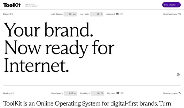
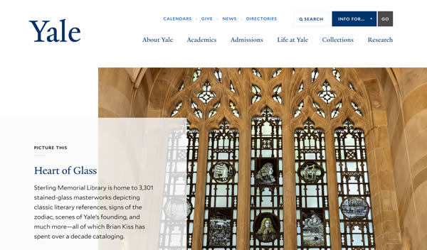
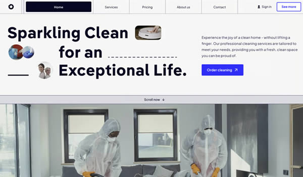
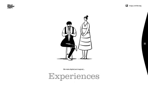
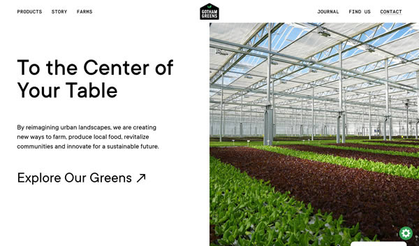
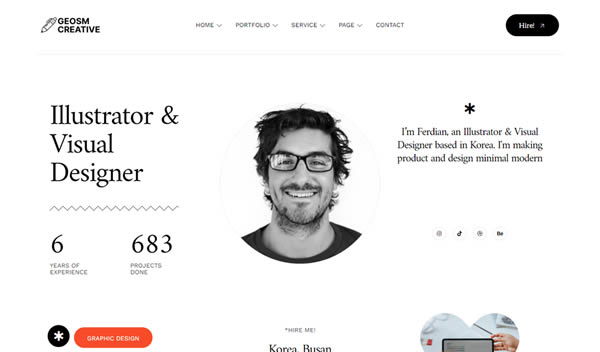
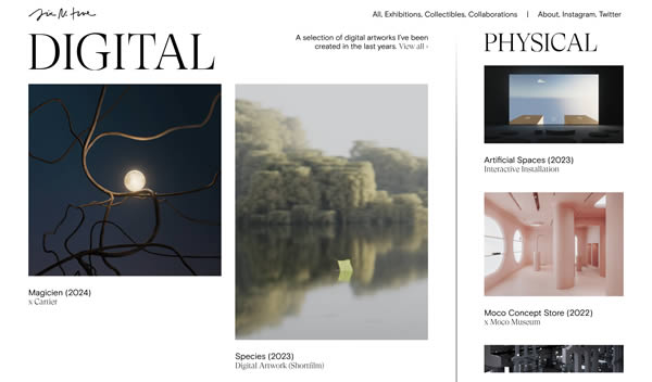
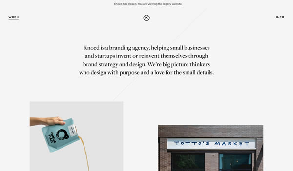
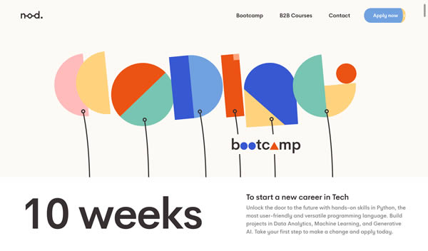
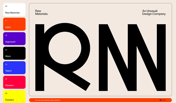
Clean & Light Web Design Inspiration
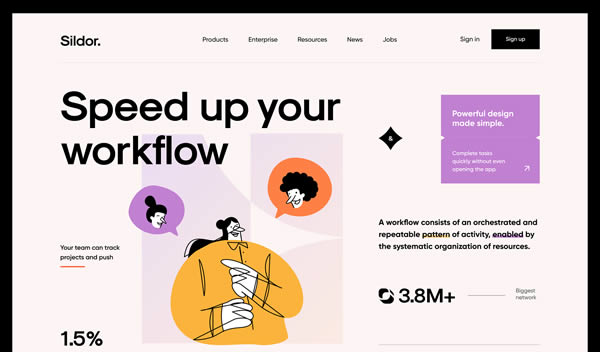
These sites use light color schemes, plenty of white space, and non-intrusive elements. They are ideal for portfolios, blogs, or corporate sites that want a fresh and modern aesthetic.

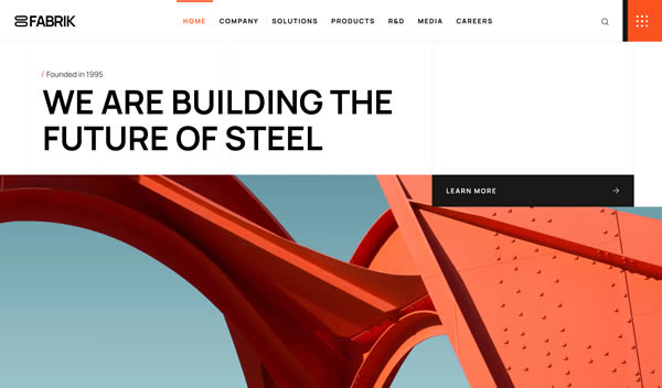


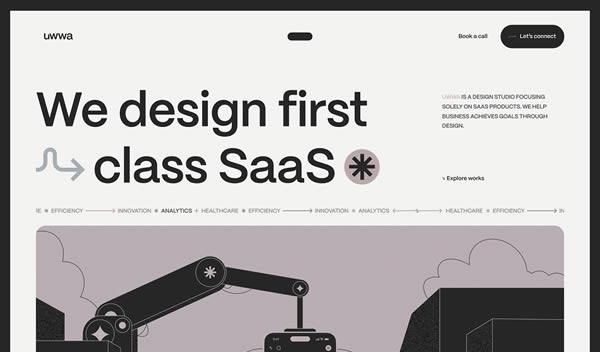


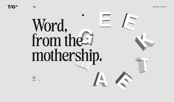
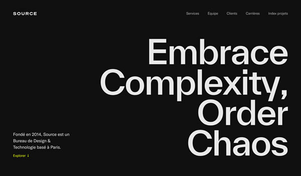
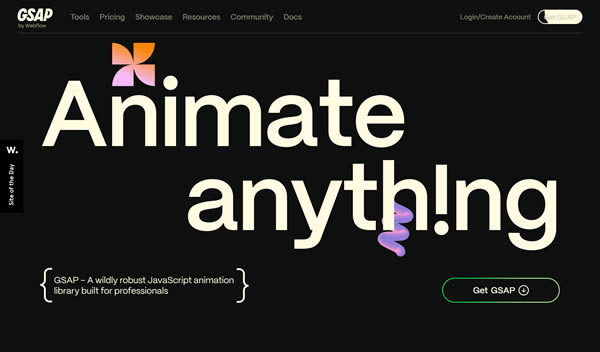
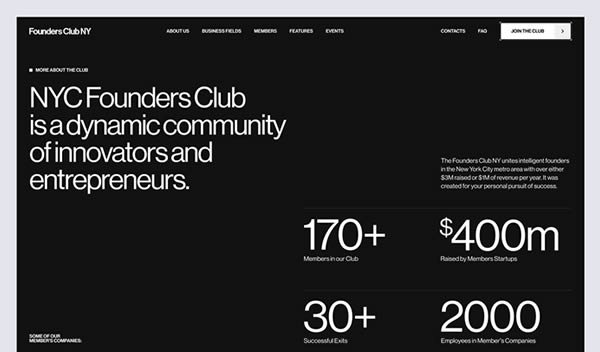
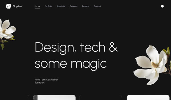
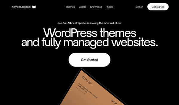
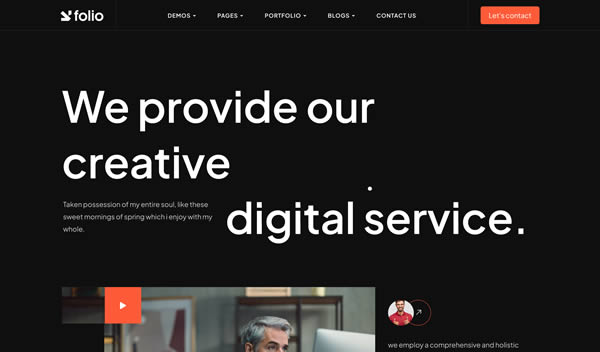
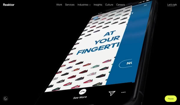
Clean & Dark Web Design Inspiration
These websites use darker tones and are excellent for tech, creative, or luxury brands that want a bold appearance. Darker color schemed websites are great for highlighting photos.
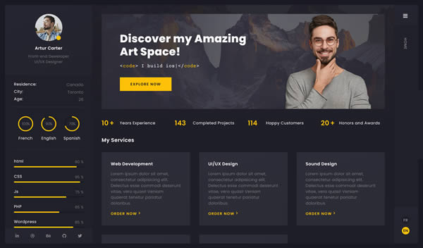

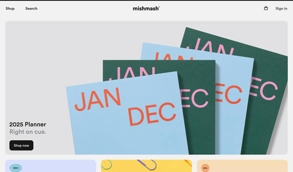
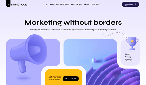
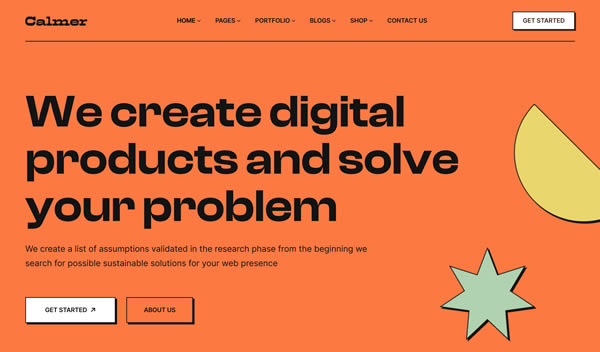
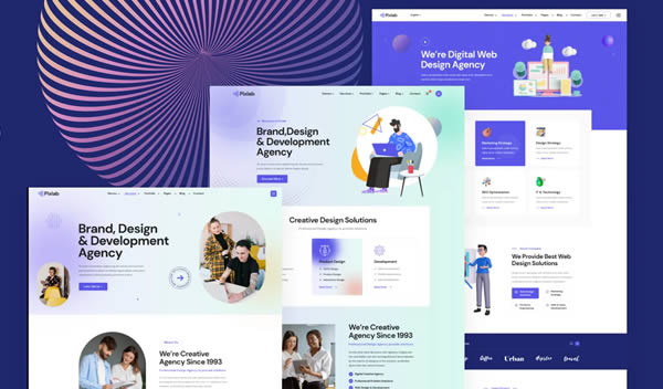
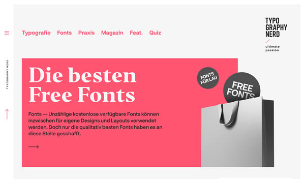
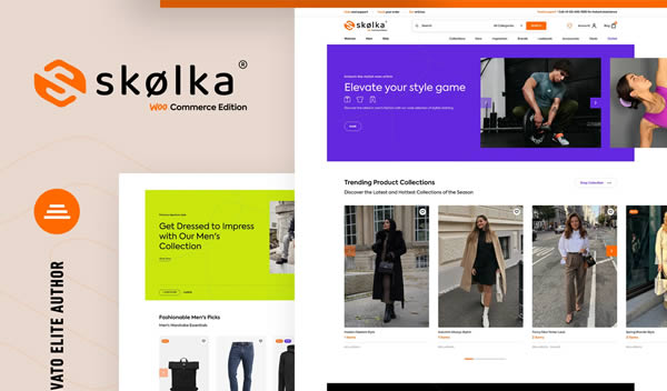
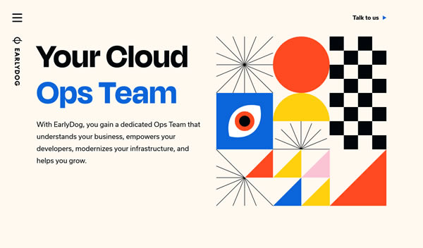
Clean & Colorful Web Design Inspiration
These sites balance clean design with brighter colors. They’re perfect for creative agencies, fashion, or lifestyle brands that are looking for a lively and energetic aesthetic.

Related Topics
Top