
It’s Relationship Building, Not Networking
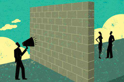
How to Improve Your Communication With Clients
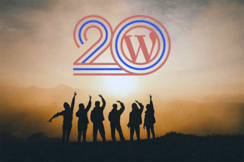
Things I’ve Learned From the WordPress Community

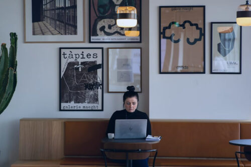
How No-Code Tools Can Disrupt the Design Process
The Five Questions to Ask Yourself Before Becoming a Full-Time Freelance Designer
Why Clients Are Asking for More Creative Control in Web Design
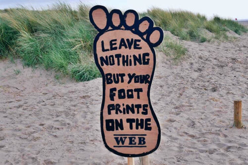
What’s the Environmental Impact of Your Website?

What Web Designers and Their Clients Need to Know About SEO
How AI Could Change Collaboration for Web Designers & Developers

How to Increase Revenue From Your Existing Web Design Clients