All designers have different interpretations of what minimal web design truly is, but most would agree that the purpose of an effective minimally designed web page is to layout the content in such a way that no single element distracts attention from the visual hierarchy.
And the key to achieving minimal distraction is to initially have a well-structured backbone focused on the comparative space relation between the fundamental elements of the web page.
Although minimal design does seem to have evolved ever so slightly over the last few years, especially within web design. Trends, techniques, and user expectations have changed, and quite remarkably, this has resulted in alterations to the look and feel of what we would typically define as a minimal site.
Those boundaries that had previously existed between all mainstream web design trends have become blurry, resulting in a blend of styles, where only the best parts of each have been wisely selected to create a whole new minimal style.
This gallery features 30 minimally designed websites that have not only stripped away all non-essential elements, but have also successfully absorbed other popular modern design trends, like over-sized typography, large imagery, simple navigation systems, long scrolling, carefully selected interactive elements, flat design, and all use the latest in responsive web design techniques.
And, as you would expect from minimal web design, the focus is firmly put on the content. Enjoy our collection!
Minimal Web Design
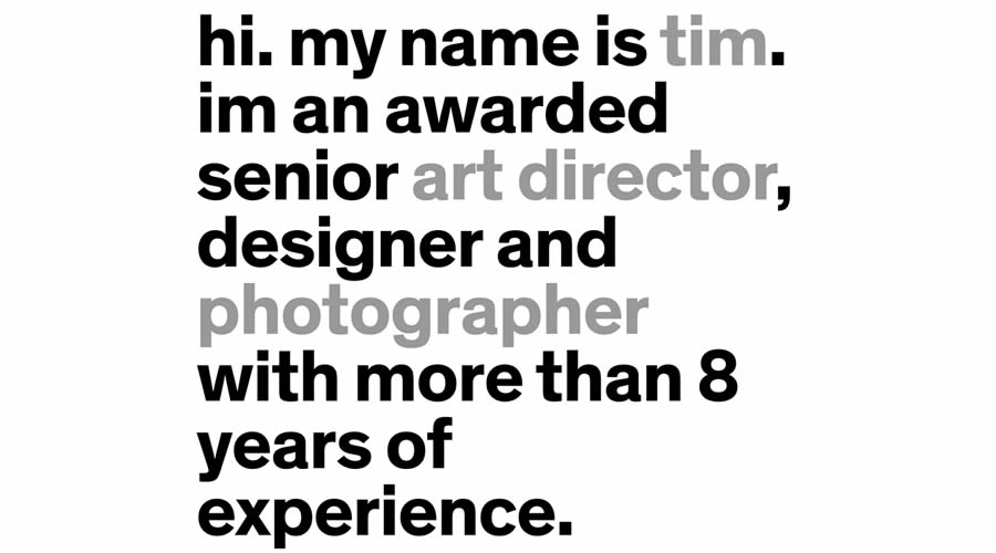
Tim Brack’s Portfolio
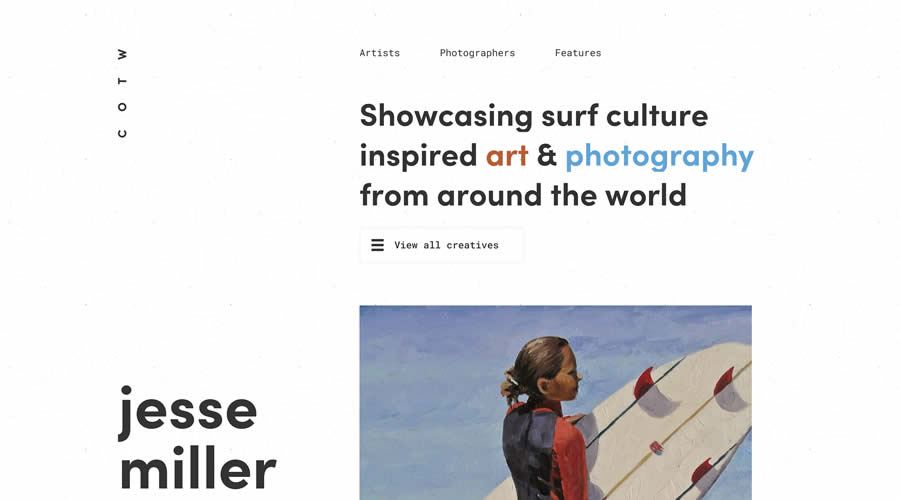
Club of the Waves
Dongkyu Lee’s Portfolio

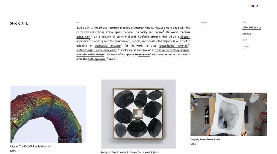
Andrew Herzog’s Portfolio
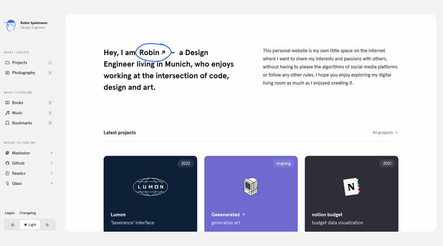
Robin Spielmann’s Personal Site
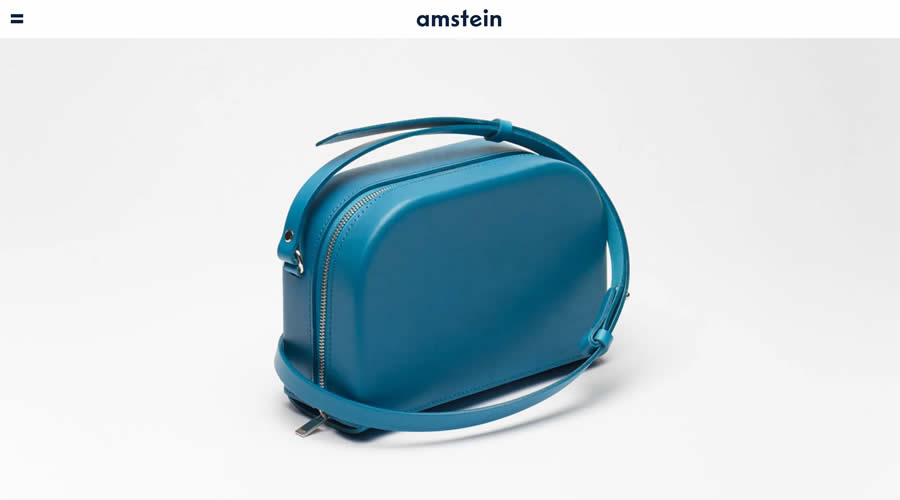
amstein Online Store
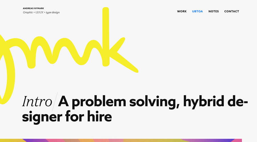
Andreas Nymark’s Portfolio
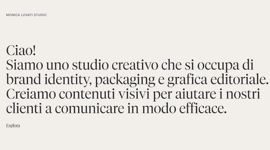
Monica Lovati’s Studio
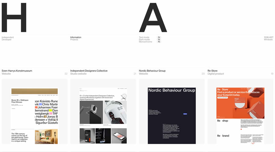
Harry Atkins
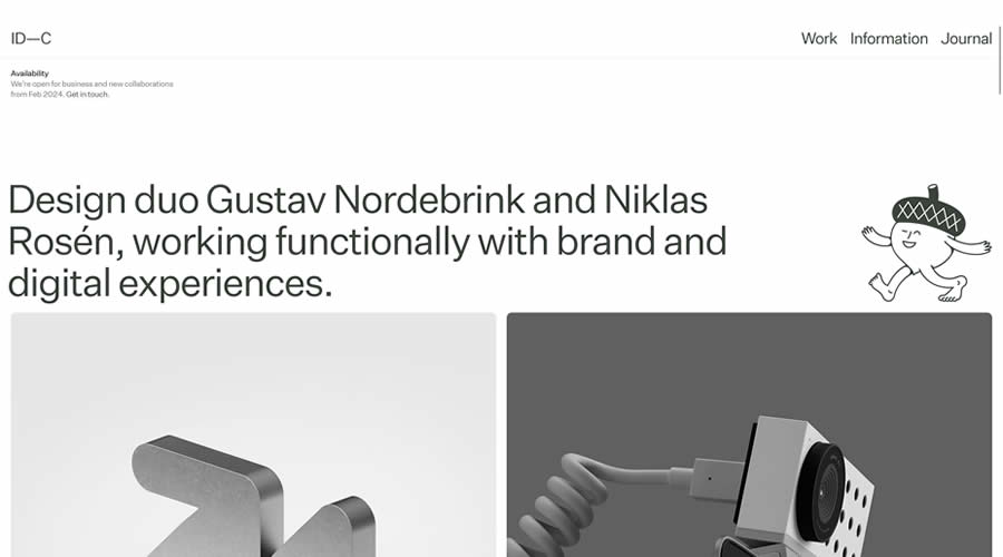
ID—C Studio
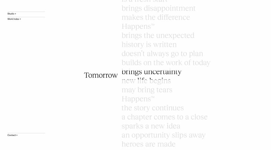
Tomorrow Happens
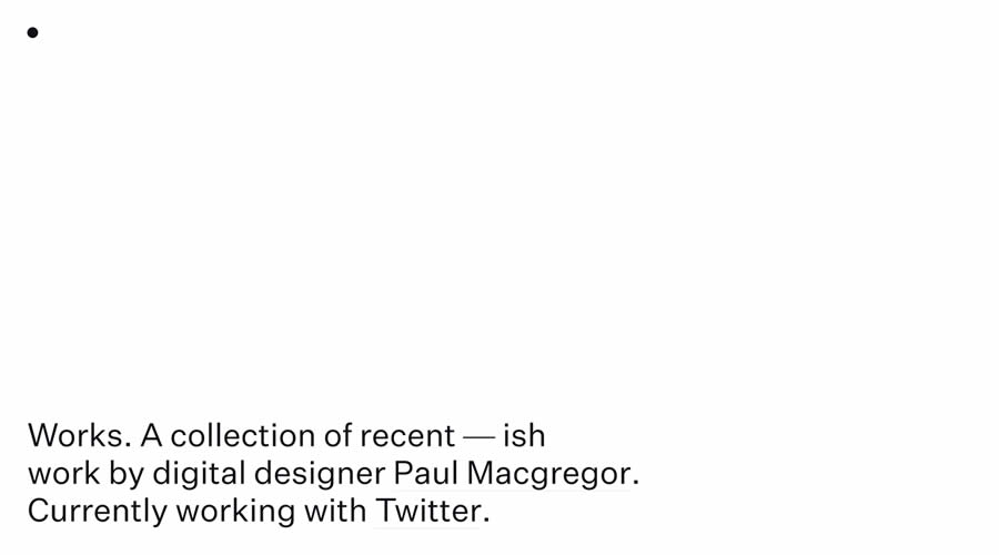
Paul Macgregor’s Portfolio
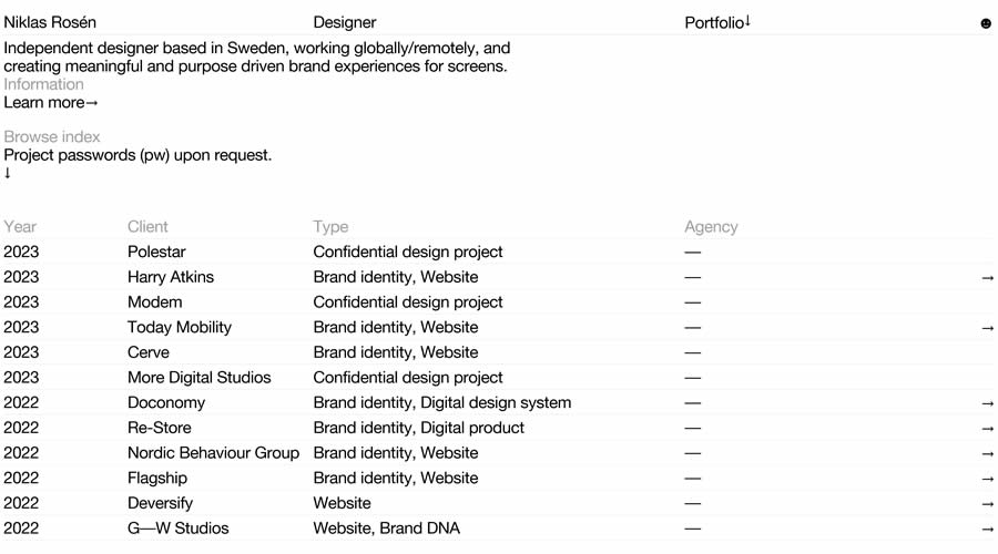
Niklas Rosén’s Portfolio
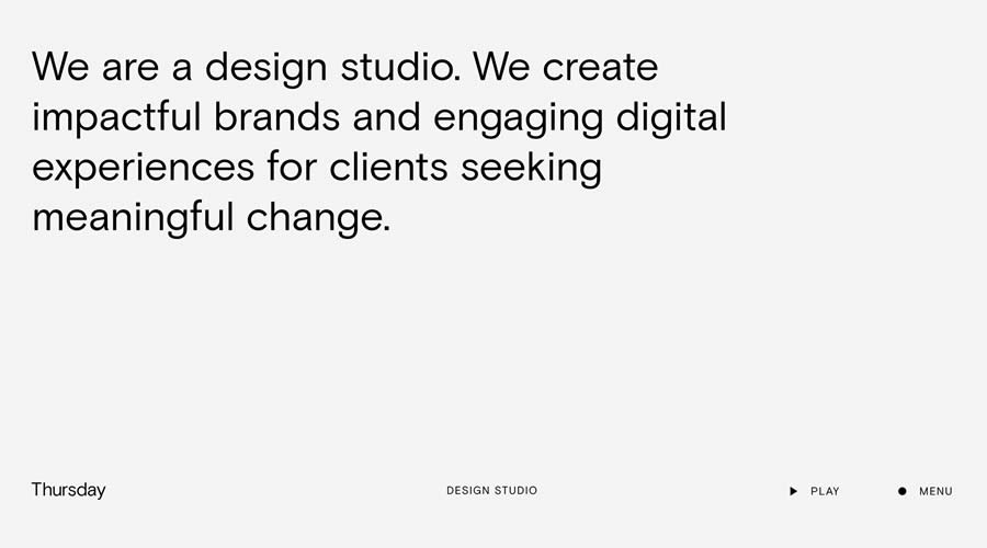
Thursday Design Studio
Minimal & Dark Web Design
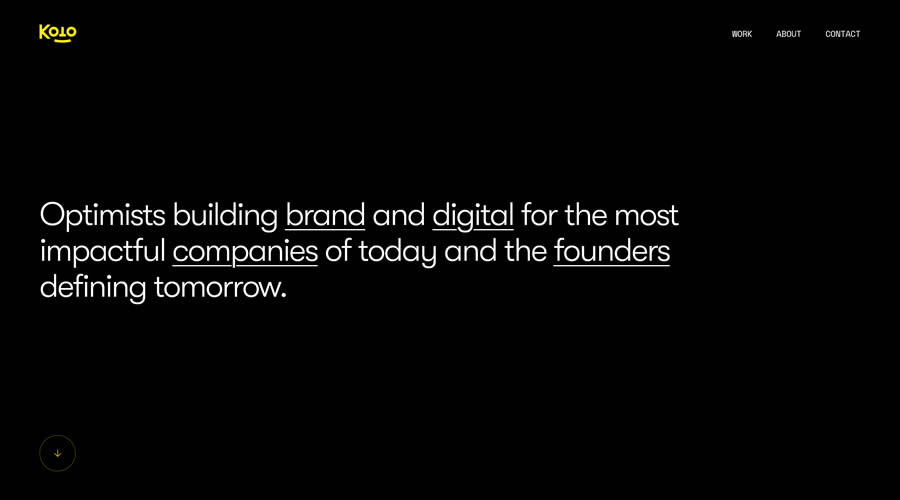
Koto Studio
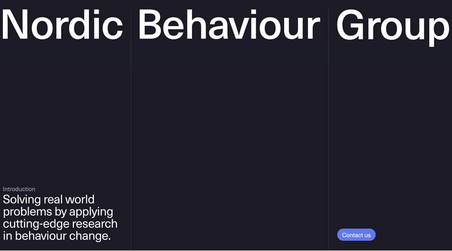
Nordic Behaviour Group
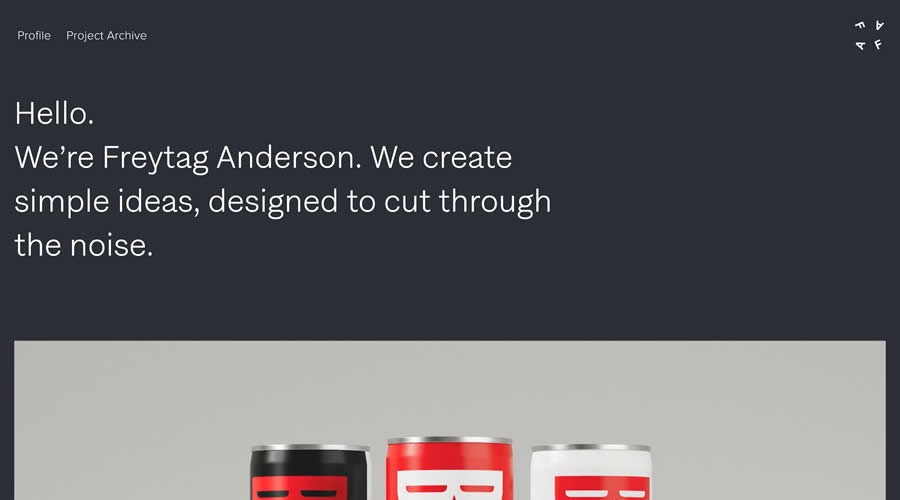
Freytag Anderson’s Agency
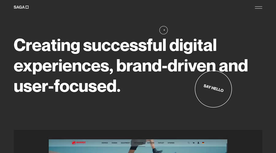
SAGA Digital
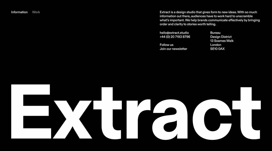
Extract Studio
Minimal & Color Web Design
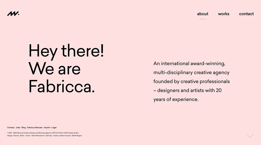
Fabricca Agency
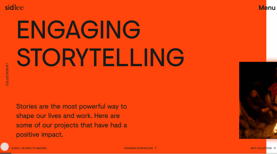
Sid Lee
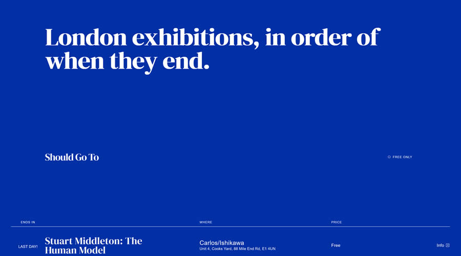
Should Go To
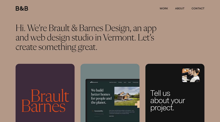
Brault & Barnes Design
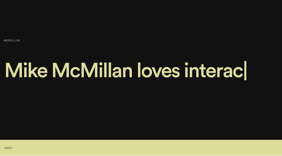
Mike McMillan’s Portfolio
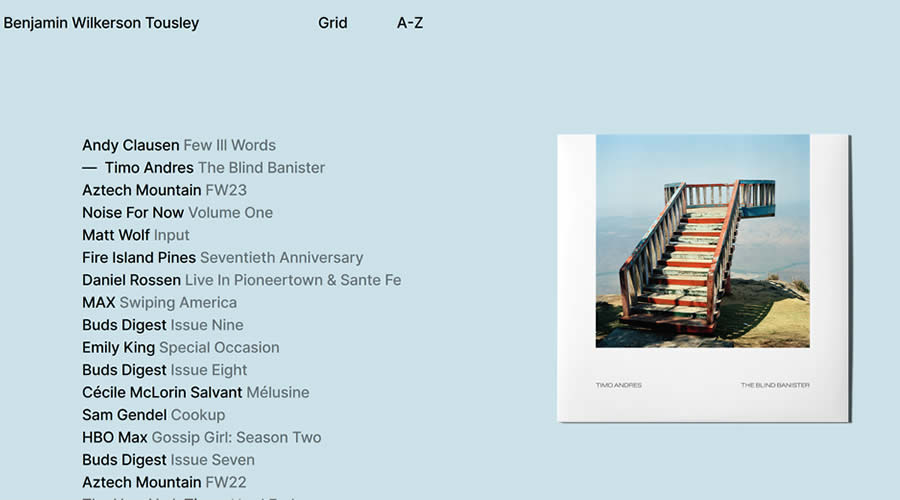
Benjamin Wilkerson Tousley
The Elements of a Minimalist Web Design
- Use of Space: Space is a powerful tool in minimalist design. Using white or negative space helps reduce clutter, making your website feel open and calm. This space isn’t just “empty”; it draws attention to your content and makes everything easier to take in.
- Color Choices: Colors in minimalist design are all about simplicity. A limited color palette can give your website a clean and harmonious look. Choose a few colors that work well together and use them consistently across your site. This makes your website look professional and easy on the eyes.
- Typography: The fonts you choose play a big part in how your website feels and how easy it is to read. In minimalist design, fonts need to be clear and impactful. This doesn’t mean boring—select fonts that reflect your site’s personality, but keep readability in mind.
- Imagery: Even with a minimalist approach, images are still important. The key is to use high-quality, relevant images but to use them sparingly.
- Navigation: A simple, easy-to-use menu is crucial in minimalist web design. Simplified navigation means fewer menu items, making it easier for visitors to find what they’re looking for. This approach to navigation improves the user experience by removing unnecessary choices and focusing on what’s important.
Create Something Beautiful
By embracing space, choosing a simple color palette, selecting clear fonts, using images with purpose, and streamlining navigation, minimalist websites offer a clean, efficient, and enjoyable user experience.
They not only load faster but also make it easier for visitors to find what they need, all while looking polished and professional.
Minimalism is not just about making your website look modern; it’s about creating a space where your content shines, and your visitors can interact with ease.
Let these inspiring examples of minimal web design inspire you to create something beautiful, functional, and distinctly yours.
Related Topics
Top