Responsive web design gained massive popularity in 2011, and it looks like it’s here to stay in 2012 as designers continue to support a wide range of mobile devices. However, creating layouts for the web can be pretty challenging, and that’s where inspiration comes in handy.
To help inspire you, we’ve put together a gallery of 40+ amazing responsive website layouts. These designs are carefully crafted to support different resolutions and automatically adjust to different screen sizes.
Implementing this functionality can be tricky, even for experienced developers who may need help understanding the nuances of responsive design trends. But don’t worry. By checking out the examples below, you’ll quickly pick up some valuable techniques to help you easily create responsive layouts.
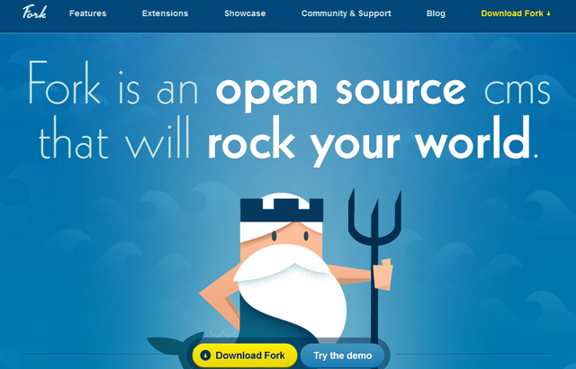
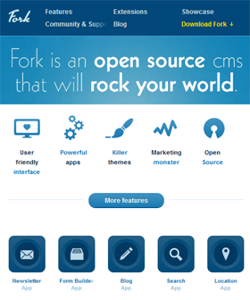
Fork CMS
Desktop View:
Mobile View:
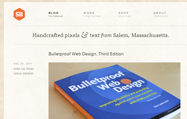
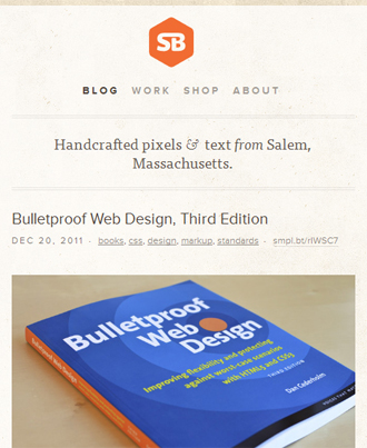
SimpleBits
Desktop View:
Mobile View:
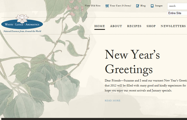
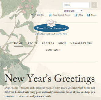
White Lotus Aromatics
Desktop View:
Mobile View:
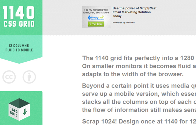
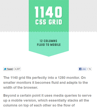
1140px CSS Grid
Desktop View:
Mobile View:
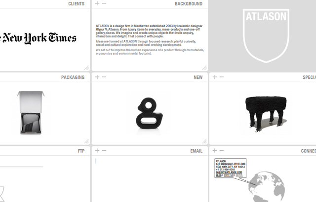
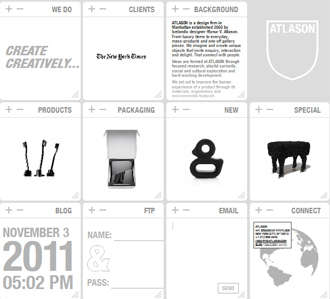
Atlason
Desktop View:
Mobile View:
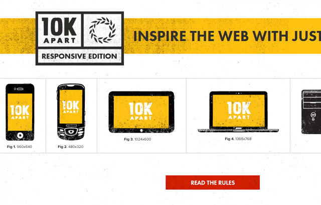
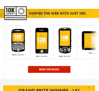
10K Apart
Desktop View:
Mobile View:
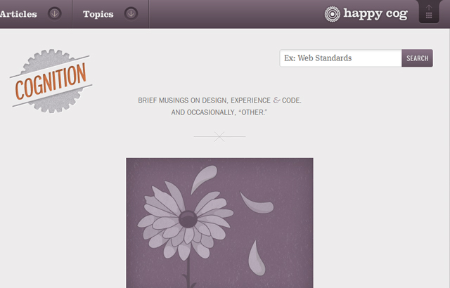
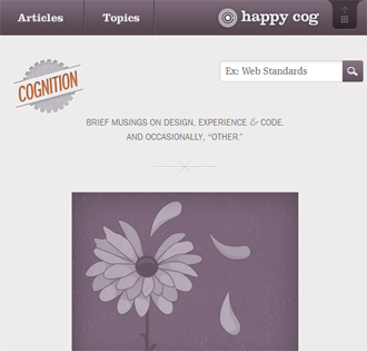
Cognition
Desktop View:
Mobile View:
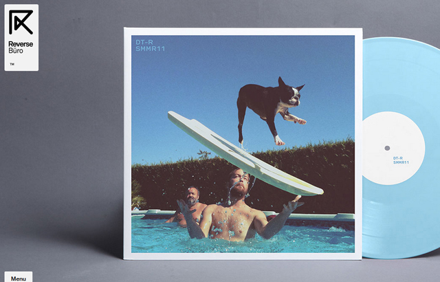
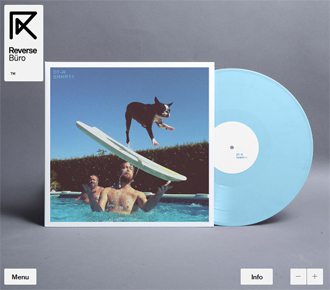
Reverse Buro
Desktop View:
Mobile View:
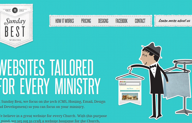
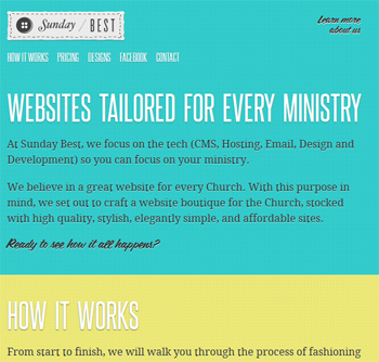
Sunday Best
Desktop View:
Mobile View:
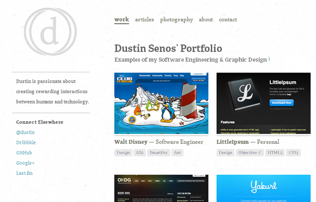
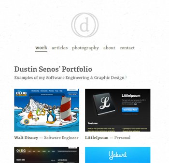
Dustin Senos
Desktop View:
Mobile View:
Clear Air Challenge
Desktop View:

Mobile View:

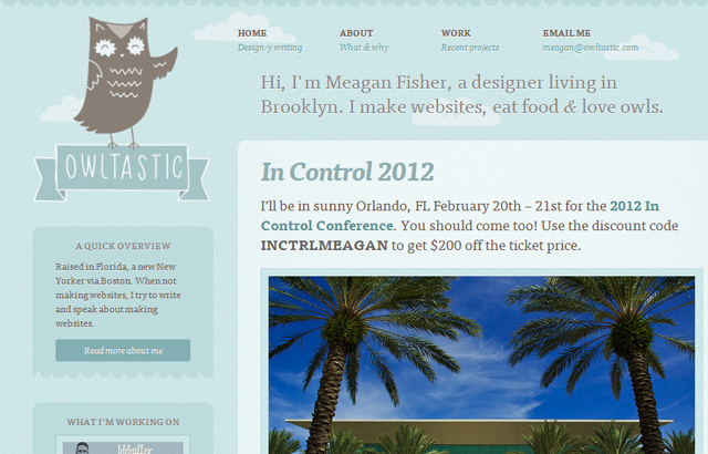
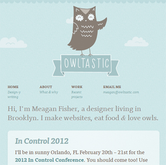
Owltastic
Desktop View:
Mobile View:
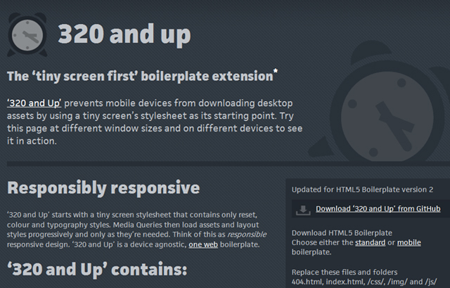
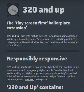
320 and up
Desktop View:
Mobile View:
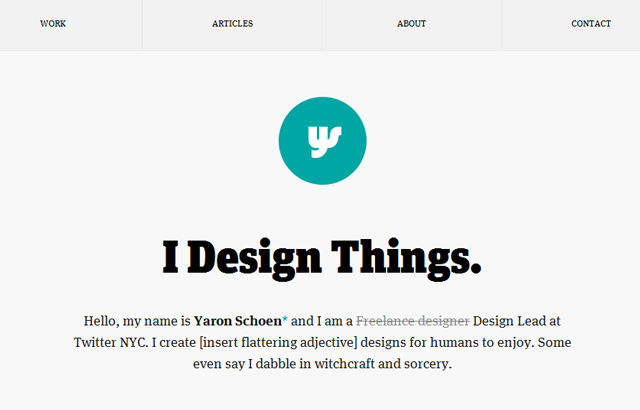
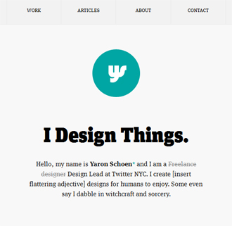
Yaron Schoen
Desktop View:
Mobile View:
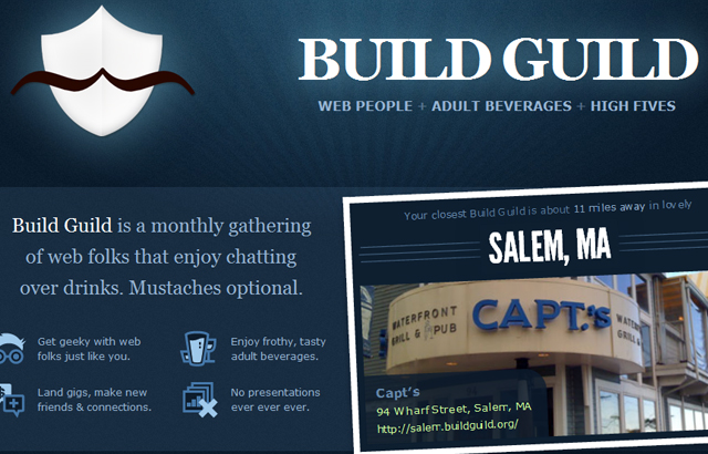
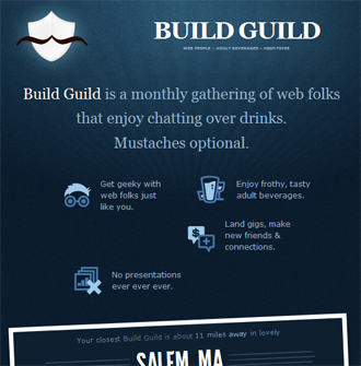
Build Guild
Desktop View:
Mobile View:
Do Lectures
Desktop View:

Mobile View:

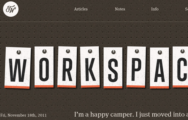
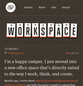
Trent Walton
Desktop View:
Mobile View:
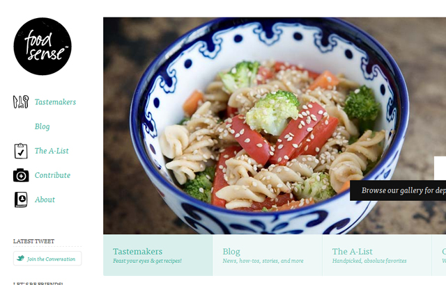
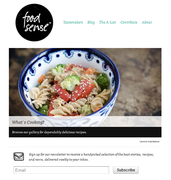
Food Sense
Desktop View:
Mobile View:
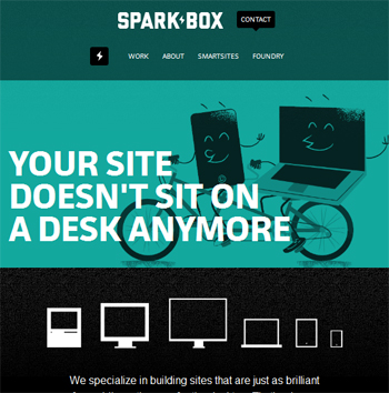
Sparkbox
Desktop View:
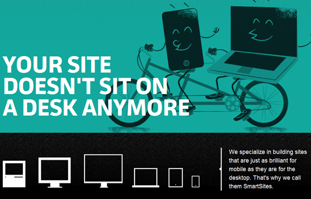
Mobile View:
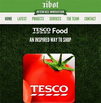
ribot
Desktop View:
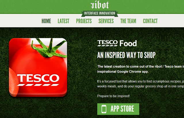
Mobile View:
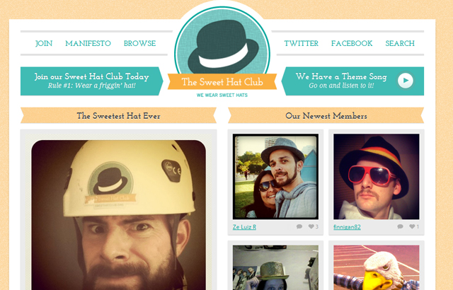
Sweet Hat Club
Desktop View:
Mobile View:

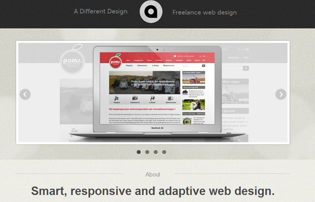
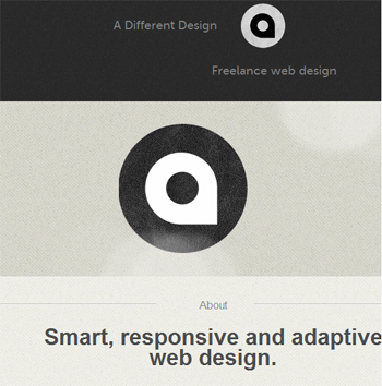
A Different Design
Desktop View:
Mobile View:
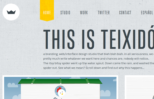
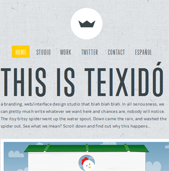
Teixido
Desktop View:
Mobile View:
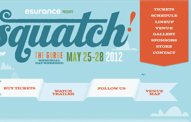
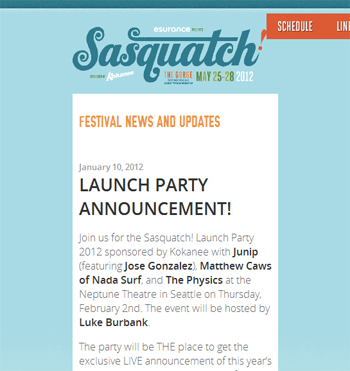
Sasquatch Music Festival
Desktop View:
Mobile View:
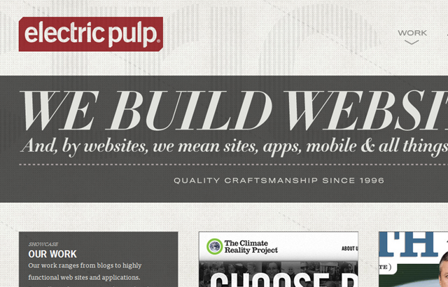
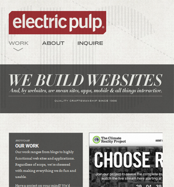
Electric Pulp
Desktop View:
Mobile View:
Stephen Caver
Desktop View:
Mobile View:
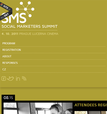
Social Marketer’s Summit
Desktop View:
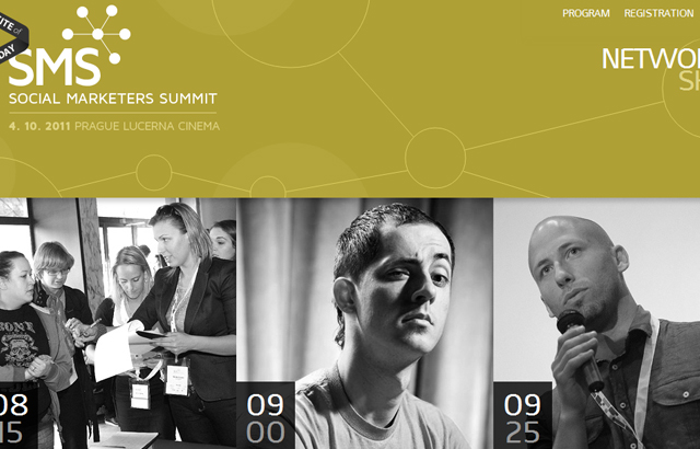
Mobile View:
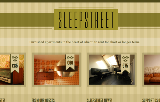
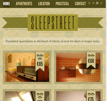
Sleepstreet
Desktop View:
Mobile View:
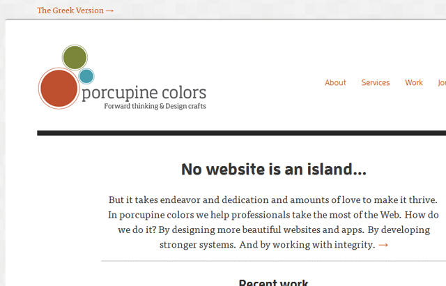
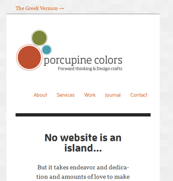
Porcupine
Desktop View:
Mobile View:
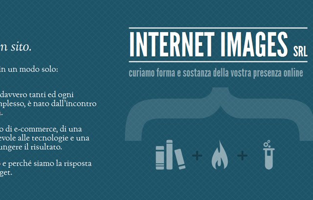
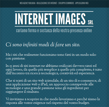
Interim
Desktop View:
Mobile View:
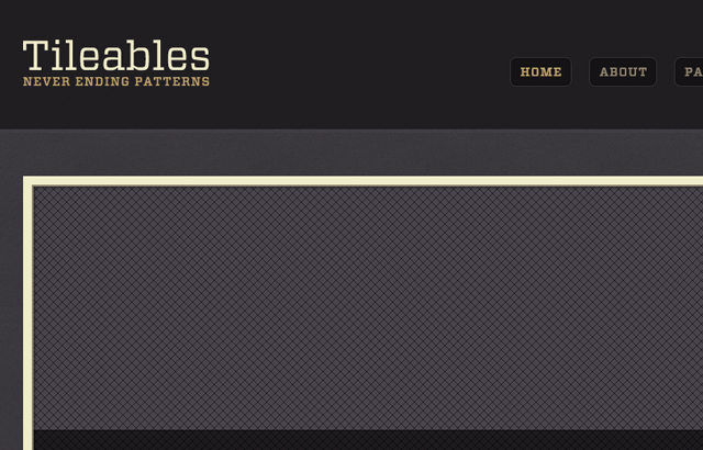
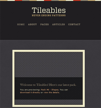
Tileables
Desktop View:
Mobile View:
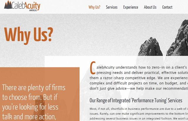
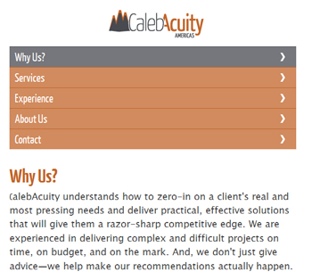
CalebAcuity
Desktop View:
Mobile View:
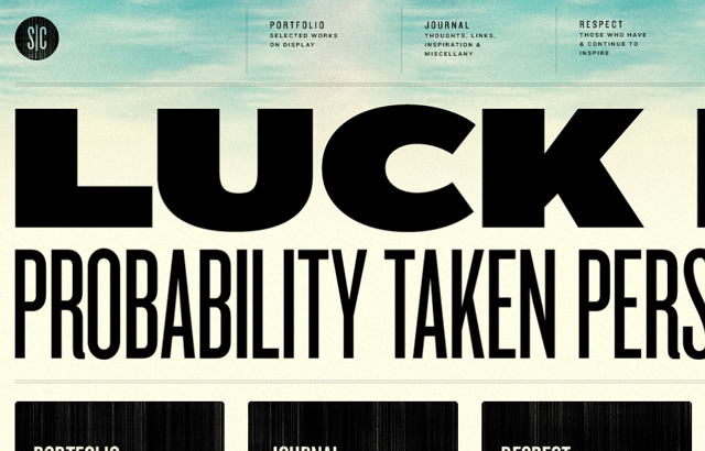
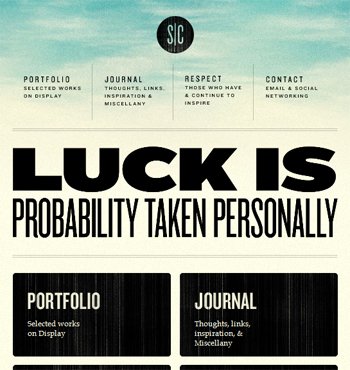
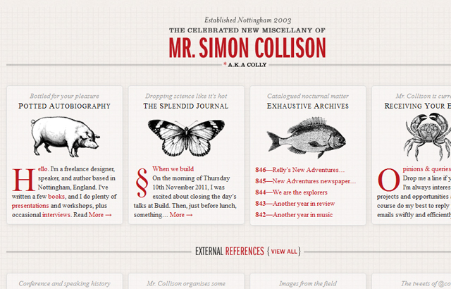
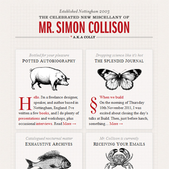
Simon Collison
Desktop View:
Mobile View:
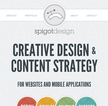
Spigot Design
Desktop View:
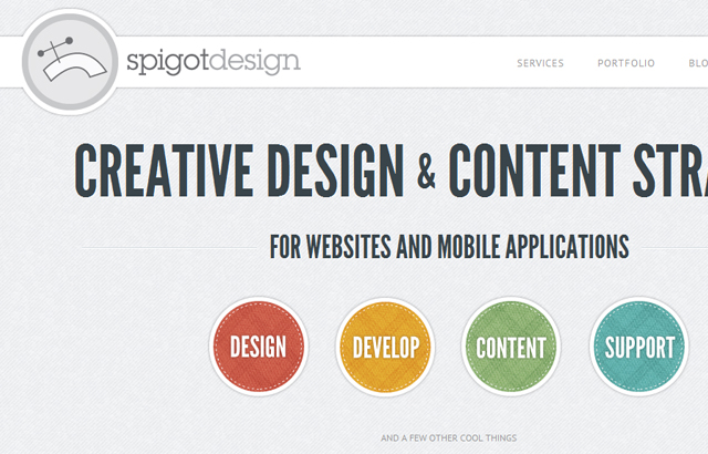
Mobile View:
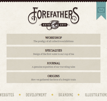
Forefathers Group
Desktop View:
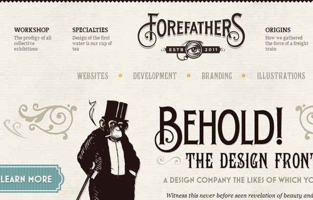
Mobile View:
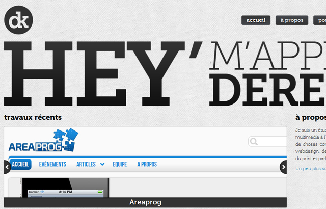
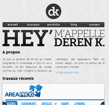
Deren Keskin
Desktop View:
Mobile View:
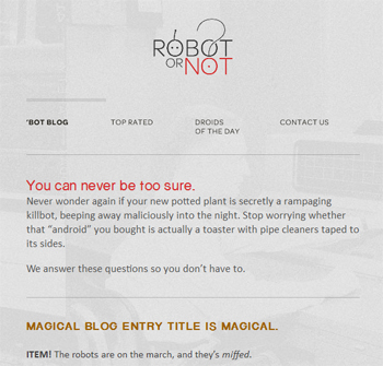
Robot… Or Not?
Desktop View:

Mobile View:
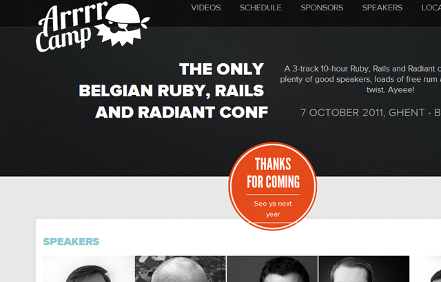
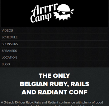
Arrrcamp Conference
Desktop View:
Mobile View:
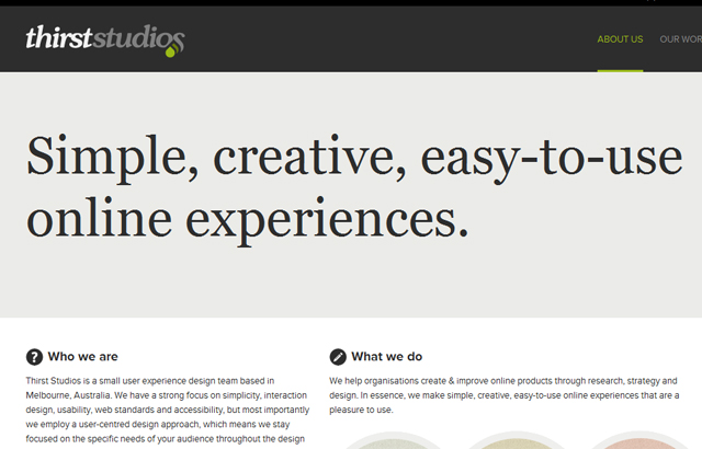
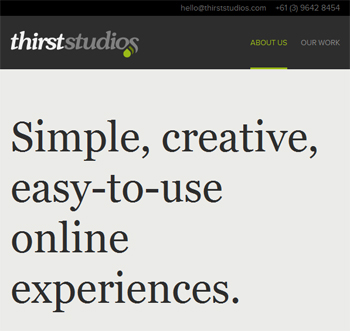
Thirst Studios
Desktop View:
Mobile View:
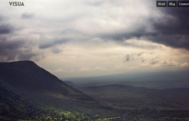
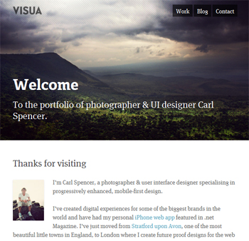
Visua Design
Desktop View:
Mobile View:
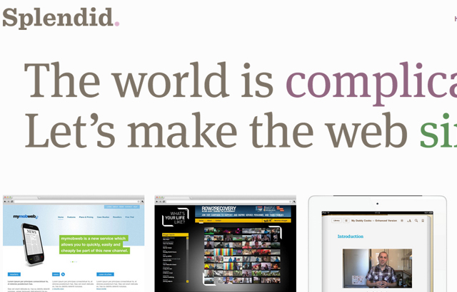
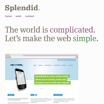
Made by Splendid
Desktop View:
Mobile View:
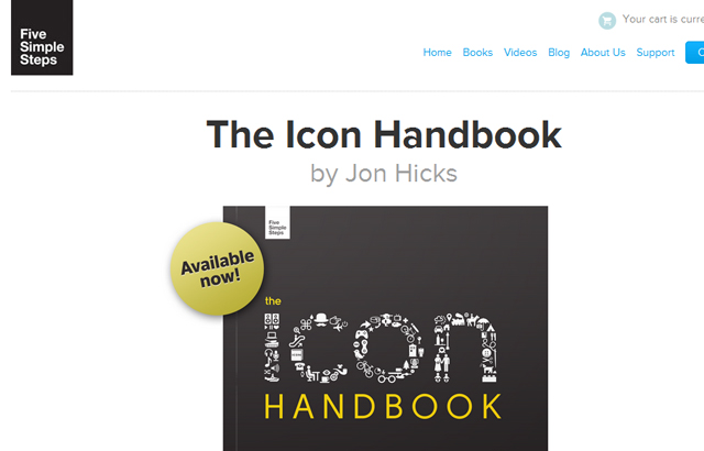
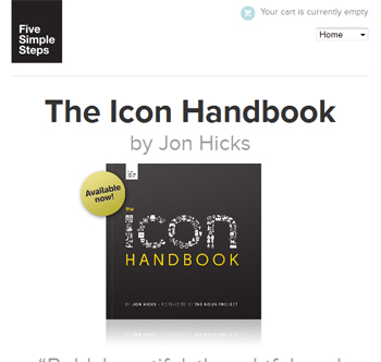
Five Simple Steps
Desktop View:
Mobile View:
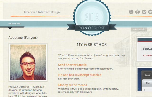
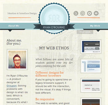
Ryan O’Rourke
Desktop View:
Mobile View:
dConstruct 2011
Desktop View:

Mobile View:

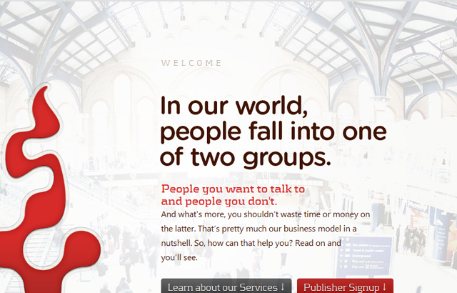
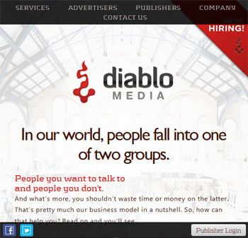
Diablo Media
Desktop View:
Mobile View:
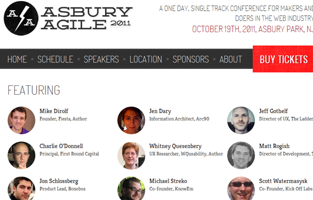
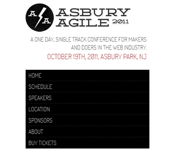
Asbury Agile Web Conference
Desktop View:
Mobile View:
Related Topics
Top