Starting as an alternative to the then-popular skeuomorphic style, flat design originated as a wholly simplistic and minimalist style that lived up to its name.
Throughout the last few years, however, it’s been evolving to satisfy the shifting tastes of users and to implement advancements in technology.
Flat design in its current state (what Ryan Allen calls “Flat 2.0”) is a style different than, but similar to, what it was in the past.
Influenced by Swiss/international design and artistic minimalism, flat design uses techniques from various mediums and eras and draws them together in something all its own.
In this article, we’ll look at seven of the most recognizable traits of the most modern version of the style.
These traits can be used individually for their specific benefits, or combined for a strong flat look. But before you start “flattening” your design, it’s important to consider the style’s pros and cons.
Advantages and Disadvantages of Flat Design
Take a look at our short analysis below to see if a flat design can help your site.
Advantages:
- Conducive to responsive design
- Easy for users to learn the system and navigate
- Structured layout and crisp visuals create visual maturity
- Speedy loading times
- Simple typography promotes readability
Disadvantages:
- Deceptively difficult to do well
- Simplistic style can weaken the signifiers
- High risk of appearing boring
- Lack of individuality due to its popularity
Now that you know what the style has to offer, let’s look at seven techniques for using it.
Shading
Part of Flat 2.0, shading adds a depth and complexity without sacrificing the minimalistic elements that make flat design appealing. This is a new addition to flat design, as the older versions avoided such flourishes.
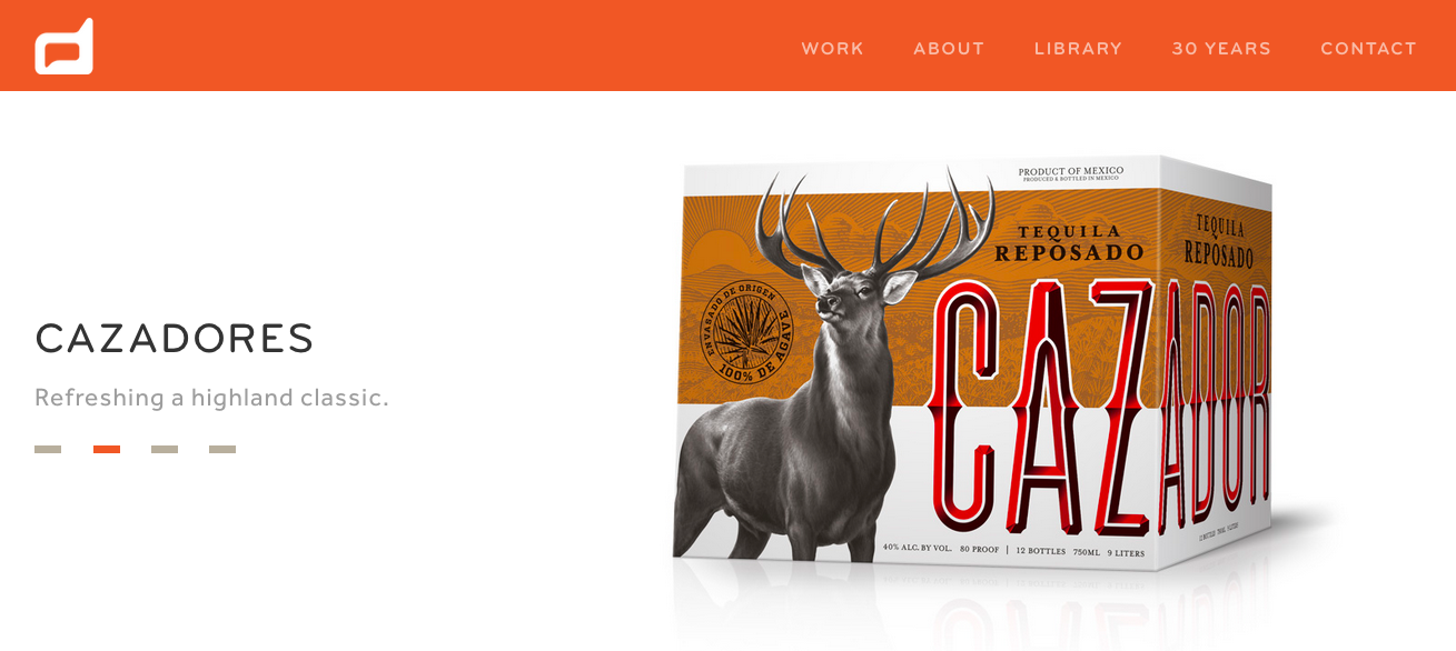
While past years saw the trend of longer, more noir-ish shadows, lately, the trend has been moving towards subtlety. In the above example from Duffy & Partners, the product’s shadow (and reflection) are slight and unobtrusive, but still add a little extra visual interest.
Dynamic Colors
To make up for the sparse visual effects, flat design embraces dynamic color, especially bright hues. The energizing colors contrasted with one another keep a page of few elements from appearing dull.
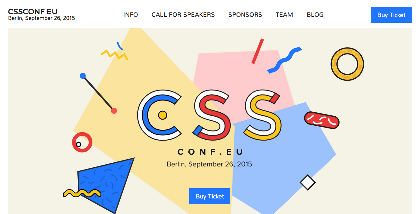
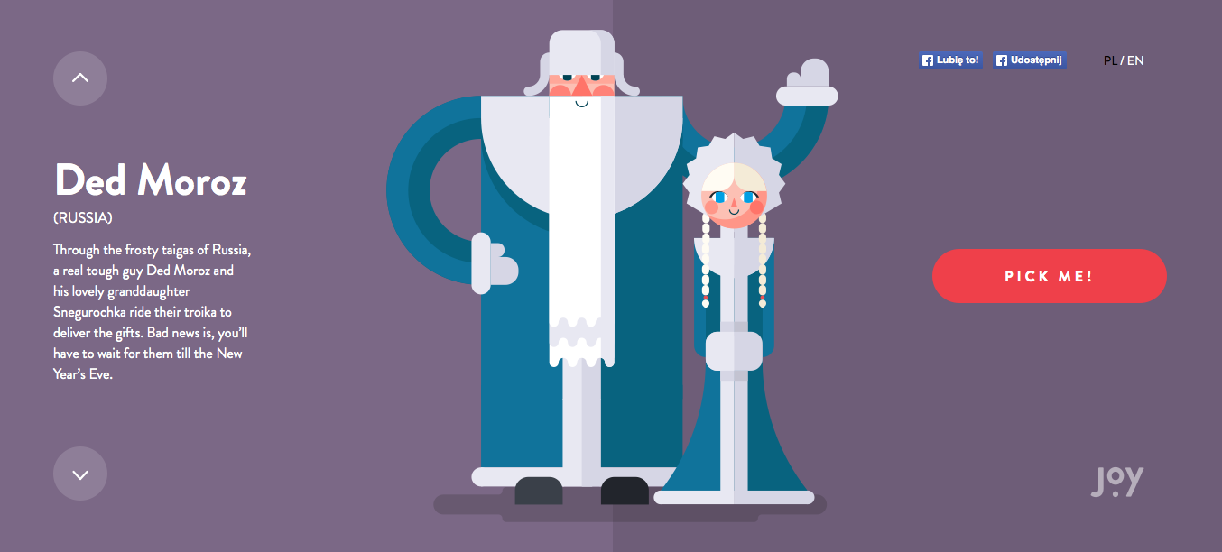
The lively colors of flat design have, from the beginning, been one of its most identifiable characteristics. The above site for the CSS Conference uses a traditional flat palette with soft and happy hues.
Because color usage is so crucial, the site Flat UI Colors has collected some of the most effective of these patterns.
Simple Typography
True to form, the typography in flat design stays simple and easy to read — which equates to sans serif and a uniform stroke width.
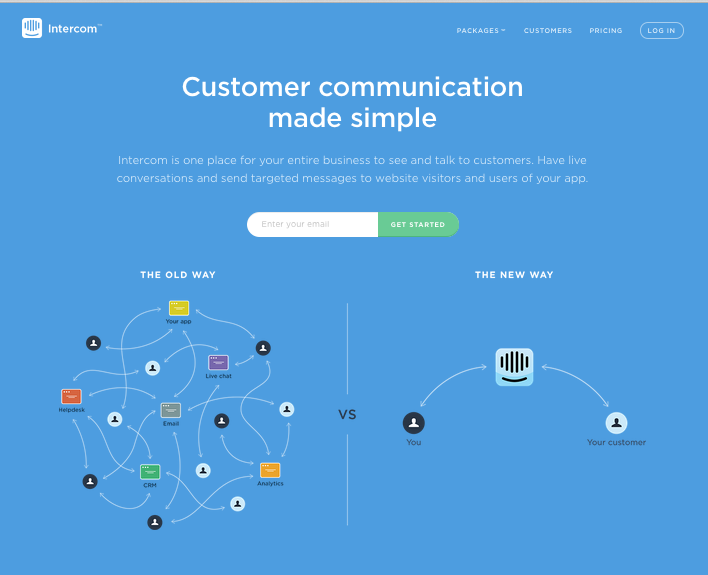
In the above example from Intercom, the font does not draw attention to itself, and the words are easy to read. This puts the focus more on the graphics, which are quite interesting.
With its emphasis on readability, the popularization of flat typography is even infiltrating other, less minimalist styles of design. We see this flat style of text used with hero headers, oversized typography or type-only websites.
Ghost Buttons
One of the trendiest elements in web design lately, the ghost button fits in equally well with the photo hero backgrounds as it does with flat design, and for the same reason: it doesn’t draw too much attention to itself, but is still recognizable as a button.

The basic typography within the buttons furthers the effects of deflecting too much attention. The minimal distraction of ghost buttons suits flat design’s classic sparsity, and makes it one of flat design’s most noticeable features.
As opposed to some other traits on this list, the ghost button can easily be used with almost any style.
Minimalism
Flat design and minimalism go hand-in-hand, sharing many of the same principles, like usability and simplicity.

Image Source: Pelican Books
While it may seem like the easy way out, minimalism is actually harder to apply than it looks. Fewer elements mean you have to use the available ones with more care.
Iconography
With only the essential elements on the screen, icons need more detail and flair to keep things interesting.

Icons are growing in size to incorporate more detail and as such, becoming more of a mainstay artistic element for a site’s expression. Notice how with the Stash Flat Icons above, each icon features the flat style within itself. Bright colors, cartoony designs, and just enough detail.
Accent Colors
The traditional bright color palettes of flat design will never fully go out of style. Flat design does, however, appear to be shifting to more standard color palettes with bright colors used only as accents.
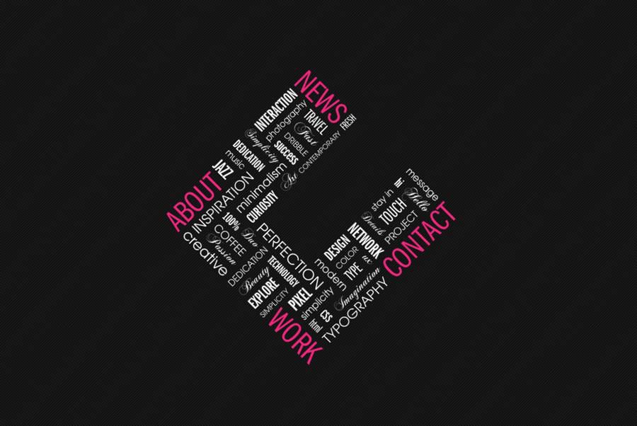
Image Source: C2s
Contrasting the bright colors against dryer backgrounds and surrounding elements gives the designer more control over what’s seen and what’s not. This works especially well with the basic colors, particularly black and white, which make flat’s bright colors stand out even more.
Conclusion
Flat design characteristics are slowly seeping into other styles of web design, and hybrid designs are becoming just as common as purebreds.
Don’t be hesitant about only using one or two of the above traits if you don’t want to fully commit to a flat design — these tactics can often succeed on their own, and may be the initial inspiration for a more innovative style all your own.
Related Topics
Top