Minimalism is all over the web these days, and for a good reason. Its lightweight layouts and low maintenance make it flexible for responsive design, and its natural elegance is sought by many brands and agencies. But appreciating minimalism and recreating it are two different things.
Due to minimalism’s sparse elements, it may seem easy to replicate the style. The truth, though, is the exact opposite — because designers only have a few elements to work with, designing a minimalist site requires more thought and effort.
In this article, we’ll explain how to use minimalism to take full advantage of it. We’ll start with a quick examination over whether the style is right for your site, then dive into the best practices, because discussing how minimalism cooperates with other techniques.
Will Minimalism Work for Your Site?
Minimalism is not the best choice for every site. While the technique works great for straightforward businesses like agency sites and creative portfolios, it becomes trickier for more complex sites.
Let’s look at some common problems sites run into when applying minimalism:
- Too much content — Sites like eBay or Amazon need a detailed interface to support content categories, so a minimalist interface isn’t the most appropriate. However, even these sites apply some of the principles of minimalism, such as hiding content until needed.
- Too many ads — In general, external ads and minimalism do not go well together. Minimalism is precise and meticulous, so if you can’t control what comes from the ad server, your entire design could be upset by something trivial like the ad’s color. Even if the ad is preset, it’s still one more element in a scheme designed for as few elements as possible.
- Children and young adult sites — The short attention spans of younger audiences make minimalism come across as boring. They’d prefer sites with more visual (perhaps even audio) stimulation.
Especially in comparison to other styles, minimalism has a very particular set of criteria in order for it to work. Think carefully before applying it.
Minimalism Best Practices
Take a look at these valuable guidelines for minimalism:
- Landing page only — The lack of elements can be harmful to certain content-rich sites. In these cases, a better option might be to create a minimalist landing page that leads to a more intricate site.
- Crisp copy — While “omitting needless words” is great writing advice in general, in minimalism, it’s even more useful. Think like Hemingway when writing your copy.
- Top-heavy — In accordance to user browsing habits, place high-level content with ample negative space at the top of the screen, then increase the content density as the scroll deepens.
- Keep it interesting — Boredom is a constant threat with minimalism, so change up your layouts just to further engage your user. Alternating layouts along the Z-shaped reading pattern can help.
- One concept per page — In the spirit of simplicity, each page/screen should focus on only one concept, centered around a single visual.
- Five or fewer sections — Content should be prioritized in no more than five sections. If there’s more, trim the fat.
- Start simple — A helpful way to design is to start with a black and white wireframe, then add flourishes like color later. This helps keep you grounded in what’s necessary, and what’s not.
If you’re new to applying minimalism, what to keep and what to toss can be a tough choice. Below we’ve made a quick list for beginners:
- Essentials — logo, navigation options, body content, contact information.
- Throw-aways — social media links/icons, footers, widgets (especially lists, i.e., “Top Posts”).
On the bright side, the more you work in minimalism, the more you develop your instincts about what can be cut. Separating what’s necessary and what’s extra is a skill that can be translated to all styles of design.
Minimalism with Other Styles
Part of the beauty of minimalism is how well it works together with other styles.
Think of minimalism as an attribute that can be added or combined with other styles and techniques to accent strengths or mitigate weaknesses.
Especially with today’s prevalence of mobile devices and heavy-loading animations, minimalism offers a way to reduce a site’s maintenance without reducing its quality. For this reason and others, minimalism is often used in conjunction with these other styles:
1. Flat Design
Minimalism and flat design go exceptionally well together, given their shared emphasis on simplicity.
Both forego design tricks to draw attention to content, and the basic style of flat design is, on its own, minimalistic.

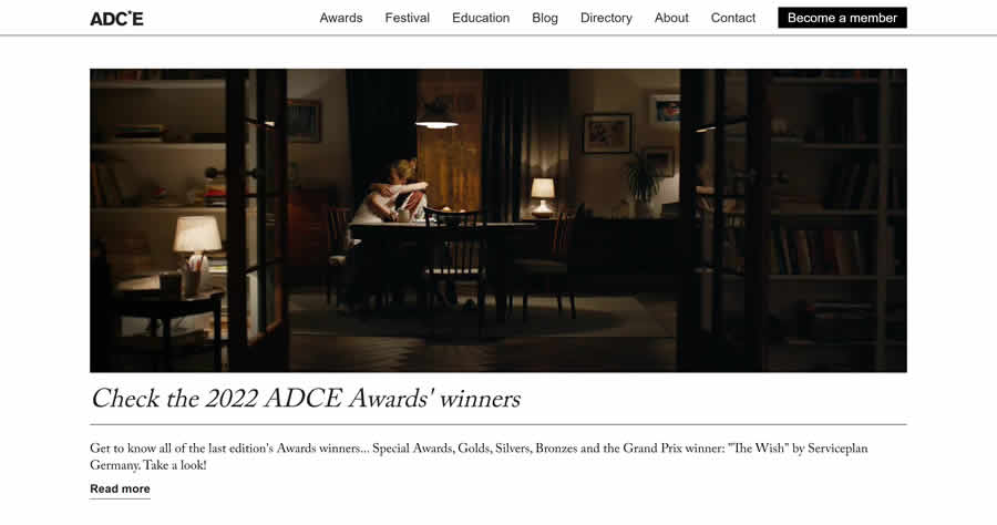
2. Hero Headers & Images
Stepping away from the stark world of flat design, realistic photos and images on a large scale are increasing in popularity.
With these massive and attractive images naturally taking the screen’s attention, coupling them with minimalism makes sense to avoid competing for your user’s focus.
In other words, you can simplify navigation with a single button like the hamburger icon, which reveals the full navigation menu only when clicked or hovered over.
While the strategy is the fastest way to go full-throttle minimalistic, it’s not recommended for every site — such oversimplification reduces the discoverability of navigation items, so it won’t work in luring users to new or unfamiliar pages.

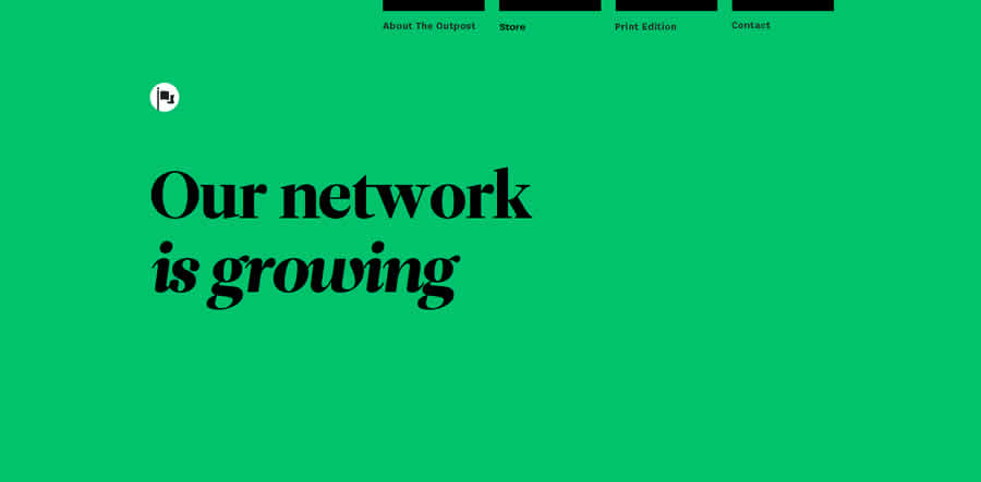
4. Dramatic Typography
Since words are almost always part of the essentials on a minimalist screen, typography takes on a whole new importance. It becomes one of the few ways left for a minimalist site to depict its personality and create atmosphere.
Conclusion
With all the practical benefits that come along with minimalism, such as reduced loading times and easier responsive design, minimalism is a style that’s at least worth looking into.
If your site satisfies all the criteria we mentioned above, try reimagining your site with less, even if just as an exercise. You may find that all those elements you once thought were essential really wouldn’t be missed if you got rid of them.
Related Topics
Top