20+ Best Free Instagram Story Templates in 2025

40+ Best Free Bootstrap Templates & Themes
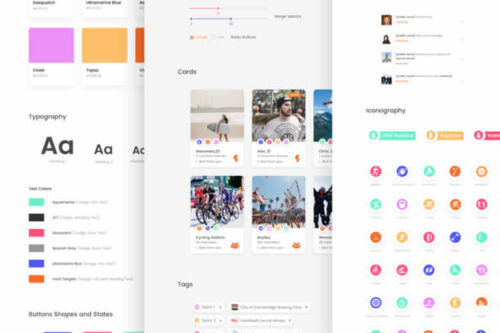
20+ Free Bootstrap UI Kits
Top 50 Free Icon Sets for UI Designers in 2025
50+ Free Wireframe Templates for Mobile, Web & UX Design
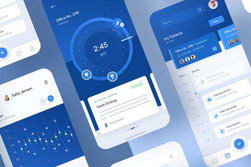
50+ Best Free Mobile UI Kits for iOS & Android
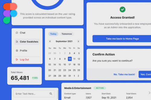
20+ Free Admin Dashboard Templates for Figma
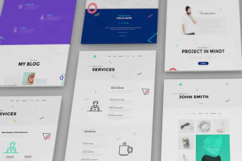
10+ Free Responsive Website Mockup Templates for UI Designers in 2025

30 Free Responsive Newsletter Templates for Your Marketing Campaigns in 2025
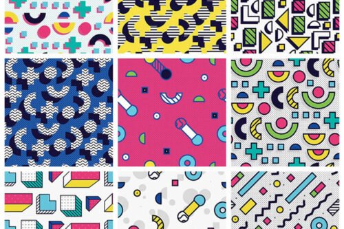
40+ Free Seamless Pattern Packs for Designers
40+ Free Web UI Kits & Templates
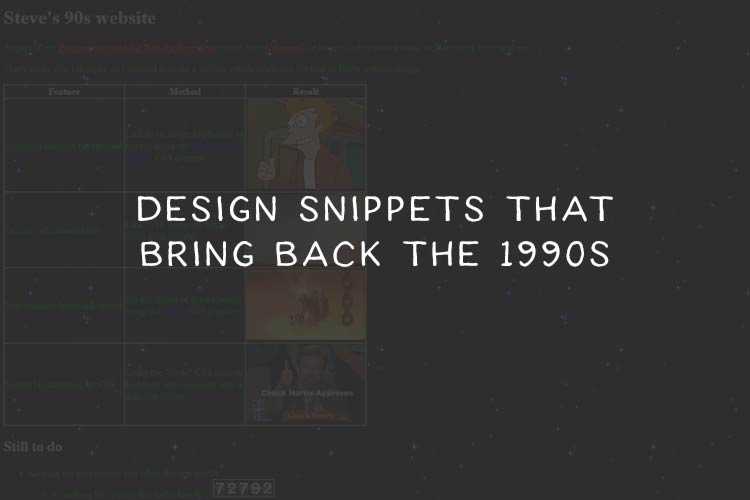
Nostalgic Code Snippets That Bring Back the 1990s
25+ Best Free Social Media Icon Sets for UI Designers
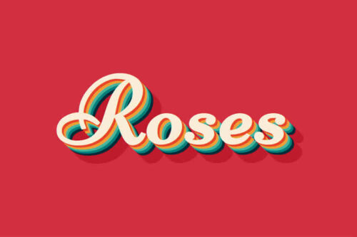
8 CSS Snippets That Demonstrate the Power of Shadow Effects
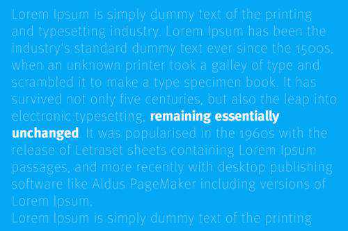
Fantastic Examples of Variable Fonts in Action
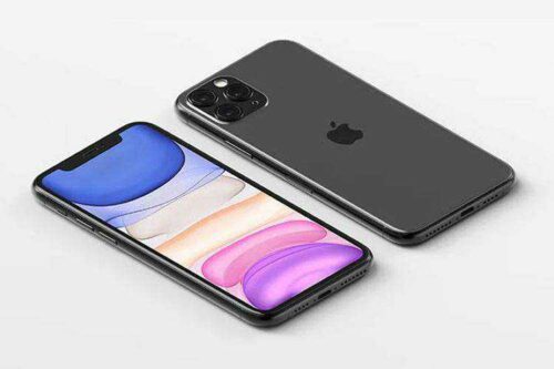
25+ Best Free iPhone Mockup Templates for UI Designers in 2025