Interaction design can separate the quality sites from the rest of the crowd – if done well. If, however, there are glaring errors in the designs, it will only serve to irritate and frustrate the very people you’re trying to impress.
Here’s a list of my least favorite IxD mistakes that have left users disappointed, confused, and can even at times leave them a little angry.
1. Lack of Contrast
When browsing sites, we like to view designs that pop off the page with clean, crisp contrast. Contrast serves an important purpose – it helps make the content readable, and effortlessly guides users around the page. This is one of the most basic design concepts, and it’s surprising that some sites just don’t seem to get it!
Without enough contrast, either in the color palette or overall presentation, a site can look, at best, a little confusing; and at worst, unreadable.
Interaction Design Mistake Example:
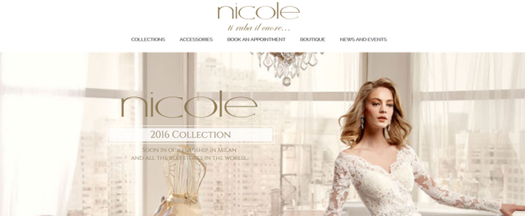
NicolEspose.it
No matter how out-of-the-box your navigation ideas are, think of your users first. It’s not being boring. It’s being thoughtful and pragmatic. Take advantage of navigation design best practices and principles: clarity, simplicity, consistency and correlation.
Interaction Design Mistake Example:
FlorianMichaut.com
3. Non-Responsive & Poor Touch Targets
Responsive websites are vital these days, and there’s no excuse for creating a site that’s hard to use on your smartphone unless you’ve done tons of user tests and proven that a mobile-friendly site is not a necessity.
Interaction Design Mistake Example:
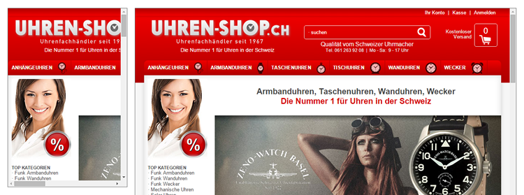
Uhren-Shop.ch
4. Mind-Numbing Music
It’s nice to put on some music in the evening and relax. Music can be great, at the right times. However, in 99.9% of cases, the right time isn’t when you’re browsing online.
Few things are more annoying than browsing a site and having an orchestral symphony blaring in your ear at the same time. It’s possibly just about excusable if you’re advertising your next album. But even then, only just.
Interaction Design Mistake Example:
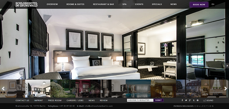
SchlossHotelBerlin.com
5. Pointless Pop-Ups
Yes, they can really be irritating. Sign-ups! Everyone needs more sign-ups! However, there’s always a more elegant way to do your marketing. Pop-ups can be about as annoying as shouting children trying to get your attention. If you must use them, keep them simple, creative, and easy to shut down.
Interaction Design Mistake Example:
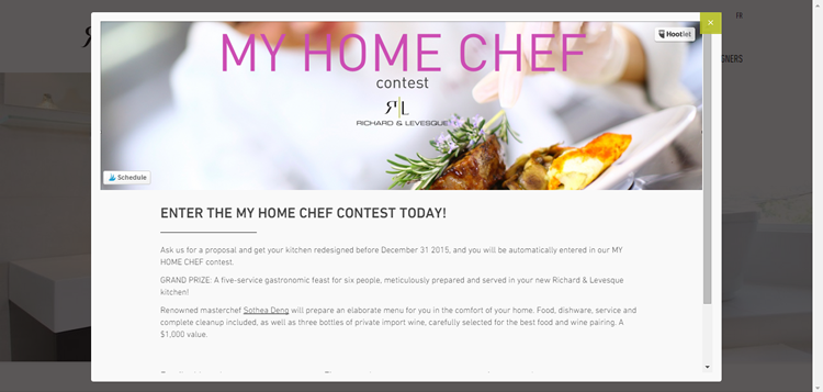
RichardAndLevesque.com
6. Poor Structure
I understand how tempting it is to try to be creative. After all, you want your design to stand out. However, when creativity just becomes one hot mess, it’s time to bring in some much needed organization instead.
Great designers are great communicators. Visual hierarchy and balance are some of the important aspects of creating a good first impression, shaping user behavior, and more importantly, effectively delivering the message beyond a web page.
Interaction Design Mistake Example:
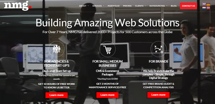
NewMediaGuru.co.uk
7. Tricky Typography
When I visit websites, I like to be able to access information quickly and easily. We’re not keen on confusing large lettering with difficult-to-read shadow effects. Trying to read words over a moving background, or struggling with teeny-tiny fonts that require a magnifying glass to view them.
Here are a few rules to help you brush up on the basics:
- Build a clear hierarchy.
- Pay attention to text alignment.
- Limit the number of font sizes, types, and colors.
- Make good use of whitespace where and when necessary.
8. Clumsy Forms
There may be times when you need to ask your users for information, and that’s fine. However, it’s not okay to present them with a form that’s overly long and far too time-consuming to complete. Nor is it a good idea to ask for the same information twice. Ask for exactly what you require, at a minimum, and don’t neglect cross-browser form styling.
Great web form interaction experience comes from clarity, conciseness, and consistency.
Here are a few tips:
- Highlight required fields.
- Display progress if necessary.
- Provide hints.
- Pay attention to field length.
- Use advanced tools for customizing form elements.
9. Copying Others, Without User Feedback & Data
It’s not necessarily a bad thing to take inspiration from someone else, but you need to ensure you’ve got the right feedback and data at your fingertips before you do so to make sure you’re designing something of genuine value for your target audience.
Interaction Design Mistake Example:
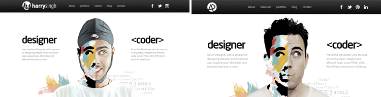
HarrySingh.in/ vs. the original AdhamDannaway.com
10. Glaring Inconsistencies
It’s ok to mix-and-match styles to a certain extent. However, if the overall effect is just one big, ugly visual “clash” then it’s advisable to get back to the drawing board and start over.
Great IxD is consistent. It gives users a better understanding of how things work, making them feel in control of the situation and increasing their efficiency in working with a web page. As Jakob Nielson said, “The more users’ expectations prove right, the more they will feel in control of the system and the more they will like it.”
Interaction Design Mistake Example:
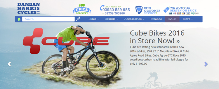
DamianHarrisCycles.co.uk
11. Too Many Effects
The occasional well-positioned interactive animation can really lift the content of your site. However, burden your pages with crazy effect after crazy effect, and you’ll leave your audience feeling a little like they’ve entered the online equivalent of a lunatic asylum, or even worse.
This one is my crowned winner when it comes to madcap design… I challenge you not to feel a little unhinged after seeing it!
Interaction Design Mistake Example:
CameronsWorld.net
12. Trend Chasing
It’s good to stay a little on-trend. However, spend your days chasing the latest buzzwords and interaction design styles, and you’ll end up with a site that reads a little bit like a cliché. Dare to be different, if you can.
Interaction Design – Four Ways to Get it Right
So, that was my collection of my most hated errors in interaction design. Here’s a handy little list, reminding you how to get it right!
- Be goal-driven. Don’t add an effect for the sake of it. Don’t choose a color palette, navigation item, or icon simply because you think it looks good. Look at the end-goal instead. What do you want your site to achieve? Once you’ve identified that, then hopefully, you should have a good idea about what interaction design you should be using..
- Remember the human touch. If you’re the artistic type (aren’t we all!) the temptation is to create something beautiful, something outstanding, something that has never been done before. However, if nobody has created and used it yet, there might be a very good reason for that…namely, it just doesn’t work. Remember, the visitors to websites are humans. Create something that is designed to appeal directly to them..
- Keep it consistent. Yes, websites should be spectacular. However, they also need to be usable. There will be certain conventions that you’ll need to follow, in order to make the site easy to navigate and simple to understand. Don’t go against the grain for the sake of being different. Instead, accept that there are certain rules you will need to implement to help your users access your site with ease..
- Test, test, test. If in doubt, test! There are plenty of user research tools to help you define where users get stuck or distracted. Do a/b tests, analyze eye-tracking data or simply ask your customers, colleagues, and friends to try out your new designs. There’s nothing more valuable than genuine feedback and there’s hardly a better way to improve your interaction ideas..
Want to Brush up on Your Skills?
If you’re keen to polish up on your interaction design skills, here are some great guides, full to the brim with useful information to help you:
Complete Beginner’s Guide to Interaction Design.Interaction Design Basics from Usability.gov.- Interaction Design Tactics For Visual Designers.
If you think I’ve missed anything, or you’ve got a pet peeve related to interaction design that you want to share, just leave a comment below!
Related Topics
Top