Designers who have been paying attention to online blogs and news sources will have noticed the increasing trend of magazine-style website layouts. Specifically, news listings where you may find a dozen stories all related to different topics which are grouped together in one section. It is a favorite style because readers will peruse through these individual news feeds looking for a headline to catch their eye.
In this article, I want to look deeper at the popularity of this design style. More specifically delving into magazine homepage layouts which have become more dynamic and influential compared with blog websites 5-10 years ago. Numerous magazines have taken their publications online to support a wider audience. The benefits are tremendous if you can manage to organize a lot of content in a plentiful yet easily-accessible manner.
The Feel of a Magazine
You will notice the majority of these websites do look and feel like a digital magazine. There is no paper to hold or pages to flip, but the colors and typography mirror a printed page. Of course, this is not always the case, but you may find this design aesthetic as the perfect fit.
Readers who understand magazine designs will typically have an easier time navigating the site. You do not need to worry so much about creating a header navigation aside from categories, and even these could be appended into a sidebar. Most of your white space should be taken up by headlines and featured news.
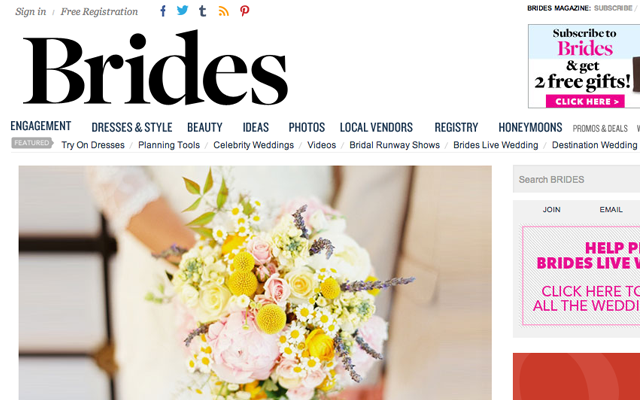
The website layout for Brides does an excellent job conveying the printed magazine feeling. Each story has a typical thumbnail image, and there are even blocks mid-way down the page breaking up featured news and small advertisements. There is also an order form to pick up physical printed copies which can be shipped right to your house! This signup form is a good idea if you plan to offer this shipping service, which may provide a bit of extra income for the business.
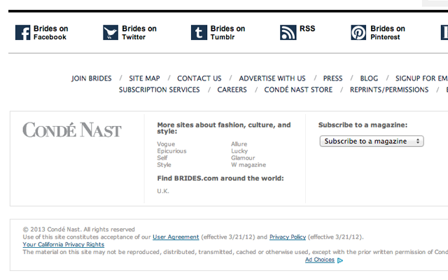
The lower footer area is also typically what you would expect in a magazine. Simple, natural contrast for reading, and it contains all the links you would expect to find in a website navigation. I think the white background using dark text is an easy solution because it allows readers to print your magazine without wasting ink. So the whole website almost feels like it is a printed magazine transferred into digital content.
Embedded Post Blocks
One interesting design style is building a magazine layout with fitted content in each column. Some readers will be annoyed by scrolling through so many headlines packed into a unique box model. However the presentation is above solid, and you can leave a mark on readers who are digging for the latest breaking stories.
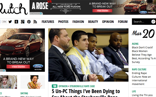
The website for Clutch Magazine is a nice example where the left sidebar contains secondary news pieces. Latest comments, opinion articles, advertisements, and a few other widgets will be displayed here. This leaves room for two columns of new articles organized chronologically. The layout is also a lazy loading design which will automatically append new pages via Ajax.
The new posts will eventually overtake the sidebar and fill the entire homepage with new content. This style can only work if you leave enough room for each post to manage by itself. Clutch uses thumbnails and borders around each headline to distinguish between them. I feel this only improves the “embedded” desire of sinking content into your page. Notice the fixed header toolbar also provides direct access to navigation links and the search form.
Infinite Scrolling News
I want to go back and revisit this idea of infinite scrolling news. The feature does not seem like such a big deal at first. But then after testing a layout which includes this lazy-loading interface you will never want to go back. Tumblr and Pinterest were early adopters among social networks, and it has grown quickly ever since.
UGS Mag is another example which uses the infinite scrolling effect on their homepage. The one downside is that readers are unable to copy and share permalinks to the different archive pages. Obviously, each article will have a unique URL, but it is unfortunate how the actual page listings will never get their own URL. These individual pages are not very popular, so there isn’t much to lose, but take this into consideration for each blog/magazine project you work on.
The homepage layout of UGS fits nicely with each post listing because the thumbnails are snug right up against the box. So each article is distinct and stands out from the crowd yet still comes together for a strange and frantic box pattern. Take personal needs into consideration when planning for these various layout designs and ask yourself what will best suit the website.
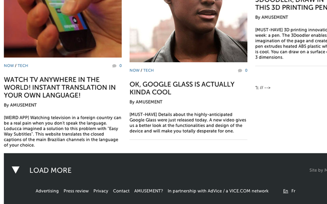
I think Amusement is worth adding into this topic because of their implementation. When you scroll to the bottom of the page, you will notice a link in the footer which reads “LOAD MORE”. Instead of automatically fetching new stories you have the opportunity to look through some of the footer links, and maybe decide if you even want another page to load. This lazy-load interface gives control over to the user which is a much better solution.
Mixed Thumbnails with Headlines
To move into newspaper territory consider homepage designs which feature a large collection of new articles. These may be mixed into different categories or columns on the page, and you will have bigger posts at the top using much larger font sizes. Typically these headlines represent featured posts which are promoted by the editors.
The concept of mixing a homepage news feed is to stagger important content without losing eye-candy appeal. This is masterfully accomplished on WWD Magazine’s website using a number of different columns. The main “Top Stories” reports down the center using only a single thumbnail. But you can scroll through the image slider of recent publications which is also located at the top of the page.
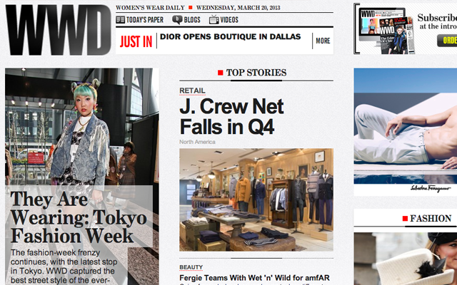
Giving your readers a number of selections to choose from will keep them interested for longer. And keeping visitors engaged is how you can bridge them into more interesting topics which may be found deeper in the website. The WWD magazine layout is great at implementing a wide variety of news listings. But it does have a slightly cluttered design, which could be better organized by keeping more featured articles at the top to draw attention.
The easiest way to expand your understanding of UI/UX effects is to find similar magazine websites which are already online. Look through these examples with a critical mind, considering both the great aspects and the not-so-great aspects which could use improvement. Then apply your insight towards your projects to capitalize on what the other guys are doing wrong(or could be doing better).
Final Thoughts
When designing your magazine/blog layout I hope you will consider a number of these ideas. New launches should be more focused on building content before applying nifty UI effects. However, a beautiful design will catch the eye almost immediately, and will lure plenty of new interested readers onto your homepage.
As we move forward I am hoping to see a lot more variety in online digital magazines. The older publication methods require a lot of time and paper. Distributing news via the Internet is a much more lucrative and profitable situation. The key to building up your reputation is through solid branding and a lot of great content.
Related Topics
Top