The next time you browse through popular print/paper newspapers or magazines, take note of how varied the page layouts tend to be from one to another. Some page layouts are crisp, clean, and highly readable.
Others are a little more stylish, artsy perhaps. Yet, they all adhere to the highest design standards and present content clearly, compactly, and beautifully.
Maintaining those high standards can’t be easy but is consistently achieved. And more often than not, those high design standards are reflected in their web versions, often pushing innovation as they do so, especially as they have to deliver content to so many different devices and screen sizes.
Magazine-style website design is a very popular layout style, yet quite often, those websites don’t draw inspiration from offline magazines. An excellent way to find out what works best is to take a closer look at popular online magazines, as those responsible for designing the printed editions often contribute to the design of the online magazines’ layouts as well.
While all are aesthetically pleasing, each of the below magazine-style websites has a creative and highly unique layout, they all put user experience first, and all are prime examples of consistency in design. This is how magazine-style web design should be done.
Time
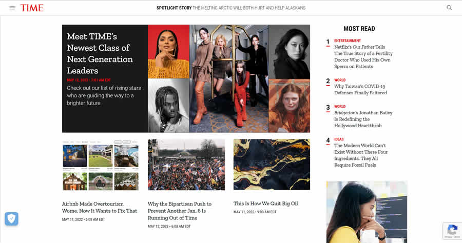
The Time homepage draws heavily on visuals, but that has always been the case with the printed version of this magazine throughout its history. The web designers have, however, managed to present the viewer with a multitude of choices while at the same time avoiding a cluttered appearance.
One of the secrets to the success of this website’s usability and readability is the reliance on visual hierarchy. The visitor can always see what the featured story of the moment is.
The Verge
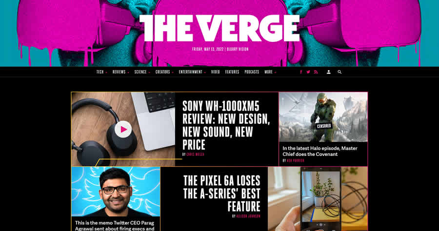
Call it a mosaic or a jigsaw puzzle, but The Verge’s homepage design gives you a quick picture of what’s inside and gets you where you want to go quickly.
The layout is pleasing to the eye as well. And skimming through the listing of articles takes but a second or two. The inner pages are sometimes broken up into carousels of image thumbnails – making it easy to drill down to a specific story or topic of interest.
The New Yorker
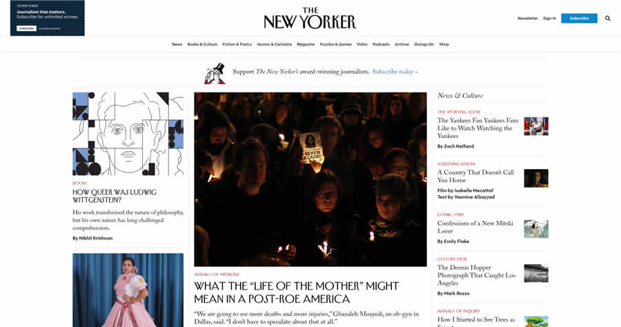
Fans of the paper version of The New Yorker won’t be disappointed in the layout of the online version. The primary focus is placed on the content, and the layout style is minimalist and appealing.
The New Yorker’s typography is familiar, as the typography of the printed version has been consistently maintained throughout the site. This magazine does an excellent job of making its online viewers feel right at home.
Wired
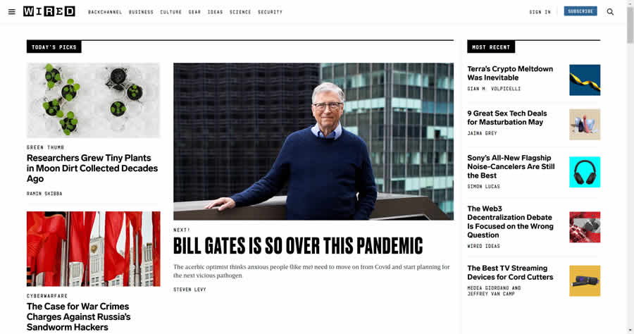
Wired’s website demonstrates an almost uncanny ability to take a huge selection of wildly varied themes (even though most appear to be geek-oriented), and arrange them in a way that actually makes for comfortable viewing and excellent readability.
This is accomplished through the skillful use of column widths, spacing, padding, comfortable use of white space, and a sans-serif font that is pleasing to the eye. Font size also gives an indication to which articles are most likely to be of interest to most viewers. Consistency is the rule, and all the various parts form a cohesive whole throughout the site.
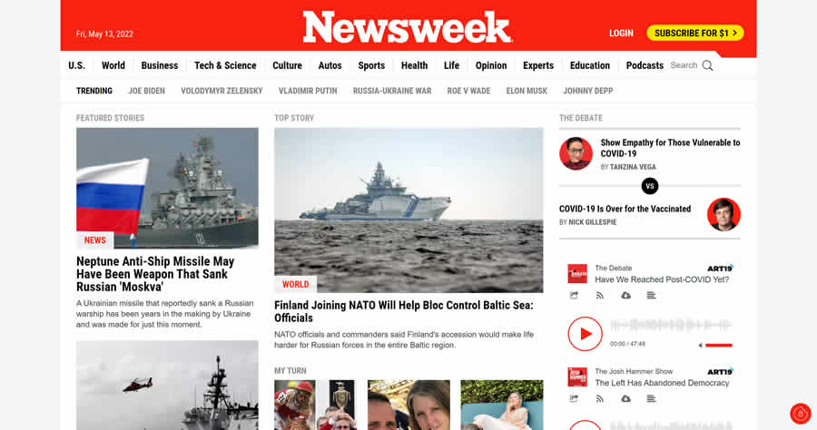
Newsweek
Newsweek’s website is thoughtfully structured, but it comes with a beautfiully designed responsive version as well, so you can thumb through its articles while on the go.
This is particularly good news for mobile users since this magazine is noted for its many excellent articles and images. It does a great job of putting everything together.
Bloomberg
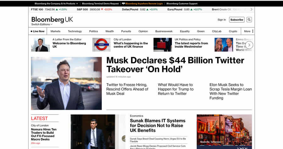
Bloomberg.com has become a digital destination for many because of its ability to deliver a news experience that offers up-to-date news and does so in a modern, user-friendly format.
Visitors especially like the way in which this online magazine, built for today’s global web consumer skillfully unifies its most powerful media assets.
GQ
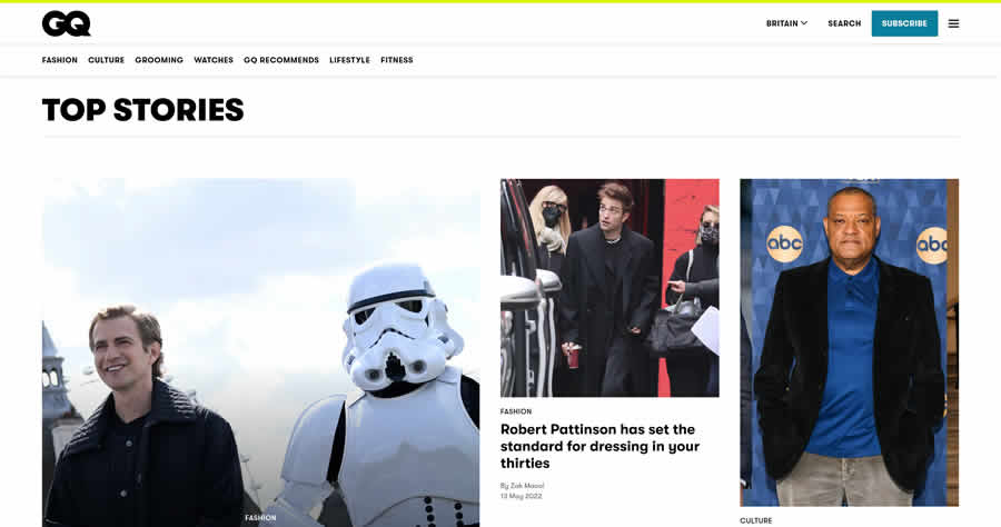
Those who are regular readers of GQ, and who have grown used to the stylish way in which the content in the offline version is presented, will find the same familiar look in the online version.
Not surprisingly, the first thing you see is a fashion-imagery banner that stretches across the width of the page. Scroll down, and the list of articles are nicely laid out in a stylish grid.
National Geographic
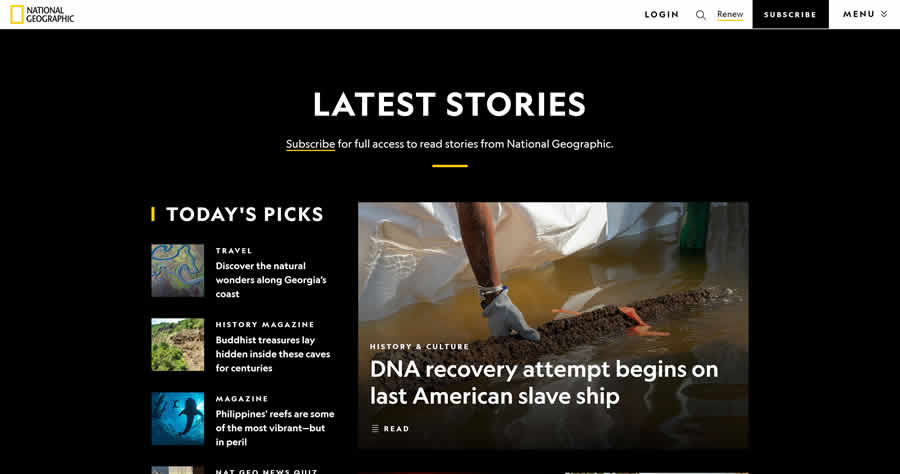
The online version of National Geographic doesn’t disappoint. The site boasts a simplistic design, and it showcases large images together with an easy-to-read selection of fonts.
Road & Track
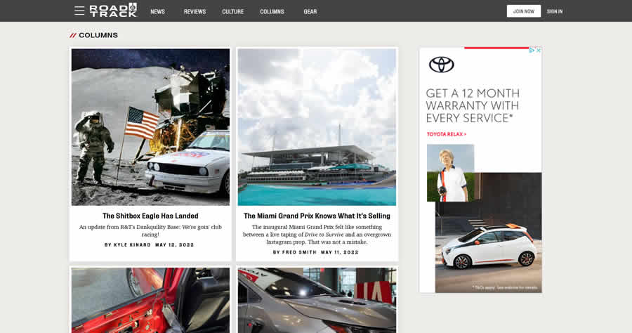
Road and Track magazine has long been popular with car enthusiasts for its insightful articles and fantastic images. The editors of this magazine obviously came ready to play when the decision was made to create the online version.
The great articles and stunning photography are still there, together with a highly convenient static navigation bar.
Vanity Fair
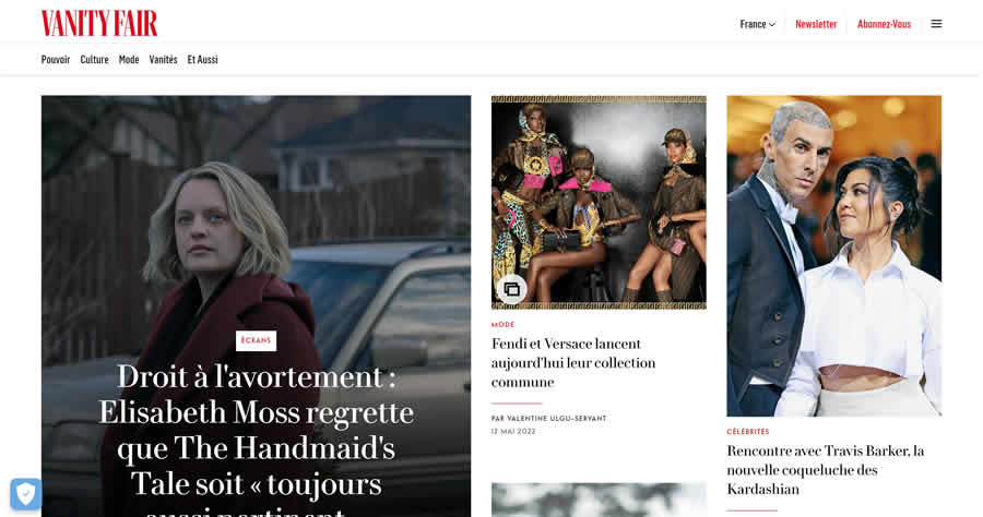
Vanity Fair redesigned its website a year ago, and the results were more than satisfactory. The new online version does an excellent job of combining lengthy articles, for which the magazine is noted, with quick-take news items, slide shows, videos, and more.
The website editors also took note of the fact that many visitors were browsing on mobile devices. They took great pains to make the content look fantastic on all platforms – and they were hugely successful.
Los Angeles Times
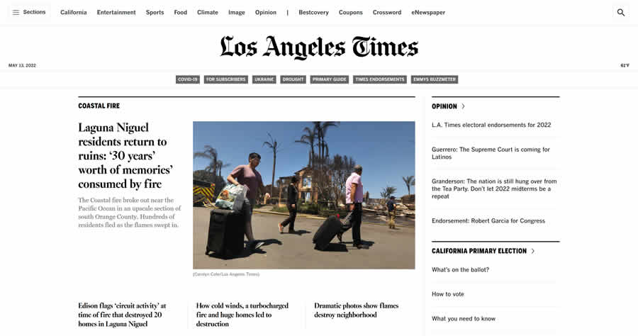
The LA Times has succeeded in creating one of the largest responsive websites ever built. Readers can get the same world-class experience in reading one of the world’s largest newspapers on any device or screen size.
To do so, the web designers dispensed with the traditional page grid. Instead, the newspapers’ marquee journalism is highlighted, clutter has been eliminated, and greater focus is placed on the paper’s unique voices and multimedia.
The Next Web
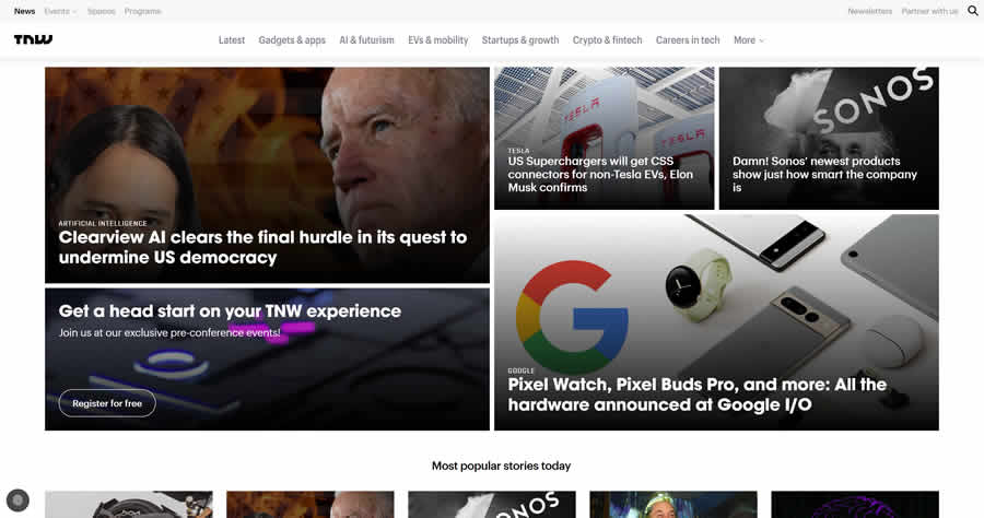
The Next Web (TNW) is presented in a solid one page website format with a bold design. It does an excellent job of balancing business needs with a strong UX.
Content is front and center, there is plenty of it, yet there is not a sign of clutter.
Entrepreneur
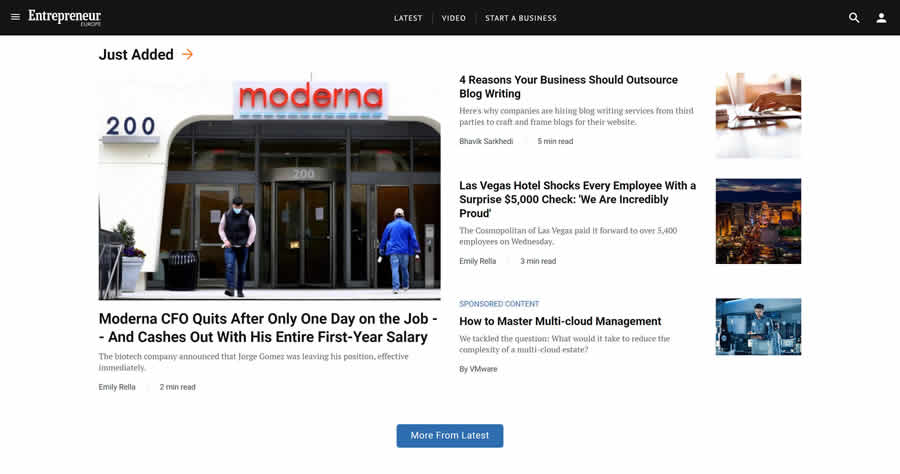
Entrepreneur, the definitive guide to meeting the challenges of business ownership, has been on the newsstands for 30 years, but the online edition is definitely modern in its layout.
The homepage may not be particularly innovative, but the layout is straightforward and easy to follow. Published monthly, this magazine is available both in print and on a mobile app.
Ad Age
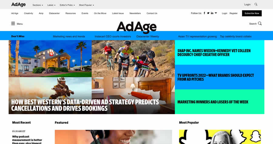
From its beginnings as a broadsheet Chicago newspaper in 1930, to its becoming a global publication, Ad Age is now available in both print and online editions – along with daily and weekly e-mail newsletters.
Except for the highlighted article, topics are given equal space until you scroll down a page or two, after which many of them are listed as line items. The Ad Age layout is one that would be easy to emulate.
One of these examples or a combination of one or two might work well for you. Just remember the importance of consistency in design.
Related Topics
Top