During my stint working for a newspaper, I recall their simple design philosophy: Big, bold text headlines on a white background. As we well know, the web is a totally different animal than print. But many principles of good design apply to both mediums. The use of large headline text is one of them.
Typography on the web has changed a lot over the past decade or so. Whereas we used to have just a few basic fonts to choose from, we now have more than enough options to satisfy our appetites for beautiful, attention-grabbing headlines.
Unlike that newspaper (which generally used one font for its headlines), web designers are exercising their creative freedom to use different types of fonts. Some use the more traditional bold, serif, and sans-serif fonts, while others use more modern styles and weights.
Let’s take a look at how designers are utilizing large headlines to convey a message. Most don’t apply to news, per se – they’re more about branding. But, as you’ll see, there is more than one way to successfully approach them.
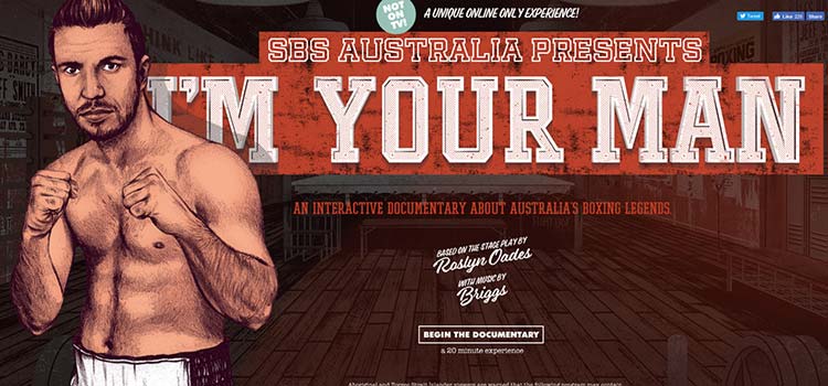
I’m Your Man
It doesn’t get much bigger and bolder than SBS Australia’s I’m Your Man.
The interactive online documentary about boxing makes great use of strong, square type to create a rough and tumble-look. It goes perfectly with the concept of an urban boxing gym.
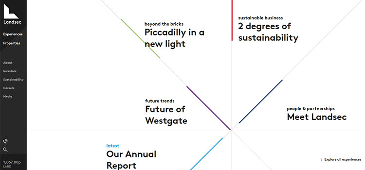
Landsec
Landsec uses large headlines strewn about in a kind of staggered circle. Hover over a headline, and the entire background changes, complete with a large photo taking up one slice of the “pie”.
Click a headline and your choice comes up as a giant presentation slide. Text is large throughout the entire experience. The UI is quite unique and the layout helps each headline to stand out on its own. This is a great example of creativity all the way around.
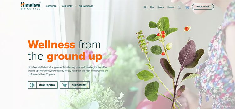
Himalaya
Himalaya utilizes a video background to emphasize the natural origins of their products.
And, even though the background uses muted colors, getting the text to stand out on top of it is a challenge. The use of color and a heavy font weight gets the job done and then some. The headline and moving background strike a great balance, though. It never feels like either one is overwhelming to the eyes.
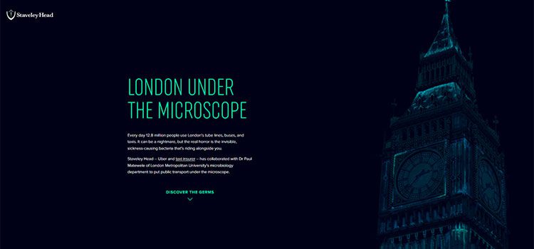
London Under the Microscope
Staveley Head’s London Under the Microscope sports a beautiful simplicity. The title font is sleek and modern, while the color provides a perfect contrast with the nighttime background.
It even matches the subtle highlights of the photograph of Big Ben. On a side note: Be sure to wash your hands after using public transport.
N6 Lofts
Brooklyn is chic these days and N6 Lofts reflects its hometown. The art deco headline and all-caps descriptive text stand out nicely over the top of a sketch of the building itself.
You find out what the building was, what it is and what you could do there – all in a short paragraph. The rectangular outlines help to bring out the points of emphasis.

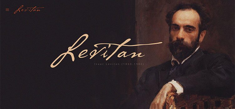
Isaac Levitan
This online ode to Russian artist Isaac Levitan makes great use of typography to help guide visitors on an incredible journey.
From the opening portrait, complete with signature font, to the timeline as you scroll through the site. A mix of beautiful type, striking images, and animation come together elegantly.
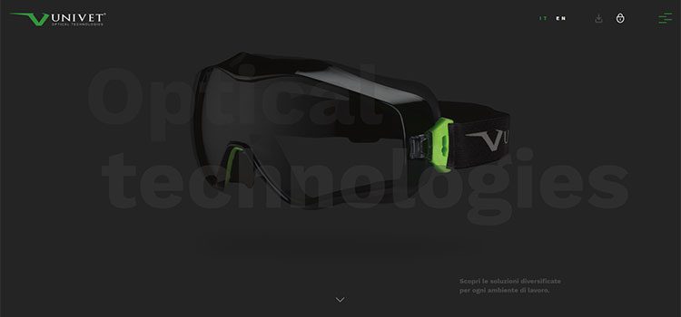
Univet
The approach Univet takes to oversized text is different than most. They turn the opacity way down as text hovers above (and blends in with) larger-than-life product images.
It’s a cool effect and, even though the contrast level isn’t high, the sheer size of the text keeps it readable. While not ideal for lengthy blocks of text, it works quite well in a case such as this.
Mile Inn
If you get into a competition with Canadian production company Mile Inn and try to out-font them, you’re going to lose – badly.
Click throughout the site and find incredibly large text in various placements and in creative ways. It may be a bit much in some spots, but there’s no way you’re going to miss their message. That in itself is a huge win.
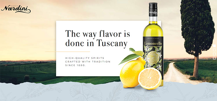
Enrico Nardini
It’s hard to argue with the classic typographical look used by Enrico Nardini. After all, take a look at this fine spirit maker’s bottle design, and the very same fonts are what consumers see in stores.
The gorgeous serif headline is easy to read and features great use of letter and line spacing. The result is classy and on-point with the brand.
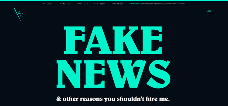
Keith Alva
Designer Keith Alva gets credit here for his incredibly clever site and for his use of truly oversized text. The fact that the content of the main headline has become part of the political lexicon of late makes it all the more cool. Plus, it just flat-out looks good.
Headlines Make News
The creative use of large text headlines by themselves won’t make for a great website. Rather, it’s a component that should fit in with the rest of the overall site design and layout. Designers have been using gigantic H1 tags since the 1990s.
So it’s more about using the right font, size, weight, and spacing to create something visually compelling.
The goal is to get people interested in what you have to say. The sites featured above should provide you with some inspiration in crafting your own creative message.
Related Topics
Top