The navigation of most books is linear. You start at the beginning and flip pages until you reach the end. Perhaps reference books are slightly different, and (for those born in the 1980s) ‘Choose Your Own Adventure’ books had a unique navigation that led the reader to choose their navigation based on the situation described in the book.
I’m at a loss as to whether a book has been written to be read in reverse. Footnotes often change the navigation system slightly as well, as do glossaries and appendices. In general, however, book navigation is straight forward.
One-pagers, are fairly straightforward, but single page navigation techniques are surprisingly more complex than it might seem.
There are four basic types of one page navigation systems:
- Horizontal
- Vertical
- No Navigation
- Experimental
Lets explore each navigation system:
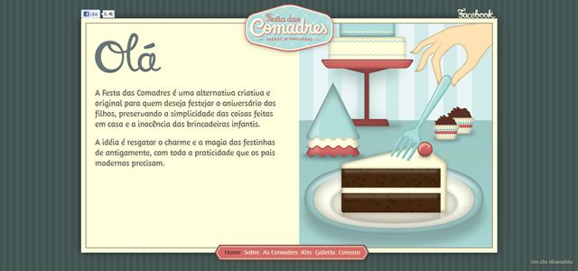
Horizontal navigation systems are those in which the different sections of the page are shown horizontally, and (in the best cases) the user knows where they are based on a horizontal marking. These are the most common as they resemble multipage websites. Horizontal navigation pages often include sticky navigation headers. It’s not necessary to have sticky navigation, but it’s a big help. These pages are similar in structure and “feel” to that of multi-page websites.
Here are some examples:

Note that on Joel Glovier’s page, the menu bar is horizontal and it highlights the section of the page the user has scrolled to. This is common amongst one-pagers.

Like Joel Glovier, Eyal Shahar uses a sticky navigation, but here the horizontal navigation does not highlight the page section.
This example features an interesting twist. The navigation bar is at the bottom of the page. The navigation is still horizontal, but it’s based around a sticky footer.

The goal of most one-pagers is to encourage the user to scroll. This site uses a dotted line to encourage users to scroll but also has a horizontal navigation for quicker navigation.

This site also features a sticky navigation bar as well as page section indication.
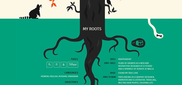
Vertical navigation systems are those where the page order and different sections are shown vertically. Often as the user scrolls the section of the page it is highlighted. This is an overwhelmingly popular style, although it is often poorly executed. While horizontal navigation pages often mirror multi-page websites in their horizontal navigation bar, vertical one-pagers are a step back from the standard page. Since scrolling is the main goal of many one-pagers, vertical navigation encourages scrolling.
Here are some examples:

This beautiful example of a one-pager includes a vertical navigation. Note that on the side of the page we can see that we are clearly on section four. Scrolling through each section causes the corresponding area to be highlighted.

This classic style one-pager is another example of vertical navigation.

In this instance the vertical navigation is on the right side instead of the left.

Here too the vertical navigation is reversed. In right-to-left languages like Hebrew, the common navigation should be on the right but here it is on the left.
Because one page websites are, in general, small, many have opted to eliminate navigation all together. Sites with no navigation are similar to books. The entire page is on scroll, the user is often induced to scroll by seeing partial images and it is not important to know where on the page you are because the distance from top to bottom is small enough that confusion is unlikely. A great example of this is Pintrest and the influx of pages with infinite scroll often confront a new navigation style that could be considered “no navigation”.
Here are some examples of portfolio pages:

In both of the portfolio pages above, there are gallery pages, but beyond the galleries there are no internal pages. In both cases there is no navigation. This is a common design for portfolios. The user simply knows to scroll down to see more information, but doesn’t need to be automatically directed there.

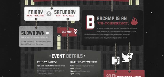

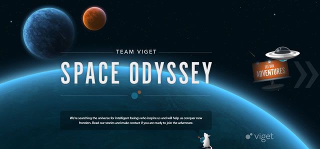
Finally, there are one-pagers that try to break the mold. For lack of a better term, I have labelled these as “experimental navigation” pages. In some ways these pages might not even be considered one-pagers, but for all intents and purposes they are. These pages are few and far between, but they represent what could be a trend for the future so they are no less important in the one-pager genre.
Here are some examples:

The site above has the “feel” of a vertical navigation page, but the information is not presented in a way that demands the user to scroll. Instead the information is projected through smaller sub-headings. The user is not sent to different pages, so this is a one-page design, but the navigation is a kind of hybrid.

This page makes use of an accordion style navigation. The accordion shows all of the options on one page and then invites the reader to click where they’d like to view the information. The user does not leave the main page, so it should be considered a one-pager, but the information is grouped in such a way that the navigation is unique.

Unfold.no represents an interesting take on the one-pager. The page runs in a loop so scrolling down eventually brings the user back to the home screen.
In this example the pages go right-and-left as opposed to up-and-down. This effect is surprisingly rare. In a way, it is a kind of combination between a traditional multi-page website and a one-page website.
Concluding
Like the Choose Your Own Adventure books from the 1980s, web designers are branching out and choosing to blaze new paths. While books were, at one time, entirely linear, some bookmakers wanted to try out new ideas. The CYOA books weren’t so successful and have largely disappeared. Likewise, it is likely that some of the styles presented here will become less favorable while others will increase in popularity. The one-pager itself may eventually fade away, but understanding the different navigational techniques it uses can go a long way to improving the complex navigation found on larger multi-page sites.
These four types of navigation represent different ways to group information on a single page. There are likely to be more ways in the near future, especially the accordion form, but at the moment these four reign. If you know of other great examples of one-page navigation, please let us know in the comments below!
Related Topics
Top