Good color choices should always be taken seriously in web design. A bad color selection or combination can have the same negative effects as poorly placed content or can create the same frustration as an excessively slow-loading page. So, underestimate the power of color at your own peril.
Even with a myriad of colors, the chances of stumbling into good an eye-pleasing color by mixing two or more together are very slim.
To help make a good color selection or arrangement, the situations when two colors are in a harmonious combination have been split into six color categories or schemes. They are: Monochromatic, Analogous, Complementary, Split Complementary, Triadic and Tetradic.
In this post, we will take a look at each and highlight some effective examples of their use within web design.
1. Monochromatic Color Harmony
As the name dictates, this calming color scheme uses only a single color as a base and allows its various shades, tints, and tones to be included within its palette.
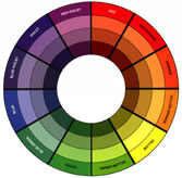
A Monochromatic Color Harmony or Scheme: Using monochromatic harmony expresses unity and instills elegance while at the same time is neither powerful nor bold enough to allow you to focus on any particular aspect of the design (due to its lack of color contrast).
Here are some beautiful examples of Monochromatic Color Schemes within web design:
1.1 Loewy Design

1.3 WilsonMiner

1.4 nclud

2. Analogous Color Harmony
Analogous color schemes are made up of colors that are directly next to each other on the 12-point color wheel.
An Analogous Color Harmony or Scheme: Compared with the monochromatic scheme (above), the analogous offers more nuances but suffers from the same defect – a lack of color contrast.
To use this scheme effectively, you have to choose one dominant color, a second to support, and lastly, a third color that is used as the accent, which will give your web design a dramatic impact.
It is also recommended to use only a few hues and avoid the combination of cool and warm colors.
Here are some examples of Analogous Color Schemes within web design:
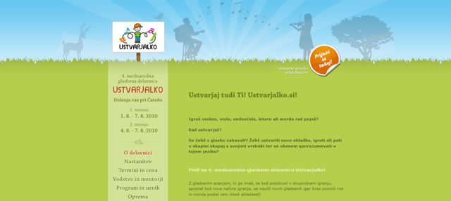
2.1 ustvarjalko
2.2 Ecoki

2.4 Whooray Records

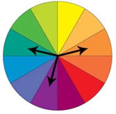
3. Complementary Color Harmony
With complementary color schemes, we finally have a recipe for good color contrast.
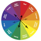
A Complementary Color Harmony or Scheme: This scheme basically uses two colors located on opposite ends of the color wheel (such as red is the opposite of green and orange is the opposite of blue, meaning they are complementary).
Due to the huge effect and power of the contrast, web designers will choose one dominant color (usually the background) and another to highlight the most important elements of the page (the content).
Any shade or tint of color can be used in a complementary color scheme, but desaturated colors should not be used, as you will lose positive contrast, and the site’s overall impact will greatly decrease. Such as, red is the opposite of green, meaning they are complementary.
Here are some examples of Complementary Color Schemes within web designs:
3.1 Gobierno Federal Mexico

3.2 Douglas Menezes

4. Split Complementary Color Harmony
To ease the contrast of the two colors from the complementary scheme (see above), split complementary schemes use a combination of three colors.
A Split Complementary Color Scheme
They are formed by combining a primary color from the color wheel with colors on each side of its complement.
Here are some examples of Split Complementary Color Schemes within web designs:
4.1 Apps Templates

5. Triadic and Tetradic Color Harmony
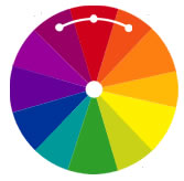
Triadic Color Scheme: As its name suggests, triadic uses the power of three colors which are situated at 120 degrees from each other (these points are determined by an equilateral triangle) on the 12 step color wheel. Their color harmonies tend to be bold and vibrant, even if you choose to use pale or unsaturated versions of the original hue.
A Triadic Color Scheme or Harmony: This harmony could be considered your best color scheme option, with its effective contrast. You could use one color for a background and the two remaining for content and the highlighted areas. The colors should be carefully balanced – let one color dominate and use the two others for accent.
Tetradic Color Scheme: Yes, you have guessed it, tetradic uses a combination of four colors, determined by a square or rectangle placed over the color wheel. To create different harmonies, the square or rectangle can be rotated, which will result in the creation of new harmonious tetradic schemes.
A Tetradic Color Scheme or Harmony: In a logical deduction, this scheme has the greatest number of combinations. It is based on two complementary pairs.
This can be a double-edged sword though – it does offer the biggest option of color, but it can give problems for good harmony. Be very careful when choosing these colors.
Both of these (triadic and tetradic) color combinations are difficult to interpret; most websites will use a combination of four colors based on these color schemes, making it difficult to highlight with examples.
Throw a stick into the deep recesses of the web, and the chances are you will wind up hitting a site with either a triadic or a tetradic color scheme.
Related Topics
Top