Whenever people communicate, there is the clear message of the words being spoken and the underlying message coming from non-verbal cues. In a conversation, non-verbal can be eye contact, posture, or tone of voice. These significant little details are a vital part of the overall message being conveyed.
When the communication is in print or online, the non-verbal cues are a bit different. In the voice-less mediums, we have layouts, colors, and images to support our directives. And, of course, there’s typography.
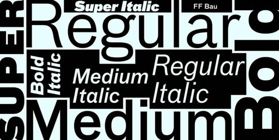
It’s a subtle overture, but the typefaces and font styles we use may actually carry subliminal connotations. Designers can play on our subconscious responses to different styles of typography to help support the main theme of any project.
Font Readability
There are a lot of fancy fonts out there that may be tempting. But if they sacrifice readability, it’s almost never worth it. People are far more likely to be accepting of a message that is stated clearly in both words and typeface. This is especially important if you are asking people to do something.
One study shows that, in a test group, people were more likely to make a decision when the message was easier to read. Following that philosophy, creating call-to-actions using highly readable fonts should encourage the most engagement.
Of course, this article suggests that in some cases you might want something a little less accessible, for example, if you want people to spend more at a restaurant.
For many people, if something is difficult to read, the perception is that it is more challenging to do, yet in the food service world, that may mean they won’t mind paying higher prices.
Masculine or Feminine Fonts?
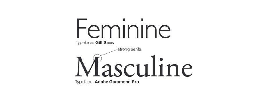
Like many things, even fonts can be classified as masculine and feminine. Feminine fonts can be described as fine, serifed, sleek, and elegant, and masculine fonts can be characterized as being blocky and bold.
When you analyze various collections of masculine or feminine fonts, you find that these generalizations largely hold true.
This insight can be used to help effectively target specific genders in marketing campaigns. Websites or advertisements that are meant to appeal to the male or female demographic can strategically utilize fonts to support that goal.
More elegant curving fonts may serve products intended for women, while items for men could benefit from bolder, more angular typefaces.
For the most part, corporate typography tends to lean toward the more masculine fonts, as they seem to indicate a greater sense of organization and professionalism. And not surprisingly, feminine fonts are still typically the most useful for feeling pathos.
I think there’s a joke about stereotypes in there somewhere, but at the risk of inciting a riot, I’m just gonna leave it alone.
Serif or Sans-Serif?
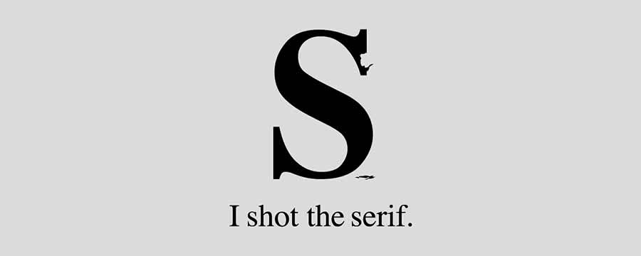
The oldest debate in the world of fonts has been whether to serif or not to serif. The difference is in the tiny little brush strokes at the end of a letter.
There are plenty theoretical arguments in favor of both styles, but ultimately, there doesn’t deem to be any scientific evidence that endorses the use of one over the other.
Although, it does appear that most users prefer sans serif fonts for websites and email but prefer serif fonts in business documents. That means that Times New Roman might still be the standard for resumes, but Arial is better as the default for your inbox.
There’s still a lot we don’t really know about the typeface. Can the font you use make your work seem more authoritative? Perhaps there is no significant difference between the serif Georgia (my all-time favorite font) and sans serif Tahoma.
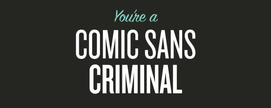
But when you go a little broader and compare the gravitas of Helvetica with, say, the perpetual butt of font jokes, Comic Sans, there’s a major disparity.
Choose Your Font
Font choice can be used to make as much of an impression as the words that comprise the copy. Websites or businesses that are creative or design-based may benefit from more artistic fonts. While institutions that require trust and credibility may want to look for more structured typefaces.
Some situations naturally lend themselves to using a specific genre of typography. In the end, though, deciding on the best font for your purpose and medium largely comes down to a matter of preference and pre-disposition.
As long as your choices are readable, purposeful, and appropriate for the circumstances, most decisions won’t be wrong.
Remember, you don’t have to reinvent the wheel; you just need to use the existing model to propel you forward.
Related Topics
Top