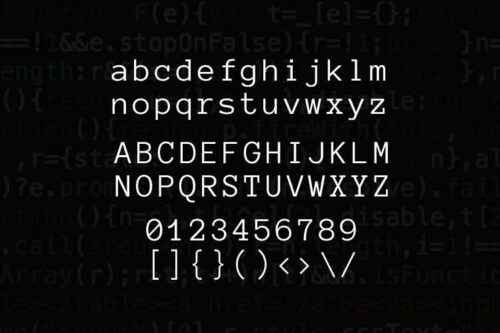
15+ Best Free Monospaced Fonts for Developers & Coders
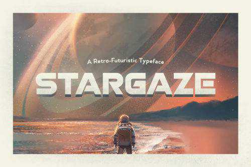
25+ Free Technology & Sci-Fi Fonts for Creatives
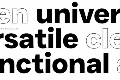
25+ Free Clean Fonts for Professional Design Projects in 2026
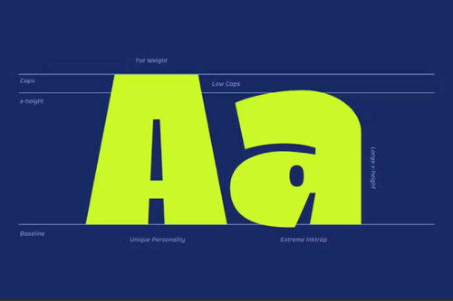
30+ Best Free Heavy & Ultra-Bold Fonts for Creatives
30+ Best Free Icon Fonts for UI Design
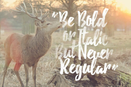
15+ Best Free Brush Fonts for Designers

20+ Best Free Vintage & Retro Fonts

Good Font, Bad Font: How to Pick the Best Font
30+ Best Free Gothic & Blackletter Fonts

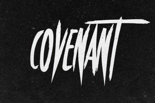
15+ Best Free Calligraphy Fonts