We have discussed the hamburger menu before. We’ve analyzed the hamburger menu, explored the hamburger and mega-menu combination, and shared CSS snippets for creating hamburger menus.
This time we’re diving a little deeper and focussing on some of the tinier details of the hamburger menu, like the animation and transitions between the clicking of the three-line icon and the moments as the actual menu appears. It takes just a split-second or so to work, but as you know, the details make all the difference – even the smallest ones. And this little effect can drastically add to the overall pleasure of the experience.
In this article, we’ll explore a selection of exquisitely designed websites that showcase breathtaking hamburger menu transitions. Each site has pushed the boundaries of what’s possible with this simple but essential design element, resulting in a truly memorable user experience. Join us on this inspiring journey as we explore the limitless possibilities of the hamburger menu!
Gizmo
Traditionally, the hamburger menu has been characterized by a sliding effect when transitioning between its two states. One classic example of this is Gizmo’s menu, where the section with links delightfully fully descends from the top, fully occupying the screen. This transition effect may be less noteworthy in terms of functionality or innovation, but it is visually satisfying.

Fishfinger Creative Agency
The team behind Fishfinger Creative Agency website tries to make the menu transition a little bit more interesting by smoothing out the angles and using a circular shape to match the overall bubbly aesthetics.

6tematik
The 6tematik agency splits their hamburger menu transition into two split sections – forcing each part of the navigation to come from the opposite side and form the common area. As a result, not only does this simple idea give a little zest to the experience, but it naturally draws the attention toward the heart of the page where the actual navigation is.

IGOODI
With IGOODI, it feels like you are taking a trip down memory lane. The website is packed with high-end features that give the site a modern look, and that feeling carries on with their hamburger menu, where the transitions and effects have Flash-like quality.

We Virtually Are
We Virtually Are also has some oldie-but-goodie vibes like iGoodi above. Here a picture appears and disappears from the small dot in the center. The solution is also spiced up with recognizable TV noise and distortion, making everything look incredible.

Digital Designer
The team behind Digital Designer took their inspiration from a classic horizontal window jalousie. The overlay screen is broken into three wide stripes spiced up with a vertical block reveal effect. The team managed to give a transition between the two states a charming and, most importantly, eye-catching appearance.
Senshu Ad Creators
If you liked the previous idea, but you want to rotate it 90 degrees, then you will undoubtedly appreciate Senshu Ad Creators‘ approach. The corporate website of this creative Tokyo-based agency also features the jalousie effect. But, this time, the shutters are vertical, and open and close across the horizontal axis.

Wizardry
The team of the Wizardry agency wins over clients with a fantastic, well-though-out cosmic theme jazzed up with advanced features. So, it is not surprising that some techy vibes also mark the transition for their menu, predictably hidden behind the hamburger button. Although the solution is based on a sliding effect, it stands out from the crowd and perfectly contributes to the theme.

Blab Studio
Blab Studio uses some kind of an origami effect. Each block of their navigation screen gradually and coherently opens in a boxy way, triggering the next area. Whether you open or close the menu, everything starts from the left bottom square that represents a menu icon and moves gradually to the right top corner, recreating a feeling of harmony and consistency.

Ruya Digital
The main menu in Ruya Digital opens with an accompanying splash-like effect that falls from the top. It has a distinctive gradient background that is also seen in the mouse hover effect. The transition smoothly changes the scene, naturally grabbing a visitor’s attention.

Bebold
Much like the previous example, the team of Bebold opts in favor of the same effect. It’s reminiscent of a watercolor painting, quickly running down the screen’s glossy surface. This time, the team adds vibrancy to the realization by using pale blue, neon green, and gentle pink into beautiful gradients. Several layers go one-after-another, recreating a lovely dimensional feeling.

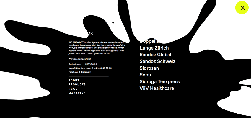
Die ANTWORT
Die ANTWORT‘s solution was also borrowed from the art world. The transition is a small animation where the black drop of paint was carelessly thrown down. It opens the navigation section. Not only does the solution produce a profound effect, but it also goes well with everything else on the website. It serves as a logical transition between the homepage and the main menu area.
The Details Matter
Like it or not, in most cases, the boxy structure of a website’s layout influences the choice of effects. Undoubtedly, the block reveal effect and boxy aesthetics seen in Blab Studio or Wizardry look great and even feel more natural to the user. However, artistic approaches like Bebold and Die ANTWORT always stand out amongst the competition and grab attention.
The important thing is that you pay attention even to the smallest details, as the design teams from the examples above have done. Give a bland hamburger menu a breath of fresh air by using transitions that will catch an eye and enrich the impression.
Related Topics
Top