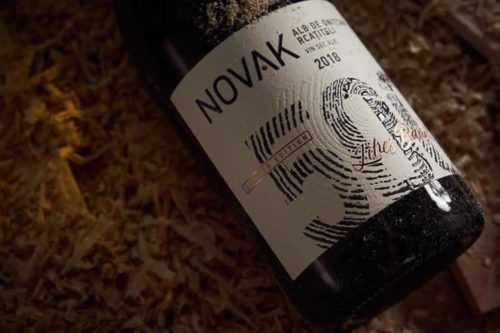
30+ Elegant Wine Label Design Examples for Inspiration
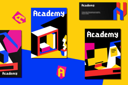
The Beauty of Bright Colors & Geometrical Shapes in Brand Identity
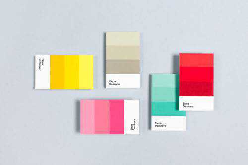
10 Beautiful Minimal & Name-Centric Business Cards
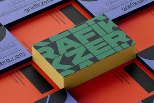
20+ Inspirational & Creative Business Cards for Designers in 2026
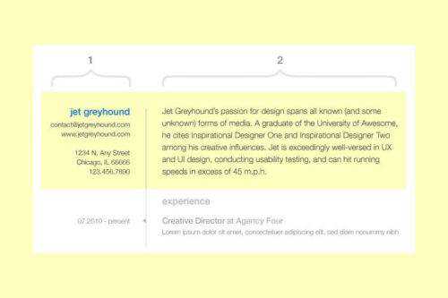
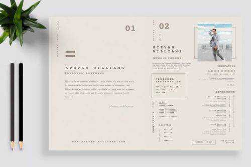
The Usability of Resume Design

15 Examples of Subtly Animated Logos in Web Design for Inspiration
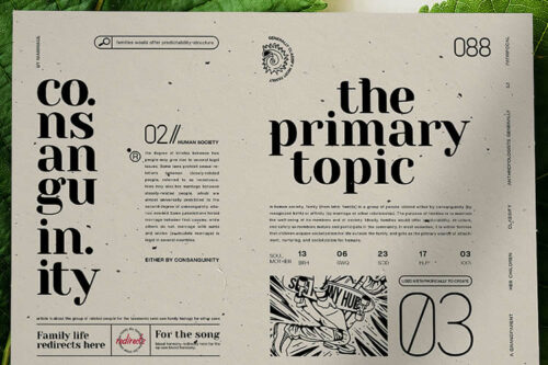
30 Beautiful Flyers for Design Inspiration in 2026
20+ Beautiful Examples of Brand Presentation for Inspiration
The Yummy Visual Identity of Food Brands
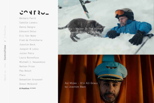
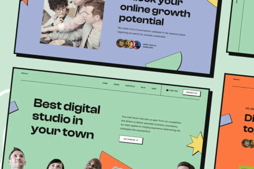
30 Beautiful Examples of Minimal Web Design for Inspiration & Ideas