Web standards are in evolution and continuing to refine how we structure our content. There are many open source platforms which allow rapid prototyping and development of new features in just a few days. As web developers it can be difficult to keep up with such fast-paced times.
Luckily with the rise of advanced standards we’re seeing less requirements to create amazing website layouts. No longer are you required 8+ hour coding sessions just to churn out a product draft. Along with the tips below we’re also sharing some popular and free HTML5 templates to download.
Expandable templates are the easiest way to cater all visitors to a site. They also contain useful source code to study and brush up on the latest syntax. As such, layouts which expand and contract based on browser resolution will fare much better in the general consensus of the web.
Back to Basics
It’s important to remember that website layouts do not require a confusing hierarchy. In fact we can break down the entire process into 2 languages – HTML markup and CSS styles. Both of these are frontend development languages used to put together a displayable website in a browser.
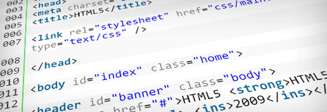
With each of these you are doing a separate job to bring together one final product. HTML is used as a markup language. This means you can define page elements, blocks, headers, forms, and all the elements needed on a page. CSS is used for styling these elements with widths, background colors, and anything else imaginable.
Define Web Page Transparency
Each type of flexible layout will provide its own benefits and drawbacks. Liquid layouts will expand and adapt into any screen resolution. This means 100% width will fill 100% of the browser window, pixel for pixel.
Elastic layouts are slightly different in that they expand based on text size. This means their width is only as large as the amount of content contained within. This isn’t a recommended path to go in today’s web as pages are updated with new content daily. You’d be reaching for a level of standards that could never be achieved.
A hybrid layout works by expanding a website to a certain limit point upon which the container will max out. This is beneficial if you have a design which can expand to larger screen resolutions but will break past a certain point.
Design Differently
The most popular CSS grid systems available usually touch upon fixed-width layouts. This means you will be running a page with 960px width no matter how many columns you implement. The retraction I have is why limit your website to private standards?

By default browsers will render a website in 100% width and let it grow to fill the screen. If a layout requires an exact limit to width because of graphical limitations it may be worthwhile to stick with base standards. However don’t approach a new design project under this assumption as you’re greatly limiting your creativity.
Based on this assumption, we should conclude that not all design mockups will allow for flexible layouts. This is absolutely true, and should be taken into consideration right from the start. It takes a trained eye to understand which mockups can scale and which can’t. Think outside the box and you’re sure to find answers to any questions you formulate.

Layout Width Affects Height
We have been discussing layouts expanding horizontally up until now but nobody seems to consider the flip side. Arguments for keeping pieces of content above-the-fold stand strong with user-backed testing and analytics data.
No flexible layouts will give you perfect control over your page height. That’s just a level of control you must release. Liquid layouts will provide an easier time for controlling the height of your page than any other. As the page expands individual lines of text and images will wrap differently and cause vertical spacing to recede or inflate.

This isn’t the case with elastic layouts where an increase in page size also increases text size. Not only are lines of text now taking up more space, but the individual letters themselves are taking up more width/height via increasing font sizes.
The best way to avoid these gaps is to keep text structured and blocked-in. This ensures all areas will scale nicely and nothing will break out of the “block grid”. Generally percents are well to be avoided typography as ems represent typography in simple elegance.
Website Graphics and Images
Images can become a problem if they aren’t implemented properly (and this sounds strange since images have always been simple!). I suppose nothing has really changed to drop images altogether… the first addition is a min-width setting on your parent container. This will keep all content set to a specific width at the very minimum – your site will never drop below this value no matter how small the browser window is.
If you have a 500px content area with 480px images sewn throughout each page you will want to ensure your layout doesn’t drop below this point. Obviously there is room for possible expansion where images would have more width to fill.
Another trick is using background images to repeat simple patterns. This technique works well with navigation menus, tabbed links, and page backgrounds with tiled patterns. As for smaller boxes of content you may consider a background gradient repeated horizontally across the top or bottom. This will not only keep your design fresh but the background image can expand on forever without skipping a beat.
HTML5 Website Layouts
Below is a small gallery collection of amazing website templates. All are coded with standards-compliance in mind and offer download free of charge. Most are also free to edit and customize with permission or credit attributed to the original author. If you’re interested in studying a bit more into HTML5 check out our collection of tutorials and study resources.
CSS3 & HTML5 One-Page Website Template

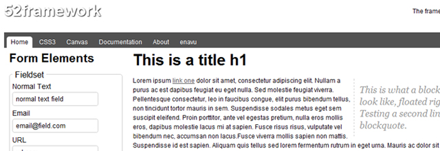
52Framework
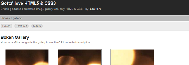
Gotta’ Love HTML5 & CSS3
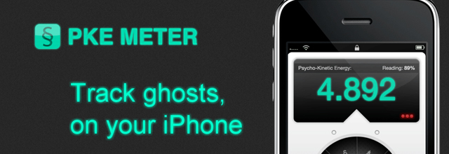
HTML5 iPhone App Website Template
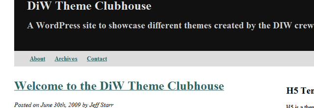
Free HTML5 WordPress Theme
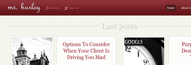
Elegant Website Template with HTML 5 And CSS3
A free HTML5 and CSS3 theme

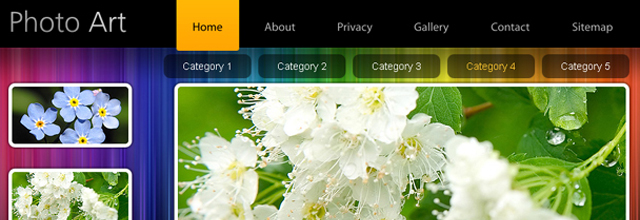
Template Monster Photography Portfolio Template
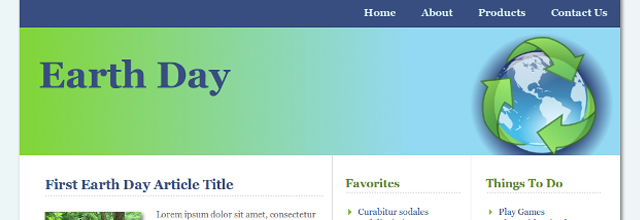
EarthDay HTML5 and CSS3 Template
Conclusion
These tips should get you started in mapping out your flexible web layout. If you consider yourself a newbie in the field spend some time researching popular CSS frameworks. There are plenty out there and they can jump-start you into a terrific starting point.
The end goal is to combine these layout structures into innovative CSS properties. With the release of CSS3 we’re seeing many new properties and styles never been implemented before. Over time I’m thinking we’ll see new standards released to control page size, layouts, and block elements with ease.
Related Topics
Top