
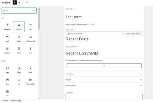
Pondering the Future of the WordPress Sidebar
A Scientific Perspective on Minimal Design

Why UI Changes Annoy People & How to Handle It

The Complexity of Simplicity in Web Design

The Role Design Plays in Your Client’s Sales Funnel

The UX Design Checklist

5 Simple Questions to Ask When Looking for User Feedback

A Primer on the Essential Elements of Successful UX

Proven Tactics to Avoiding Shopping Cart Abandonment
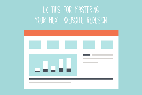
UX Tips for Mastering Your Next Web Redesign