
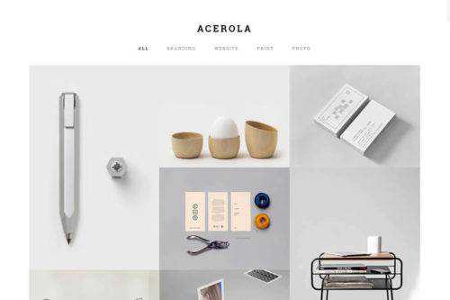
40 Creative Portfolio Websites for Inspiration in 2025
25 Beautiful Design Agency Websites for Inspiration & Ideas
30 Beautiful Examples of Minimal Web Design for Inspiration & Ideas
40 Beautiful Examples of Clean Web Design for Inspiration & Ideas

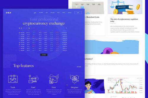
15 Examples of Pricing Page Web Layouts for Ideas & Inspiration
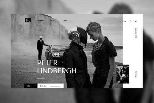
20+ Photographer Portfolio Websites for Web Design Inspiration & Ideas

40+ Creative Examples of 404 Pages in Web Design for Inspiration & Ideas

20 Beautifully Designed Coming Soon Pages for Inspiration & Ideas
15+ Business & Corporate Websites for Web Design Inspiration & Ideas

20 Sport Websites for Web Design Inspiration

15+ Beautiful Restaurant & Food Websites for Inspiration
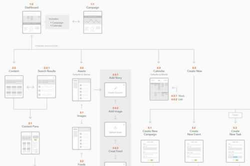
25 Beautifully Designed Sitemaps & User Flow Maps for Inspiration
10 Stunning Examples of Ultra-Minimalism in Web Design for Inspiration

20+ Beautifully Designed Admin Dashboards for Inspiration
12 Examples of Non-Profit & Charity Websites for Design Inspiration & Ideas
10 Examples of Using Over-Sized Titles in Web Design for Inspiration