25+ Best Free Bootstrap Admin Dashboard Templates

A Long Time Ago: Code Snippets Inspired by Star Wars

10+ Best Free HTML Resume Templates in 2026

40+ Best Free Bootstrap Templates & Themes in 2026
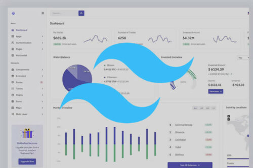
25+ Free Tailwind CSS Admin Dashboard Templates in 2026
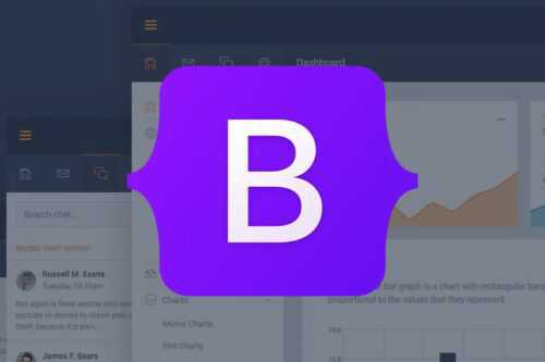
20+ Free Bootstrap UI Kits

The Importance of Keeping Up with the Latest CSS Techniques

8 CSS & JavaScript Snippets for Creating Photo Galleries
8 CSS Code Snippets for Creating Stunning Border Effects
8 CSS & JavaScript Snippets for Background Noise Effects